

 Aktualisieren
Camp Tuolumne Trails Logo with simple, classic. clean and natural look
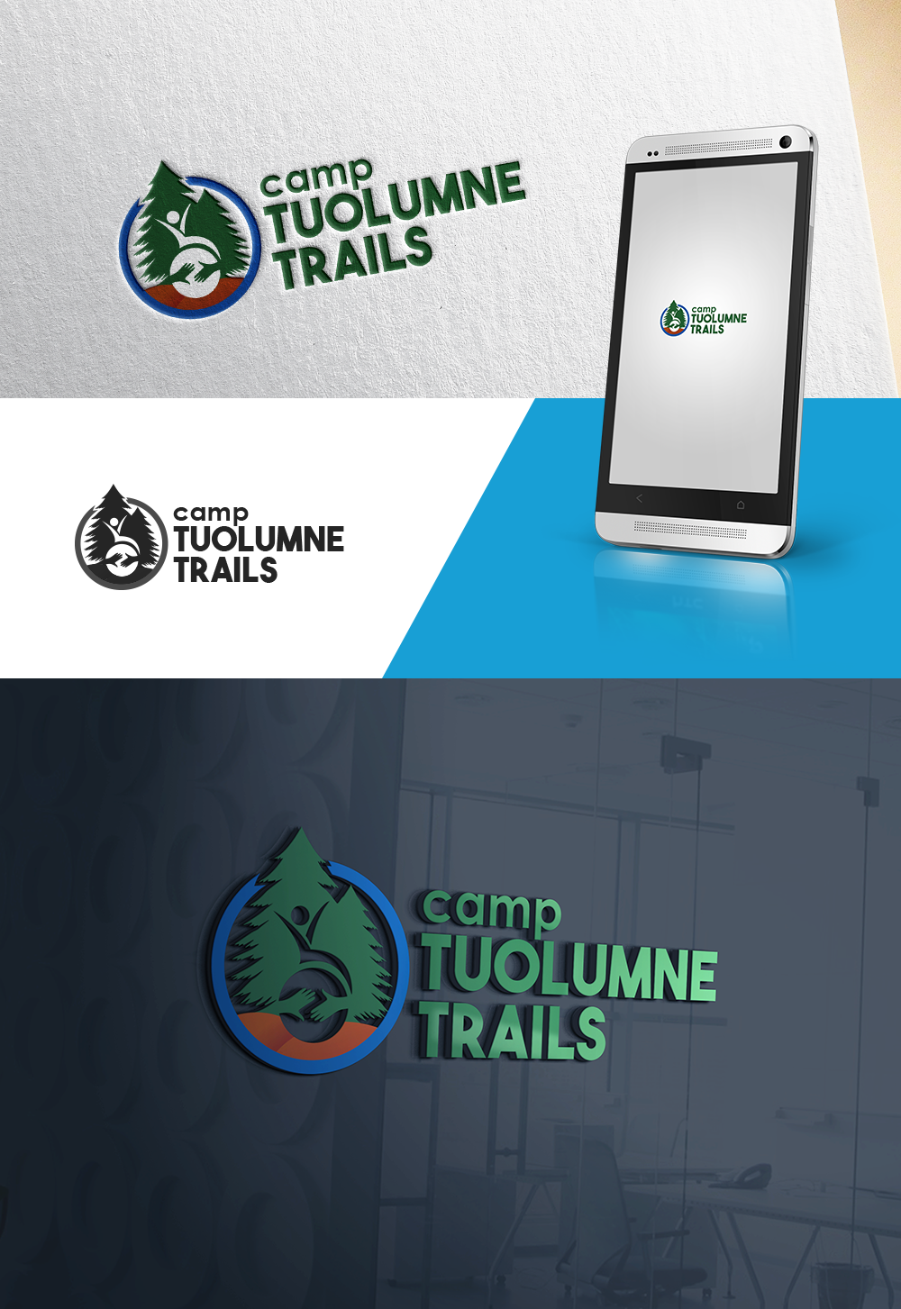
Wollen Sie auch einen Job wie diesen gewinnen?
Dieser Kunde bekam 128 Logo-Designs von 33 Designern. Dabei wurde dieses Logo-Design Design von AnjelsS als Gewinner ausgewählt.
Kostenlos anmelden Design Jobs finden
-
 US$150
-
 128 Designs
-
 33 Designer
Logo-Design Kurzbeschreibung
Camp Tuolumne Trails is in need of a logo that represents a wide range of clientele. We are a camp located just outside of Yosemite (along the Tuolumne River). Our main mission is to serve children and adults who have special needs and disabilities in a safe and fun outdoor environment. We also operate as a site that caters to Outdoor Education Schools for elementary and middle school students along with a broad range of Veteran groups. We would like a logo that represents our mission with the suggestion of a wheelchair but ideally an abstract representation of one. We are drawn to badge logos with a more traditional/classic feel. We are open to the use of colors (that are representative of nature and earth), but do not want to have more than three present in the logo. We are open to a wide variety of ideas. (Our full tag line is "Camp Tuolumne Trails: A Place for Me")
Zielmarkt/( -märkte)
Children and Adults with Special Needs (and Caregivers), Outdoor Education Groups, Rental Groups, Veteran Groups
Logo Text
Camp (smaller text) Tuolumne Trails (Larger text)
Logo Stile, die Sie interessieren können
Emblem-Logo
Logo eingeschlossen in einer Form



Pictorial / Combination-Logo
Ein reales Objekt (Text optional)



Abstraktes Logo
Begrifflich / symbolisch (Text optional)



Farben
Der Designer kann die Farben des Designs frei wählen
Sehen und fühlen
Jeder Schieber zeichnet eine der Charakteristiken der Marke des Kunden aus sowie den Stil, den euer Logo widerspiegeln sollte.
Elegant
Fett
Spielerisch
Ernst
Traditionel
Modern
Sympatisch
Professionell
Feminin
Männlich
Bunt
Konservativ
Wirtschaftlich
Gehobenes
Anforderungen
Muss haben
- Reference to special needs and disabilities as well as the outdoors. Classic/traditional logo.
Schön zu haben
- Natural colors, simple to read logo that comes across well in engravings and single color as well. Abstract suggestion of a wheelchair or community.
Sollte nicht haben
- overcomplicated elements


