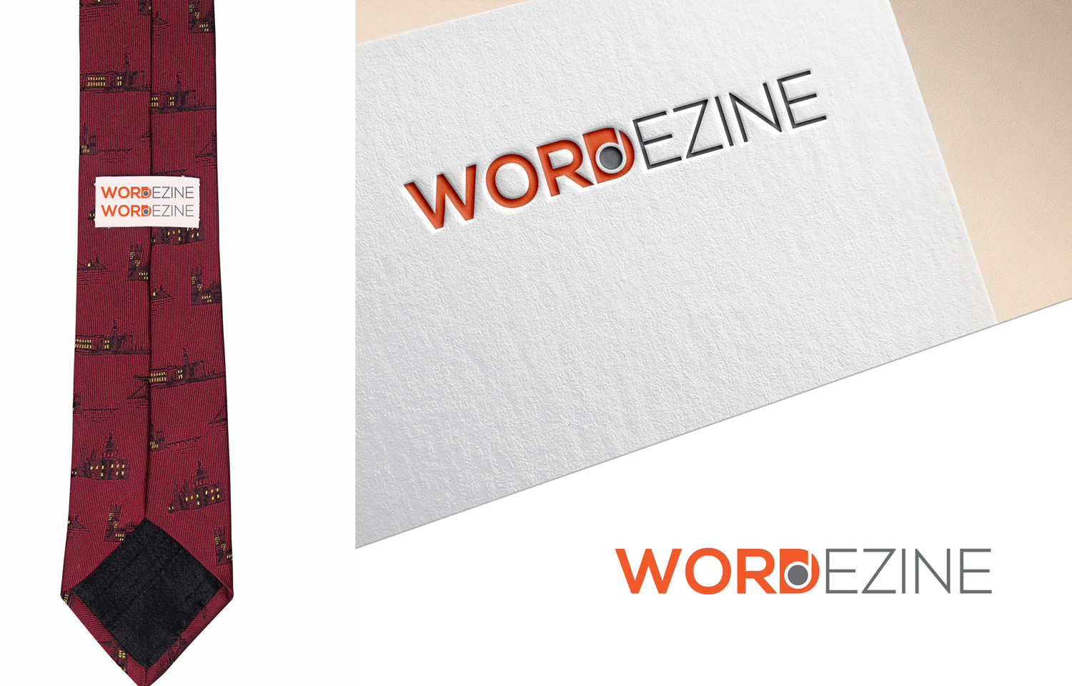
Logo for company that creates neckties and scarves.
Wollen Sie auch einen Job wie diesen gewinnen?
Dieser Kunde bekam 99 Logo-Designs von 31 Designern. Dabei wurde dieses Logo-Design Design von Juli creation als Gewinner ausgewählt.
Kostenlos anmelden Design Jobs finden-
 US$150
-
 99 Designs
-
 31 Designer
Logo-Design Kurzbeschreibung
We create & sell neckties and scarves (hopefully more items later). Each features unique patterns comprised of words, phrases, quotes. I have included images of some prototypes. I am also including, some local beer coaster graphics. These are not that relevant to my business - but I like the aesthetic - funky, fun, irreverent, cheeky...
Customers are hipsters and young professionals, mostly women. Shop at Whole Foods, listen to public radio... The logo will be used in social media, website, and printed on the back side of neckties. So will be used on screen and printing.
A fun part of our designs is that they look like designs, stripes, etc from a distance - but when closer you can read the words.
An earlier working name was ThinkerTies - changed to WORDEZINE. I have included photos to show the ThinkerTies logotype printed on the back of a tie. Each item is designed to look like a pattern from a distance and a message when viewed from closer.
Zielmarkt/( -märkte)
Upscale young professionals. Should appeal to women, as I expect mostly women shop for scarves - and for ties for their husbands, fathers and men-friends.
Industrie/Einheitstyp
Clothing
Logo Text
WORDEZINE
Logo Stile, die Sie interessieren können
Wortmarke-Logo
Word oder namensbasiertes Logo (nur Text)
Lettermark-Logo
Kurzwort oder Buchstaben-Logo (nur Text)
Zu verwendende Schriftarten
Farben
Der Designer kann die Farben des Designs frei wählen
Sehen und fühlen
Jeder Schieber zeichnet eine der Charakteristiken der Marke des Kunden aus sowie den Stil, den euer Logo widerspiegeln sollte.
Elegant
Fett
Spielerisch
Ernst
Traditionel
Modern
Sympatisch
Professionell
Feminin
Männlich
Bunt
Konservativ
Wirtschaftlich
Gehobenes
Anforderungen
Muss haben
- Needs to work primarily for: printing on the back of the tie, and website and social media.
- Should use the two way the words are blended: Word & Dezine - the D shared between them.
Schön zu haben
- Nice if it used unique logotype that plays with the two words - WORD & DEZINE - both share the D.
- Nice if it looked fun, clever, the core of our business is Language & Apparel.
Sollte nicht haben
- Should not look strong, dark, macho, masculine. Probably not red & black because that tends to be strong. Maybe greens, blues, back, white, gray...