Recruitment company website redesign
Wollen Sie auch einen Job wie diesen gewinnen?
Dieser Kunde bekam 23 Web-Designs von 14 Designern. Dabei wurde dieses Web-Design Design von sjordan als Gewinner ausgewählt.
Kostenlos anmelden Design Jobs finden-
 A$300
A$300
-
 23 Designs
-
 14 Designer
Web-Design Kurzbeschreibung
We're looking to redesign our current website, located at http://www.people2people.com.au, to make it more FRESH, modern, easy-to-navigate, and user-friendly. Navigation should be very obvious, and buttons should be big. The design should be closer to the flat/clean look of Google or iOS7 rather than the somewhat older embossed look.
The design also needs to take into consideration that the coding will be responsive (mobile, tablet, etc.-friendly).
We'd like to see your work on two pages, and from there, we'll choose a designer that we will pay further to design the rest of the site. The two pages we will need are:
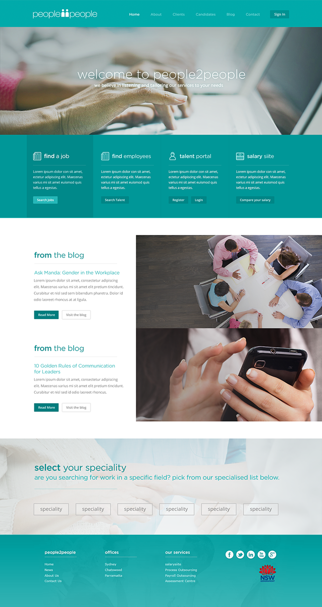
1. A home page, with the content detailed in the attached image home-outline.jpg. Keep in mind that this is a very rough outline with no design whatsoever, so please take those elements and create a beautiful page from it. Feel free to move the content around if necessary, as long as that's all on there. We're pretty open to whatever you think would look best.
Using high quality images could look great, and we'd purchase the perfect stock photos down the line, but for now just use any business-related images that aren't too cheesy (stay away from anything that looks too stock image-y like smiling actors).
2. A talent dashboard. This will live as a separate microsite; therefore, the design should be consistent with the home page but also be separate. Here, you have some more freedom with the design, but use our overall style and make it look like a user dashboard - very simple and easy to translate for responsive design.
There should be a horizontal menu that includes: "Edit Profile," "Apply for a Job," "WHS" (this will have a drop-down submenu), "My History" (also with a drop-down submenu), and "Contact."
Above that menu should be a place for users to sign in/out. Below the menu will be a welcome message and then a notice board for our updates.
Aktualisierungen
Project Deadline Extended
Reason: Still haven't found the perfect design.
Added Tuesday, December 03, 2013
Project Deadline Extended
Added Wednesday, December 04, 2013
Project Deadline Extended
Added Friday, December 06, 2013
Hi designers,
Added Thursday, December 12, 2013
Project Deadline Extended
Added Monday, December 16, 2013
Industrie/Einheitstyp
Business
Zu verwendende Schriftarten
Farben
Vom Kunden ausgewählte Farben für das Logo Design:
Sehen und fühlen
Jeder Schieber zeichnet eine der Charakteristiken der Marke des Kunden aus sowie den Stil, den euer Logo widerspiegeln sollte.
Elegant
Fett
Spielerisch
Ernst
Traditionel
Modern
Sympatisch
Professionell
Feminin
Männlich
Bunt
Konservativ
Wirtschaftlich
Gehobenes
Anforderungen
Muss haben
- Please use our current color scheme, fonts, and logo. Attached is our logo and style guidelines. Not included in those style guidelines is the orange we also incorporate into our designs, which is #ff9a00.
Also have a look at http://www.people2people.com.au, http://www.people2people.com.au/blog, and http://www.facebook.com/people2peoplerecruitment. We want to take our current look and just modernize it a bit.