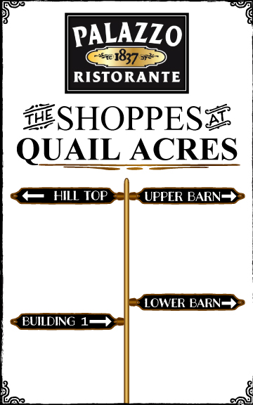
Palazzo 1837 Ristorante and The Shoppes at Quail Acres Signage
Wollen Sie auch einen Job wie diesen gewinnen?
Dieser Kunde bekam 44 Beschilderungs-Designs von 7 Designern. Dabei wurde dieses Beschilderungs-Design Design von UrbainFX als Gewinner ausgewählt.
Kostenlos anmelden Design Jobs finden- Garantiert
-
 US$380
-
 44 Designs
-
 7 Designer
Schilder-Design Kurzbeschreibung
My small business needs to establish enhanced signage for our historic fine dining restaurant and adjoining property with 11 specialty shops and businesses in the midst of a rapidly growing local business market. The sign will be 5' x 8' vertical with the restaurant at the top and each individual shop being listed below it on magnetic changeable marquees. The marquees will be designed as easily changeable because some tenants come and go in a year or two's time.
Attached is a rough draft of what I would like to see the designer enhance with his or her vision. The restaurant logo will stay the same, but text and framing of the sign with designs to enhance the overall feel and appearance in a way where people feel like they are on a classy and historic property is the goal.
Zielmarkt/( -märkte)
For RESTAURANT: Business Executives in Oil & Gas and Pharmaceutical Industry, Lawyers, Doctors, Professionals, Local Business Owners, families having events such as Wedding Rehearsal Dinners, Bridal Showers, Baby Showers, Weddings, Date Night, Anniversaries, etc... Catering to an upper middle class to wealthy clientele.
For SHOPPES: local female shoppers and guests staying in local hotels that are interested in specialty gift shop items, hair salon, spa, dog groomer, flower shop, etc...
Industrie/Einheitstyp
Small Business
Zu verwendende Schriftarten
Sehen und fühlen
Jeder Schieber zeichnet eine der Charakteristiken der Marke des Kunden aus sowie den Stil, den euer Logo widerspiegeln sollte.
Elegant
Fett
Spielerisch
Ernst
Traditionel
Modern
Sympatisch
Professionell
Feminin
Männlich
Bunt
Konservativ
Wirtschaftlich
Gehobenes
Anforderungen
Muss haben
- A historical feel. The restaurant is located in the main building on the property and it is the anchor. The building was built in 1837 and features extraordinary colonial architecture that has been largely preserved and also restored.
Schön zu haben
- The color preference is to keep it simplistic with a noble and historic feel. I am open to seeing a black background with white text or a white background with black text. The restaurant logo has already been established, which has a brass plate on it with the date 1837, so that is the only other color that I have so far. If the designer wants to introduce a color that he or she feels would enhance the design, I would like to see their ideas.
Sollte nicht haben
- Nothing cartoon-like or circus-like.
![quailhouse[1] Thursday, 30 October 2014 16:53:29](https://designcrowd.s3.amazonaws.com/brief_uploads/326503_quailhouse%5B1%5D_brief305328.jpg?AWSAccessKeyId=ASIARQT47ZIUV3OMJ4TA&Expires=1765063823&response-content-disposition=attachment%3Bfilename%3D%22quailhouse%5B1%5D%20Thursday%2C%2030%20October%202014%2016_53_29.jpg%22&x-amz-security-token=IQoJb3JpZ2luX2VjEJz%2F%2F%2F%2F%2F%2F%2F%2F%2F%2FwEaCXVzLWVhc3QtMSJHMEUCIQCu1W0d8Iq6tvSHeGu9IkBa3Ako37SUNq1ImB8m4QWpYQIgLzFUw%2FHRJ%2FLLFvw3vIHZdGhqG86%2FNwDC9xBytlQAxxoq6wMIZRAAGgwxMDQ0MTUwODcxNDUiDN%2B1WXMgeBAs6XX8YCrIA8LY84nrCUKLRF1rkUhSmx0X3CeCKWGNdOUTrYC6cmlahAa8NuVgAVc8pF56tHTw08swvEX9yb7ieaFV%2BKr%2BCFGsobEcU9kPJ7pDvfoygHYfxy%2FvZTVpkses5wmm3zZvequsMX4%2BS%2FeRVUXhJk61iYxvah0rV3DhGMHyhlxnBLoSphGgFhEe83%2F8XOvoGYzvwcskSlNgSzHpAXpE9ekZDsw4fAgG67pOGedw%2FeczhroZlzf%2FyYoSzb4nmJOj%2FK8B43vQutBtM5SrgZiqV6VQZdOT5zAjAqTDLmkWZxdS7wE4JgonXcgNxSNmlEIt35ExGi9Joe2aSNL8j2bY%2FSTFkFeK12OvQ%2Bhc2%2BgZOXIwxD2xQrJwPgJtmEOTvwGzVHeLGsz5IX9OkaFl3n0wuh78mx%2FIZfJMoZn0wsvb2RW%2FQK0t2kiLdbEZrC7OkkKHAEl1HRXShvY3ZMTeXQGrj7qATqCYcIB8U5H%2B8436FSIYj3S3LkyH2fUVUwhacZEvI8wrwceBhDABqIg32E3JL9aZEsyf1U%2BEDZxDbWI%2F%2FuocMa0pglsMj2QZdU3Hfu8cfRD0WdCk78djaLuUg7jqxcy07OdPKFgWYIwMoDDw4szJBjqlAZEuTbfob8sDF5GhpHkPR128Jas%2FX6VuCEC5IZp8fv4J1U1IH0QqrGAUdr8RvpKQfvO9VsrGobJ1P0JaCpsZip%2FQKRdYXV0PqKvW91t6p1DQDWgF4axqKbrBCgZPFCkmM4g9mdradEh%2FeKIb83VNSN3pPg%2B4VZRaAphc9PMn63o2Y9glC%2BEg%2B7N6H7AgfcaQB13EEI4TKLudoM5WDMyMSagEdGN%2F7w%3D%3D&Signature=Dm%2Fkg4HA9BF4nuLaohRf2fy8nbg%3D)