

 Aktualisieren
Amazing CreamCam App Deserves New Icon and Logo
Wollen Sie auch einen Job wie diesen gewinnen?
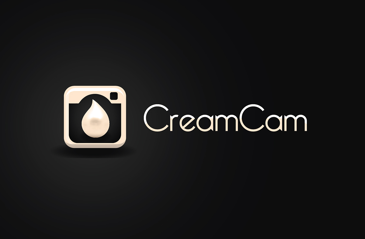
Dieser Kunde bekam 45 Icon-Designs von 17 Designern. Dabei wurde dieses Icon-Design Design von Synthesis als Gewinner ausgewählt.
Kostenlos anmelden Design Jobs finden
- Garantiert
-
 US$275
-
 45 Designs
-
 17 Designer
Icon-Design Kurzbeschreibung
CreamCam is the best FREE portrait enhancement app for achieving a perfect and flawless complexion in just a few seconds. The app is fully automatic and requires no manual editing. The transformation is complete with a touch of a button.
Please install the app to get a feel of its functionality. It's currently called '~ cream ~' in the App Store but will be renamed CreamCam in the next update.
https://itunes.apple.com/us/app/cream/id689603048?mt=8
The current app icon has a picture of a jar of face cream. (see uploaded file) It doesn't really convey the camera/photo aspect of the app at all. The new app icon should represent that plus the idea of creaminess/smoothness.
The current logo is sticker-like and just says "cream". (see uploaded file) I don't mind keeping the script font as long as it retains a smooth feel. The new logo should read "CreamCam", either as one word or with the "Cam" part split-off but creatively attached to the "Cream" part.
We are also starting up our social presence. An icon that can also be part of CreamCam's profile icon and/or web banners would be preferred.
Webpage: http://www.creamcamapp.com
Facebook: https://www.facebook.com/creamcamapp
Tumblr: http://creamcamapp.tumblr.com
Twitter: https://twitter.com/creamcamapp
Thanks,
Michael
michael@creamcamapp.com

Aktualisierungen
I am looking for two separate pieces of art: an iOS app icon and a logo that says "CreamCam". The current app icon contains the logo "cream". For the new app icon, I would like to remove the logo from the app icon itself so there's more room for graphics and to make everything more clear at lower resolutions.
Added Thursday, December 05, 2013
Zielmarkt/( -märkte)
The target audience is young women worldwide who loves taking selfies and posting pics to social networks.
Industrie/Einheitstyp
Store
Zu verwendende Schriftarten

Sehen und fühlen
Jeder Schieber zeichnet eine der Charakteristiken der Marke des Kunden aus sowie den Stil, den euer Logo widerspiegeln sollte.
Elegant
Fett
Spielerisch
Ernst
Traditionel
Modern
Sympatisch
Professionell
Feminin
Männlich
Bunt
Konservativ
Wirtschaftlich
Gehobenes
Anforderungen
Muss haben
- The icon must have an element to represent the Cream portion (e.g. a drop or dollop of face cream) and an element to represent the Cam potion (e.g. a camera or camera lens). These two pieces should integrate well with each other. The icon must look good scaled to all sizes (from 32x32 to 1024x1024).
Schön zu haben
- It would be nice to see a white camera/lens instead of the usual black. A creamy color palette that conveys smoothness would be great. The app itself currently uses the colors #FFDAB9 and #FAF0E6. The icon should feel "sophisticatedly cute".
Sollte nicht haben
- The design should not just be a colorful camera like all the other camera/photo apps out there. The icon should not have a pink or red palette. While the target market is female, the design should appeal to men too.


