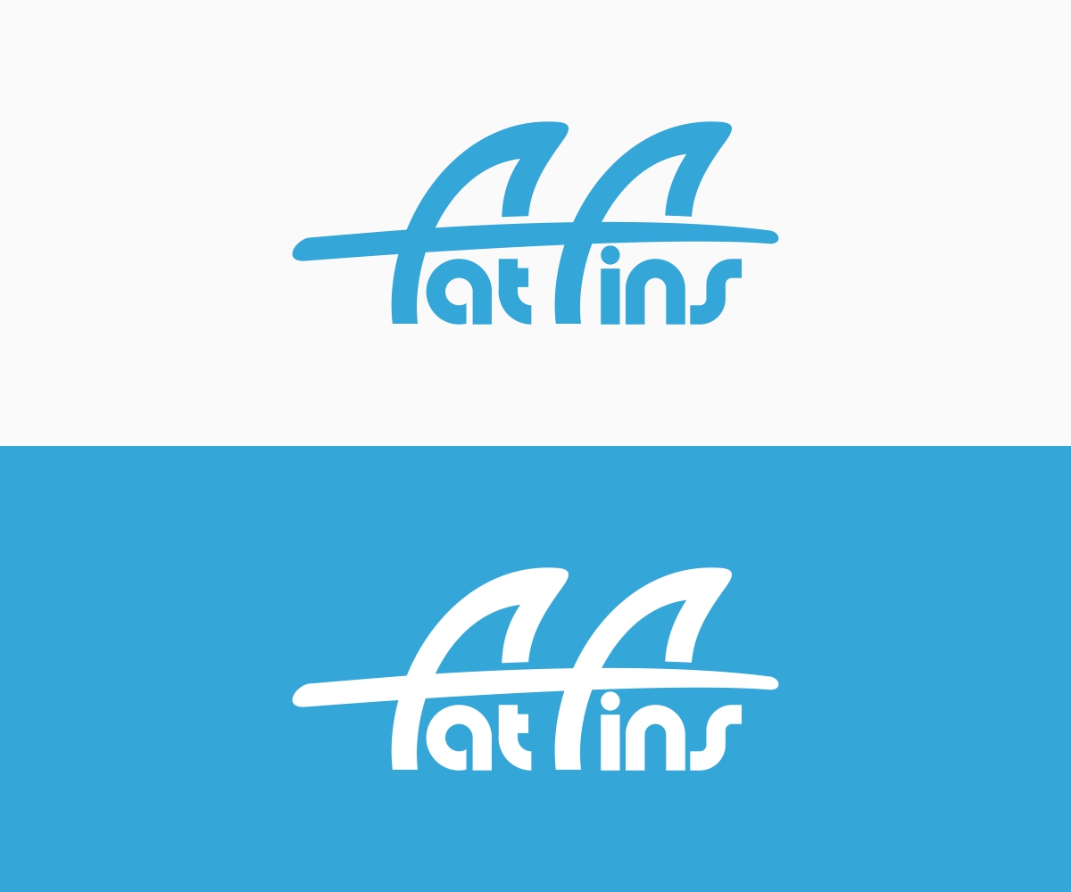
Graphic logo design for fat fins a surfing brand
Wollen Sie auch einen Job wie diesen gewinnen?
Dieser Kunde bekam 119 Logo-Designs von 30 Designern. Dabei wurde dieses Logo-Design Design von B8 als Gewinner ausgewählt.
Kostenlos anmelden Design Jobs finden- Garantiert
-
 A$120
A$120
-
 119 Designs
-
 30 Designer
Logo-Design Kurzbeschreibung
Fin design company looking for a logo, fins are used on surfboard. The fins are safer and less likely to hurt than other fin designs, making it safer and more fun. Brand is called fat fins as the contact area is fatter than normal fins therefore preventing severe liaisons.
Would like to incorporate fin siluettes or surfboards into the wording. Eg top of the “f’s” for fat fin representing thrusters from a surfboard.
Would prefer custom typography.
Ultimately the logo will be used for merchandise branding and marketing so want to keep simple and timeless
Thank you and good luck
Industrie/Einheitstyp
It Company
Logo Text
Fat Fins
Sehen und fühlen
Jeder Schieber zeichnet eine der Charakteristiken der Marke des Kunden aus sowie den Stil, den euer Logo widerspiegeln sollte.
Elegant
Fett
Spielerisch
Ernst
Traditionel
Modern
Sympatisch
Professionell
Feminin
Männlich
Bunt
Konservativ
Wirtschaftlich
Gehobenes
Anforderungen
Muss haben
- Incorporate fins and surfboard into design
- It is also going to be a logo on cap and T-shirts needs to be cool, or retro
Schön zu haben
- Try and create a feeling of movement. Surfing is dynamic. And fun.
- It’s that energy that can hurt.... fat fins save you
- Maybe word “fat” is wider bigger than “fins” like a bigger fin?!
Sollte nicht haben
- Should not look like a Shark