

 Aktualisieren
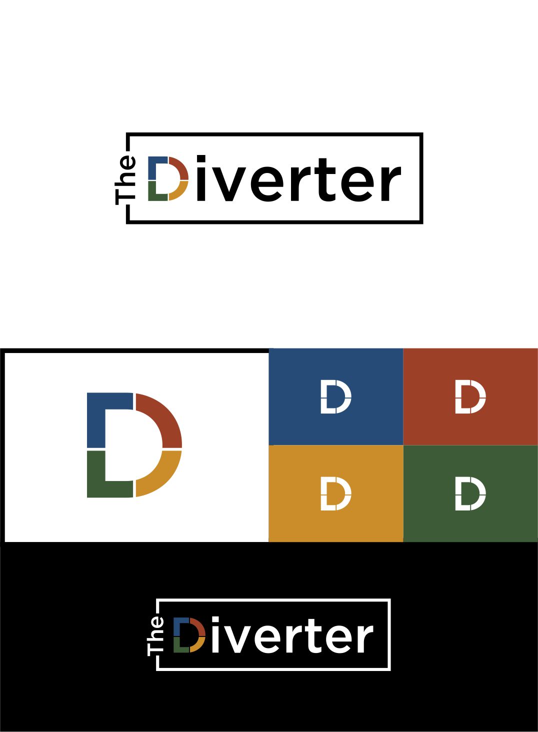
Logo for Waste Consulting Firm
Wollen Sie auch einen Job wie diesen gewinnen?
Dieser Kunde bekam 143 Logo-Designs von 40 Designern. Dabei wurde dieses Logo-Design Design von Sarah Graphic als Gewinner ausgewählt.
Kostenlos anmelden Design Jobs finden
- Garantiert
- Gebündeltes Projekt 1
-
 A$150
A$150
-
 143 Designs
-
 40 Designer
Logo-Design Kurzbeschreibung
We need a logo design for a new consulting firm and industry website based in Australia. The name is "The Diverter."
We have a website that waste and recycling industry professionals can access for information, podcasts and videos and we provide consulting services to waste companies and government on waste and recycling management, tendering, strategy, etc.
We would like to see designs that are not too corporate, exude knowledge and innovation and are a little bit edgy.
We like a logo that does not have a separate symbol, ie, the words are the logo, with the "d" in diverter being able to stand on its own as the logo.
We like multi colour use but the logo should also look good as black on white or vice versa.
The whole words can be lower case.
In regards to the attached file with logos, we like abstract lettering, matte colours rather than bright, art/design type fonts and something cool. The file with the big D uses great colours. Perhaps a blue could be added in with the green, yellow and red.
Zielmarkt/( -märkte)
Waste Management professionals from all walks of life
Industrie/Einheitstyp
Waste Management
Logo Text
The Diverter
Logo Stile, die Sie interessieren können
Wortmarke-Logo
Word oder namensbasiertes Logo (nur Text)


Lettermark-Logo
Kurzwort oder Buchstaben-Logo (nur Text)



Zu verwendende Schriftarten

Farben
Vom Kunden ausgewählte Farben für das Logo Design:
Sehen und fühlen
Jeder Schieber zeichnet eine der Charakteristiken der Marke des Kunden aus sowie den Stil, den euer Logo widerspiegeln sollte.
Elegant
Fett
Spielerisch
Ernst
Traditionel
Modern
Sympatisch
Professionell
Feminin
Männlich
Bunt
Konservativ
Wirtschaftlich
Gehobenes
Anforderungen
Muss haben
- Earth tones of any colours used. One or more of colours below.
Schön zu haben
- No words + extra logo component.
- The D in vertex should be strong enough to stand on its own as a logo of sorts.
Sollte nicht haben
- a typical corporate look
Dateien
Alle Dateien herunterladen - 0,5 MB

Zahlungen
Gesamt
A$150
Projekt-Deadline
02 Apr 2018 18:37:18 UTCProjekt Upgrades
Gebündelte(s) Projekt(e)
- übergebe A$39 Visitenkarten-Design an den Sieger
