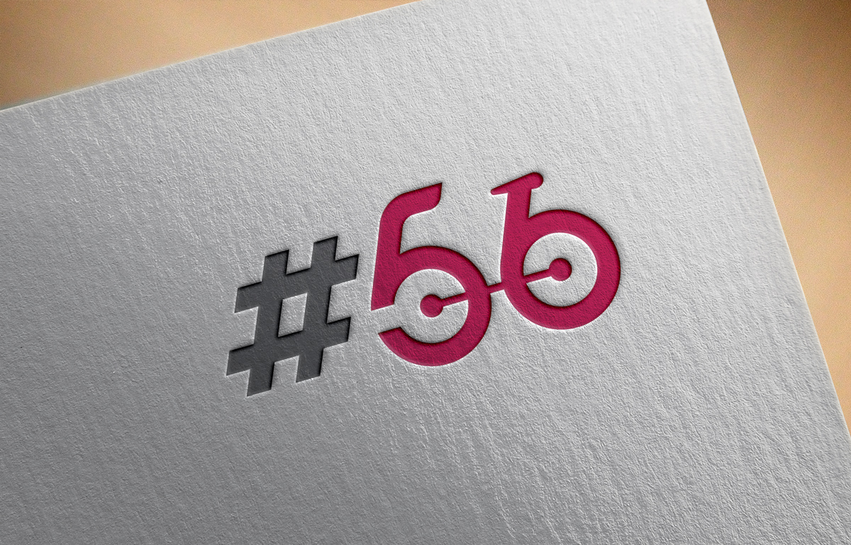
Logo for a cyclist coffee cafe called: Rule No 56. Logo is used for signage, web and social.
Wollen Sie auch einen Job wie diesen gewinnen?
Dieser Kunde bekam 127 Logo-Designs von 63 Designern. Dabei wurde dieses Logo-Design Design von Logoplain als Gewinner ausgewählt.
Kostenlos anmelden Design Jobs finden- Garantiert
-
 S$300
S$300
-
 127 Designs
-
 63 Designer
Logo-Design Kurzbeschreibung
A logo design for a coffee cafe. The cafe targets mainly cyclists. Rule no 56 has a meaning to cyclists. Rule 56: When wearing cycling kit and enjoying a pre or post ride coffee, it is only appropriate to drink espresso or macchiato. If the word soy/skim latte is heard to be used by a member wearing cycling apparel, then that person must be ceremonially beaten with Co2 canisters or mini pumps by others within the community.
The idea behind the coffee shop is to be a home for cyclists after their rides or just to hang out with other cyclists and share stories. It needs to feel like their second home.
The cafe will be located in the central business district of Singapore. Besides coffee, the cafe will also have a mechanic and a lot of cycling memorabilia.
For the logo, we're thinking of a cycling jersey or an abstract cyclist (with bicycle). The logo will be used for signage, business cards, social media and the website. Later down the line we'll also introduce merchandise (such as jerseys, socks and t-shirts).
Zielmarkt/( -märkte)
Cyclists and cycling enthousiasts
Industrie/Einheitstyp
Cafe
Logo Text
#56
Logo Stile, die Sie interessieren können
Pictorial / Combination-Logo
Ein reales Objekt (Text optional)
Abstraktes Logo
Begrifflich / symbolisch (Text optional)
Lettermark-Logo
Kurzwort oder Buchstaben-Logo (nur Text)
Sehen und fühlen
Jeder Schieber zeichnet eine der Charakteristiken der Marke des Kunden aus sowie den Stil, den euer Logo widerspiegeln sollte.
Elegant
Fett
Spielerisch
Ernst
Traditionel
Modern
Sympatisch
Professionell
Feminin
Männlich
Bunt
Konservativ
Wirtschaftlich
Gehobenes
Anforderungen
Muss haben
- The logo must either have a jersey or bicycle. Preferred abstract logo which is easy to use and recognize on merchandise.
Schön zu haben
- DIfferent color variations.
Sollte nicht haben
- Too much color or over-designed features. Simple and abstract is key.