RED ROCK
Wollen Sie auch einen Job wie diesen gewinnen?
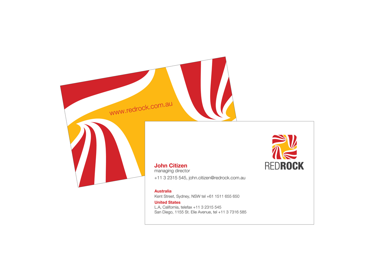
Dieser Kunde bekam 159 Logo-Designs von 32 Designern. Dabei wurde dieses Logo-Design Design von Rammal als Gewinner ausgewählt.
Kostenlos anmelden Design Jobs finden- Garantiert
-
 US$300
-
 159 Designs
-
 32 Designer
Logo-Design Kurzbeschreibung
hi all,
we need you to design a cool, yet professional logo for our new start-up; RED ROCK SOFTWARE
we are starting a commercial software development that is targeting mining, energy and project construction services in australia (for now). we are starting small, but want to stand out
we like 'communist poster art' and banksy, but are OPEN TO ANY IDEAS that say BOLD, BRIGHT and PROFESSIONAL- rocks, rock and roll, even australiana (which is generally groanworthy in australia)
we will be using it on business cards and our website, so entries that show us how it might be presented would be best. just general ideas, specific layouts are not required yet, though will probably ask the winner to more work later
we are pretty excited about what designs you can create, but we don't want to waste your time, so the project is guarranteed to pay, we wont waste your time by extending it and will give feedback pronto
cheers and good luck,
pri and russell.
Updates
hi,
thanks for the submissions - there are some bold and clean layouts we like so far, but we think we need to add some notes to further clarify what we are after
we need an image of action and certainty - we looked at 'communist poster art' and banksy and whilst many of those images are not suitable, they are strong, evocative action images
here are tow search links:
and
thanks a lot,
pri and russ
Added Monday, March 05, 2012
hi,
we're not sure of the protocol, but we are going to eliminate most of the applications now, so the remaining designers know what is working best
mostly the rock/mountain thing is harder to do than we thought. it sounds like a strong image, but rocks are largely just lumpy things. perhaps the rock and roll, or other mentioned imagery (and uploaded images) is better
thanks a lot for the work you've done,
pri and russ
Added Tuesday, March 06, 2012
hi to everyone who has submitted a design for us
just a quick apology, i should have been messaging everyone and instead, i was using feedback, which i assume can be searched on later and wont make sense to anyone else
sorry about that
regards,
pri and russ.
[ :
Added Wednesday, March 07, 2012
hi everyone,
thanks for all the submissions. we have enjoyed viewing many of the logos you have created
pri and i will compare our favourites tomorrow and narrow it down to about 4 designs we have in common and then ask for any mods (if required) before we make a choice
we've been trying out many of the logos, to see how the design would work on a web page/business card and the related colour schemes and found that some of our favourites are not working as well as we thought. logos taller than wide are the most problematic and other subtler designs are perhaps not 'loud' enough for a start-up business
surprisingly, creativity will not the most important factor in making a choice. rather, durability and useability matter more. for example, a limited number of colours (including black and white) is better, as it focus's the style (i.e. ibm is a blue and white company). also, a simple design we can use in many settings (letterheads/reports/promotional material) without much thought is nice. also, as we are dealing with cautious customers who are handing over money for products they may not really understand, we are inclined to sit with traditional shades of red/white/blue/black that are on say national flags (uk/us)
i also think mild references something interesting (rock and roll, or communist art) referenced against regular bold colours with regular shapes (circle/square/triangle) will be preferred. i think curves are ok, but they may be slight. once again, i think we are dealing with structured minds making financial decisions about software they may not understand from a new software company. so, the language must be formal, but a with a suggestion of something a little more interesting
i hope that makes sense, because i am not sure this means we will decide on a logo anything like what we expected before you began submitting your designs.
so thanks to you all for all your excellent work and if you are eliminated, chances are it will not be due to the quality of your work, but rather the fickleness of a client on the internet, you have not met.
kind regards,
pri and russ
( :
Added Saturday, March 10, 2012
hi all,
thanks very much for all your submissions
sorry a winner was not declared earlier, but we had some health issues that kept us elsewhere
there have been some very good submissions and some clever work and there was not much to pick between our 7 favourite entries
unfortunately, we can only pick one winner
thanks very much for your efforts and best of luck
regards,
pri and russell.
Added Saturday, March 24, 2012
Zielmarkt/( -märkte)
1) other software companies and 2) companies needing a software partner
Industrie/Einheitstyp
Construction
Logo Text
Red Rock, or Red Rock Software
Logo Stile, die Sie interessieren können
Emblem-Logo
Logo eingeschlossen in einer Form
Pictorial / Combination-Logo
Ein reales Objekt (Text optional)
Figuren-Logo
Logo mit Abbildung oder Zeichen
Sehen und fühlen
Jeder Schieber zeichnet eine der Charakteristiken der Marke des Kunden aus sowie den Stil, den euer Logo widerspiegeln sollte.
Elegant
Fett
Spielerisch
Ernst
Traditionel
Modern
Sympatisch
Professionell
Feminin
Männlich
Bunt
Konservativ
Wirtschaftlich
Gehobenes
Anforderungen
Schön zu haben
- some ideas, or rough layout that may show how the logo will incorporated into a layout (need not be included in the handover files)
Sollte nicht haben
- soft focus kittens, or ms wordart (unless it is 8-bit)
( :
UPDATE: (Unless you have a great idea, perhaps steer away from images of rocks - they don't seem to look so good on logos)