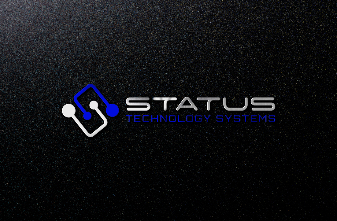
Audio, Visual, Home Automation and Technology company requires logo update after 10+ years in busine

Wollen Sie auch einen Job wie diesen gewinnen?
Dieser Kunde bekam 225 Logo-Designs von 75 Designern. Dabei wurde dieses Logo-Design Design von GLDesigns als Gewinner ausgewählt.
Kostenlos anmelden Design Jobs finden- Garantiert
Logo-Design Kurzbeschreibung
After over 10 years providing customised technology solutions for home owners and businesses we would like to update our logo so it can stand alone as Status, as Status Technology Systems, and possibly as an icon or as STS and be more easily recognised in both full and abbreviated form.
We would like to see options both updating the current logo into a more tech, cooler version and also some new ideas that incorporate technology/audio/smart home/wifi type icons so that customers can know the field of business that we operate in at a glance of the logo.
We would also like to explore having a full name logo - Status Technology Systems, plus also just using the acronym STS so that we can use them interchangeably. We currently use STATUS as the larger work in our marketing (and in how we talk to customers) but we are open to see new ideas and options.
We don't want STS and Status technology systems in the same logo. I think the brief wasn't clear enough so will update that. We need it to say STATUS TECHNOLOGY SYSTEMS with the emphasis on Status and only the ability to pull the STS out to create a separate logo to use on occasion.
We have a "tech print" that we like that is used on our business cards and website backgrounds. We have a van signage redesign in process where we have some text as a placeholder awaiting our logo update - see picture attached, as well as our old van signage which used icons for some of the services we provide. We like the idea of having some kind of pattern or picture that we can then use in other graphic design elements, eg: brochure covers etc, that is comprised of cool angles or patterns or an element such as a sound wave, wifi wave, speaker sound or something like that.
We have included a couple of other company's logos which we like the style of.
Status colours are = Dark Blue, Silver, Black and White
The current Blue of the logo is approx - C=100, M=85, Y=32, K=18
but feel free to play around with this slightly.
Thank you in advance.
Zielmarkt/( -märkte)
30-70 year old homeowners and people into AV and smart homes
Logo Text
Status Technology Systems (and also) STS
Logo Stile, die Sie interessieren können
Abstraktes Logo
Begrifflich / symbolisch (Text optional)
Wortmarke-Logo
Word oder namensbasiertes Logo (nur Text)
Zu verwendende Schriftarten
Sehen und fühlen
Jeder Schieber zeichnet eine der Charakteristiken der Marke des Kunden aus sowie den Stil, den euer Logo widerspiegeln sollte.
Elegant
Fett
Spielerisch
Ernst
Traditionel
Modern
Sympatisch
Professionell
Feminin
Männlich
Bunt
Konservativ
Wirtschaftlich
Gehobenes
Anforderungen
Muss haben
- "STATUS" as the main part of the logo (not necc.in capitals) . "TECHNOLOGY SYSTEMS" as a smaller font. Dark blue/Royal blue colour to match all our current marketing materials. Some kind of graphic so it is not just a font.
- A great font that is easy to read and that will look good in print; embroidered, screen printed, large and small.
- We don't want STS and Status technology systems in the same logo. I think the brief wasn't clear enough so will update that. We need it to say STATUS TECHNOLOGY SYSTEMS with the emphasis on Status and only the ability to pull the STS out to create a separate logo to use on occasion.
Schön zu haben
- A modern look
Sollte nicht haben
- Hard to read font. Cursive font. Nothing that looks dated