Logo design for soSIMPLE Software branding
Wollen Sie auch einen Job wie diesen gewinnen?
Dieser Kunde bekam 124 Logo-Designs von 70 Designern. Dabei wurde dieses Logo-Design Design von ideaz2050 als Gewinner ausgewählt.
Kostenlos anmelden Design Jobs finden-
 US$150
-
 124 Designs
-
 70 Designer
Logo-Design Kurzbeschreibung
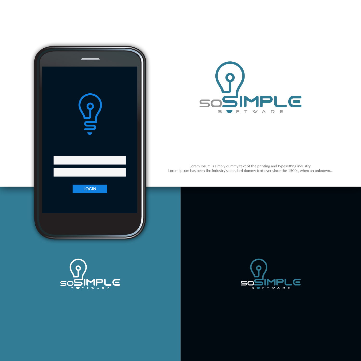
Designing new logo for a brand we've been using for years. We've previously just used lettering, or in combination with our company logo.
Some of the values we're looking to portray: Clean, simple, quality software. modern, forward-thinking, innovators.
We've been playing around with the lightbulb idea. But some of the reaction has been that while it captures the "simple" part, it doesn't capture the "modern" part. I think if we could stylize or modernize the light bulb it might work better.
Not necessary, but if we gracefully include elements of our company logo, that would be nice. That's why we chose teal as the color.
Aktualisierungen
Need extra days to review
Zielmarkt/( -märkte)
FileMaker Pro developers and power-users.
Industrie/Einheitstyp
Business Software
Logo Text
soSIMPLE Software
Logo Stile, die Sie interessieren können
Pictorial / Combination-Logo
Ein reales Objekt (Text optional)
Sehen und fühlen
Jeder Schieber zeichnet eine der Charakteristiken der Marke des Kunden aus sowie den Stil, den euer Logo widerspiegeln sollte.
Elegant
Fett
Spielerisch
Ernst
Traditionel
Modern
Sympatisch
Professionell
Feminin
Männlich
Bunt
Konservativ
Wirtschaftlich
Gehobenes
Anforderungen
Muss haben
- Color teal from company logo.
Schön zu haben
- Project description says most of it. I'm liking the lightbulb idea, but needs to be more modern. I also like that the lightbulb has the letter "S" in the stem. But it looks a little old-fashioned, and we need modern.