Uncompromised Logo
Wollen Sie auch einen Job wie diesen gewinnen?
Dieser Kunde bekam 41 Logo-Designs von 27 Designern. Dabei wurde dieses Logo-Design Design von Creative Shots Studio als Gewinner ausgewählt.
Kostenlos anmelden Design Jobs finden- Garantiert
-
 US$120
-
 41 Designs
-
 27 Designer
Logo-Design Kurzbeschreibung
I am just starting a site and I want to make sure to brand from the get go with a great logo. It's going to go from blog to a coaching platform where I sell coaching products or services at some point. I'm calling it "The Uncompromised Life" the idea being live to the fullest, do your passion, take ACTION.
Thoughts that came to mind for me when I think uncompromised were:
-vacation
-travel
-camping
-working out/the gym
-family
-coaching others through issues
-action
-facing fear and doing it anyway
Zielmarkt/( -märkte)
Men and woman from the age of 18-44, typically into things like motivational speakers, self improvement, anxious behavior, depressive behavior
Industrie/Einheitstyp
Life Coaching
Logo Text
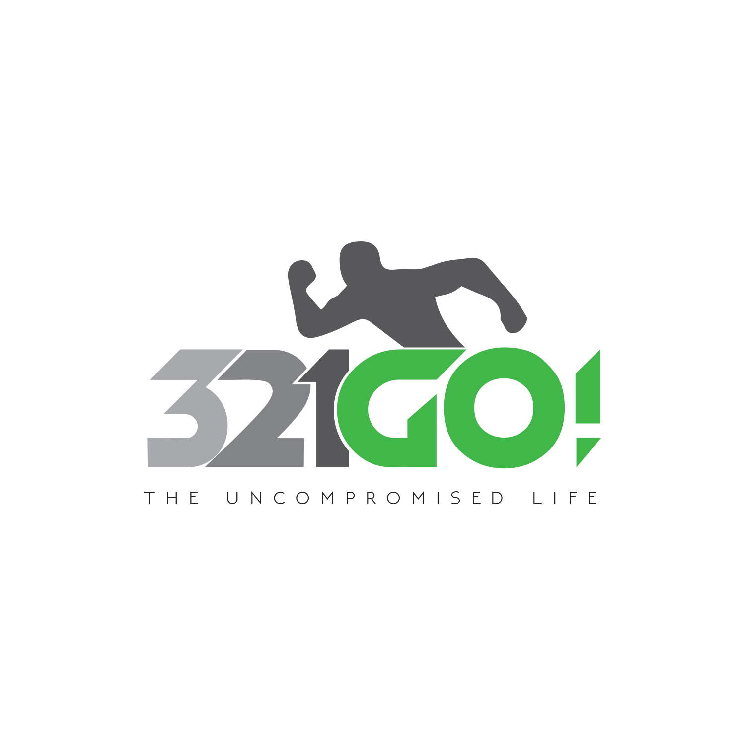
3,2,1 GO!
Logo Stile, die Sie interessieren können
Emblem-Logo
Logo eingeschlossen in einer Form
Pictorial / Combination-Logo
Ein reales Objekt (Text optional)
Figuren-Logo
Logo mit Abbildung oder Zeichen
Zu verwendende Schriftarten
Farben
Der Designer kann die Farben des Designs frei wählen
Sehen und fühlen
Jeder Schieber zeichnet eine der Charakteristiken der Marke des Kunden aus sowie den Stil, den euer Logo widerspiegeln sollte.
Elegant
Fett
Spielerisch
Ernst
Traditionel
Modern
Sympatisch
Professionell
Feminin
Männlich
Bunt
Konservativ
Wirtschaftlich
Gehobenes
Anforderungen
Muss haben
- not "bright" color was bold colors. They "pop" stand out
- what comes to mind to you when you think of things you COULD do if NOTHING was in your way. If you were to say 3,2,1 GO on your dreams what would it be. The point is to give someone that feeling with the logo
Schön zu haben
- what comes to mind to you when you think of things you COULD do if NOTHING was in your way. If you were to say 3,2,1 GO on your dreams what would it be. The point is to give someone that feeling with the logo
Sollte nicht haben
- no need for "vibrant" "bright" colors it wouldn't go with who we are.