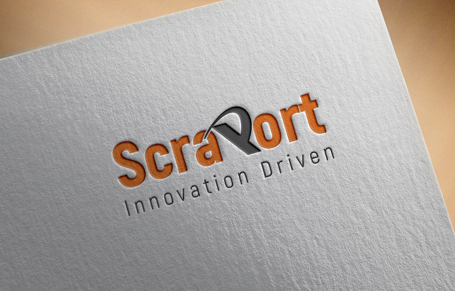
New scrap yard opening as ScraPort

Wollen Sie auch einen Job wie diesen gewinnen?
Dieser Kunde bekam 157 Logo-Designs von 55 Designern. Dabei wurde dieses Logo-Design Design von sukran als Gewinner ausgewählt.
Kostenlos anmelden Design Jobs findenLogo-Design Kurzbeschreibung
Our business is designed to operate with the most sophisticated equipment and machinery in the world. Our business is designed to process scrap using the newest technology available in the world.
Our slogan "Driven by Innovation" or "Innovation Driven"
we chose to insert the word "Port" in our business name "Scraport" to signify they size of business we do, compared to shipping ports and airports in terms of business volume. Please consider this when making your design.
The designer can be creative with a 3D shape that represents scrap processing in a new way. (optional)
Things to consider adding into the logo
- Representing scarp processing in a new way can be shown by a shape being compressed, cut, or a combination of both
- Can be shown by a shape being cut and compressed.
- 3D circles, cones, pipes , triangles or other shapes
- combination of 2D and 3D of the layout of the text/ shapes in the logo
- The style of text needs to be a style that represents our scarp yard business
- The letter P in ScraPort needs to be larger in size than the rest of the letter in the business name.
Things NOT to be in the logo (recycling arrows, flames, cranes, machines, green leafs, oil drops)
Need to insert our slogan into the logo
Zielmarkt/( -märkte)
large industrial facilities that generate scrap metal
Industrie/Einheitstyp
Recycling
Logo Text
ScraPort / Driven by Innovation or Innovation Driven
Zu verwendende Schriftarten
Andere Schriftarten erwünscht:
- Colonna MT, Chiller, MV Boli, Nyala, Papyrus,
Farben
Vom Kunden ausgewählte Farben für das Logo Design:
Sehen und fühlen
Jeder Schieber zeichnet eine der Charakteristiken der Marke des Kunden aus sowie den Stil, den euer Logo widerspiegeln sollte.
Elegant
Fett
Spielerisch
Ernst
Traditionel
Modern
Sympatisch
Professionell
Feminin
Männlich
Bunt
Konservativ
Wirtschaftlich
Gehobenes
Anforderungen
Muss haben
- Things to consider adding into the logo
- ScraPort could be wrapped around a shape
- - The letter P in ScraPort needs to be larger in font size and Bolder than the rest of the letter in the business name.
- - Representing scarp processing in a new way can be shown by a shape being compressed, cut, or a combination of both
- - Can be shown by a shape being cut and/ or compressed.
- - 3D circles, cones, triangles, or other interesting shapes
- - combination of 2D and 3D of the layout of the text/ shapes in the logo
- - The style of text needs to be a style that represents our scarp yard business
Schön zu haben
- -futuristic way of metal recycling
- - spaced out letters in the business name as such S c r a P
- o
- R
- T
Sollte nicht haben
- Do NOT place (recycling arrows, flames, cranes, machines, green leafs, oil drops)