Logo design needed for a new eBook publishing company, Bloody Good Book
Wollen Sie auch einen Job wie diesen gewinnen?
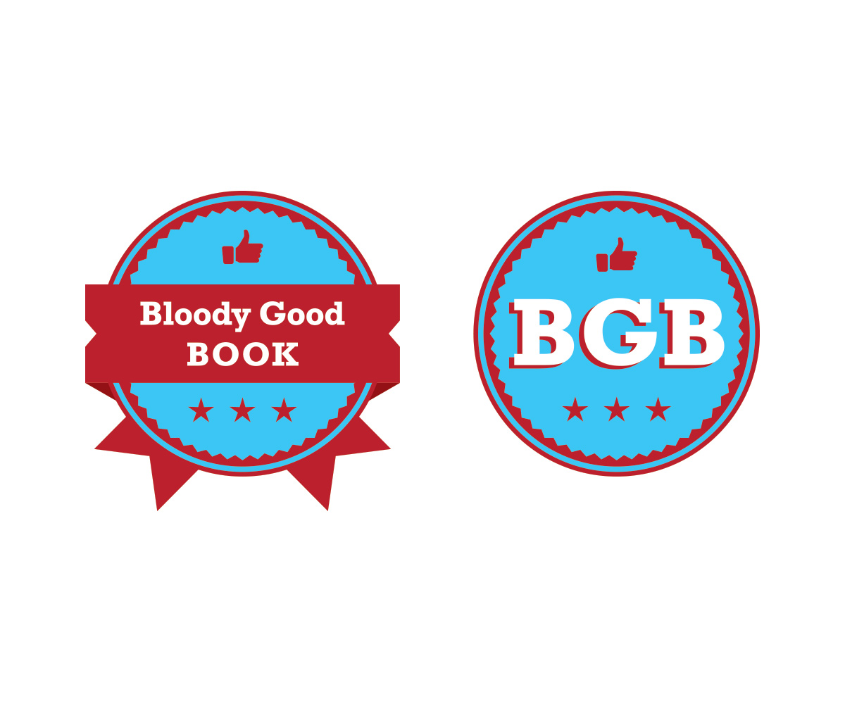
Dieser Kunde bekam 52 Logo-Designs von 22 Designern. Dabei wurde dieses Logo-Design Design von MariannaY als Gewinner ausgewählt.
Kostenlos anmelden Design Jobs finden-
 US$200
-
 52 Designs
-
 22 Designer
Logo-Design Kurzbeschreibung
We need a logo design for our new eBook publishing company in India called Bloody Good Book. We are creating an online platform which will crowd source and crowd curate manuscripts by first-time authors. We are going to invite all novice authors to send their manuscripts so that we may put up a portion of it online where readers will rate, recommend and critique them. The top ten most popular manuscripts will be judged by the editors of Bloody Good Book, who will then decide if we should publish them as eBooks.
We would like the logo to resonate the tongue in cheek humor and wittiness of our name, Bloody Good Book. We are going to put up the logo of 'Bloody Good Book' on our website but we will also need a shorter logo, perhaps one that just uses the initials BGB, for our eBook covers. The most popular of the ebooks will also be published in print and the logo would go on those covers as well.
Zielmarkt/( -märkte)
Our target market are young people from teenagers to people in their 30s, who are likely to read eBooks.
Industrie/Einheitstyp
Publishing Company
Logo Text
Bloody Good Book
Logo Stile, die Sie interessieren können
Pictorial / Combination-Logo
Ein reales Objekt (Text optional)
Wortmarke-Logo
Word oder namensbasiertes Logo (nur Text)
Lettermark-Logo
Kurzwort oder Buchstaben-Logo (nur Text)
Farben
Der Designer kann die Farben des Designs frei wählen
Sehen und fühlen
Jeder Schieber zeichnet eine der Charakteristiken der Marke des Kunden aus sowie den Stil, den euer Logo widerspiegeln sollte.
Elegant
Fett
Spielerisch
Ernst
Traditionel
Modern
Sympatisch
Professionell
Feminin
Männlich
Bunt
Konservativ
Wirtschaftlich
Gehobenes
Anforderungen
Sollte nicht haben
- Should not depict blood visually as the name is ironic. Not literal. Also, we dont want a book graphic as part of the logo. We prefer a 2 colour logo.