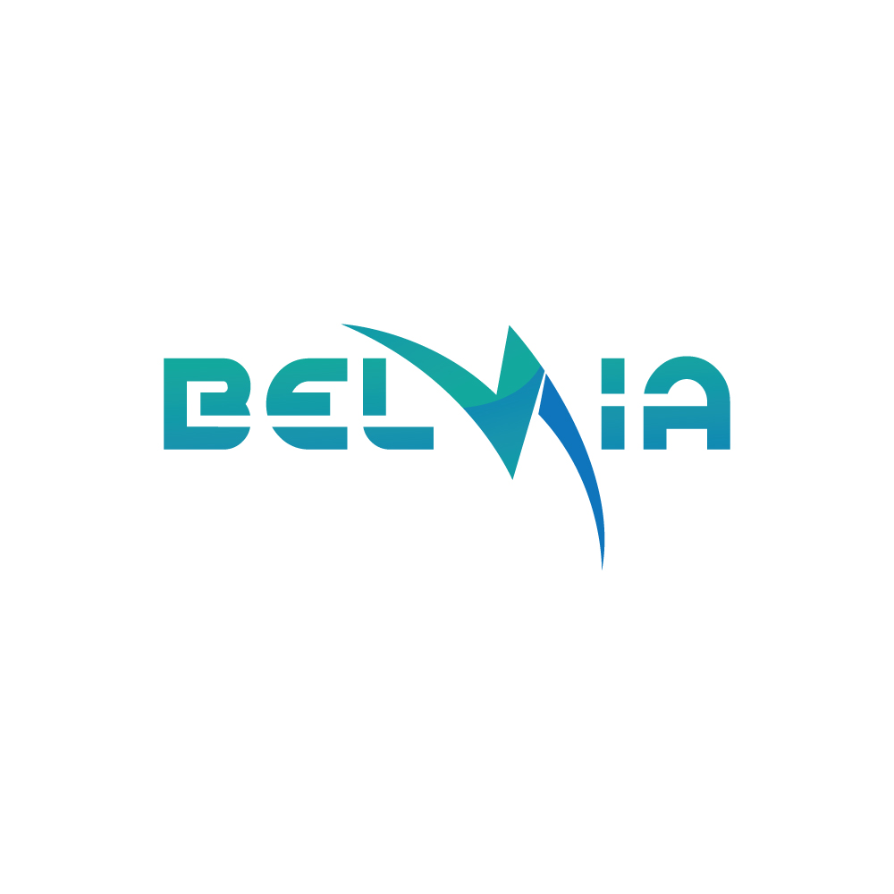
Update of Belvia Logo
Wollen Sie auch einen Job wie diesen gewinnen?
Dieser Kunde bekam 172 Logo-Designs von 88 Designern. Dabei wurde dieses Logo-Design Design von Kreative Fingers als Gewinner ausgewählt.
Kostenlos anmelden Design Jobs finden- Garantiert
-
 A$250
A$250
-
 172 Designs
-
 88 Designer
Logo-Design Kurzbeschreibung
Belvia Services specialises in Electrical projects for construction, high end retail, commercial fitouts and have an extensive service base. since starting in 2004, we have grown and have become a preferred electrical contractor in our area. We are in the process of taking things to the next level and its time our 14 year old logo gets a modern look to help us stand out even more!
Although we are electricians, we still need that "Corporate" and professional look.
We think moving away from having symbols/icons and going to a text logo with just "BELVIA" would be the way to go. Colours have a sentimental value to the director and should be highly considered.
As well as the standard of website, business cards and letter head, the logo would be featured on our (new to come) website, fleet of ute's , hard hats, Shirts,jackets, Hi-Vis vests and possible other signage so this needs to be taken into account
Aktualisierungen
Went on vacation/holiday
Zielmarkt/( -märkte)
We are an electrical contractor working more for Builders than clients direct. We specialize in construction , office fitout and high end retail
Industrie/Einheitstyp
Construction
Logo Text
Belvia
Logo Stile, die Sie interessieren können
Wortmarke-Logo
Word oder namensbasiertes Logo (nur Text)
Zu verwendende Schriftarten
Farben
Vom Kunden ausgewählte Farben für das Logo Design:
Sehen und fühlen
Jeder Schieber zeichnet eine der Charakteristiken der Marke des Kunden aus sowie den Stil, den euer Logo widerspiegeln sollte.
Elegant
Fett
Spielerisch
Ernst
Traditionel
Modern
Sympatisch
Professionell
Feminin
Männlich
Bunt
Konservativ
Wirtschaftlich
Gehobenes
Anforderungen
Muss haben
- Looking for a modern, simplistic logo that will stand out
Schön zu haben
- Looking more for a Text logo than an actual symbol/icon with just "BELVIA". Please review attached for current logo designed in 2004. Would like to try and keep the colours but you guys are the pro's