Logo Rebrand for a small family owned Sports Medicine Clinic
Wollen Sie auch einen Job wie diesen gewinnen?
Dieser Kunde bekam 62 Logo-Designs von 30 Designern. Dabei wurde dieses Logo-Design Design von pulogo als Gewinner ausgewählt.
Kostenlos anmelden Design Jobs finden-
 US$120
-
 62 Designs
-
 30 Designer
Logo-Design Kurzbeschreibung
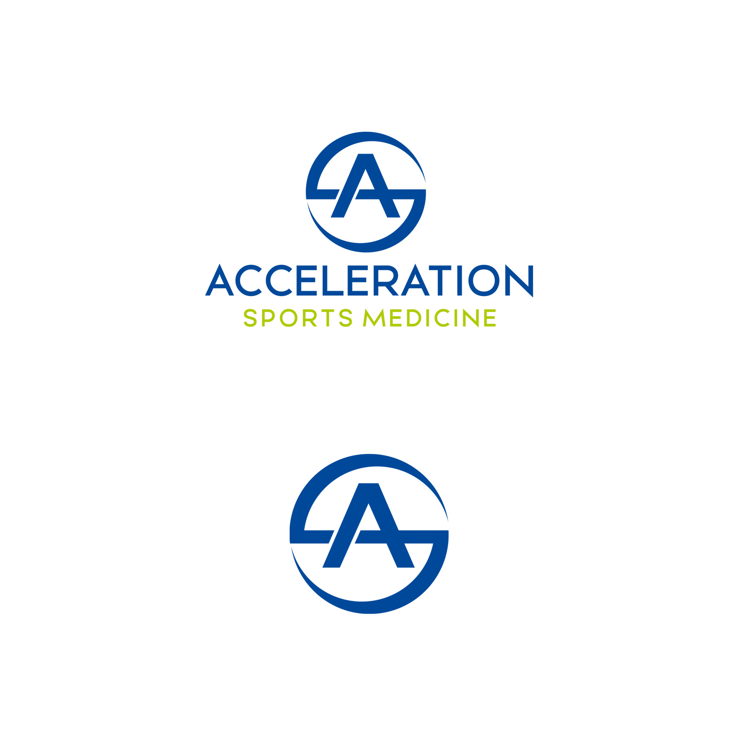
We are a small family owned sports med clinic. Our current logo is simple and clean and shows motion, but the rectangular size is too hard to work with. We want something that will fit within a more square sized area. The logo should either be an “A” or a clever simple design that interstates “ASM” (Acceleration Sports Medicine), with the “A” being prominent.
Our colors are dark blue and bright green, but the logo would also need to pop in all black or all white.
Zielmarkt/( -märkte)
Athletes and active people. Potential patients. Most typical demographic is age 25-50, mostly women.
Logo Text
An simple artistic representation of an “A” that conveys motion.
Logo Stile, die Sie interessieren können
Abstraktes Logo
Begrifflich / symbolisch (Text optional)
Zu verwendende Schriftarten
Farben
Vom Kunden ausgewählte Farben für das Logo Design:
Sehen und fühlen
Jeder Schieber zeichnet eine der Charakteristiken der Marke des Kunden aus sowie den Stil, den euer Logo widerspiegeln sollte.
Elegant
Fett
Spielerisch
Ernst
Traditionel
Modern
Sympatisch
Professionell
Feminin
Männlich
Bunt
Konservativ
Wirtschaftlich
Gehobenes
Anforderungen
Muss haben
- A logo that acts as a symbol. Must fit in a square/circle so it is easy to put on collateral and other items. See current logo www.asportsmed.com. We love our current logo but the rectangle shape is hard to work with. Could try a reimagining of current logo.
- Symbol/A will need to fit in with text to be used on signage or letterhead. The A logo does not need to actually be the “A” in the word Acceleration.
Sollte nicht haben
- Should not look like other logos. .... obviously.