New online premium luxury candle business needs a candle label design
Wollen Sie auch einen Job wie diesen gewinnen?
Dieser Kunde bekam 16 Etikett-Designs von 9 Designern. Dabei wurde dieses Etikett-Design Design von jjrenucci als Gewinner ausgewählt.
Kostenlos anmelden Design Jobs finden- Garantiert
-
 A$120
A$120
-
 16 Designs
-
 9 Designer
Etikett-Design Kurzbeschreibung
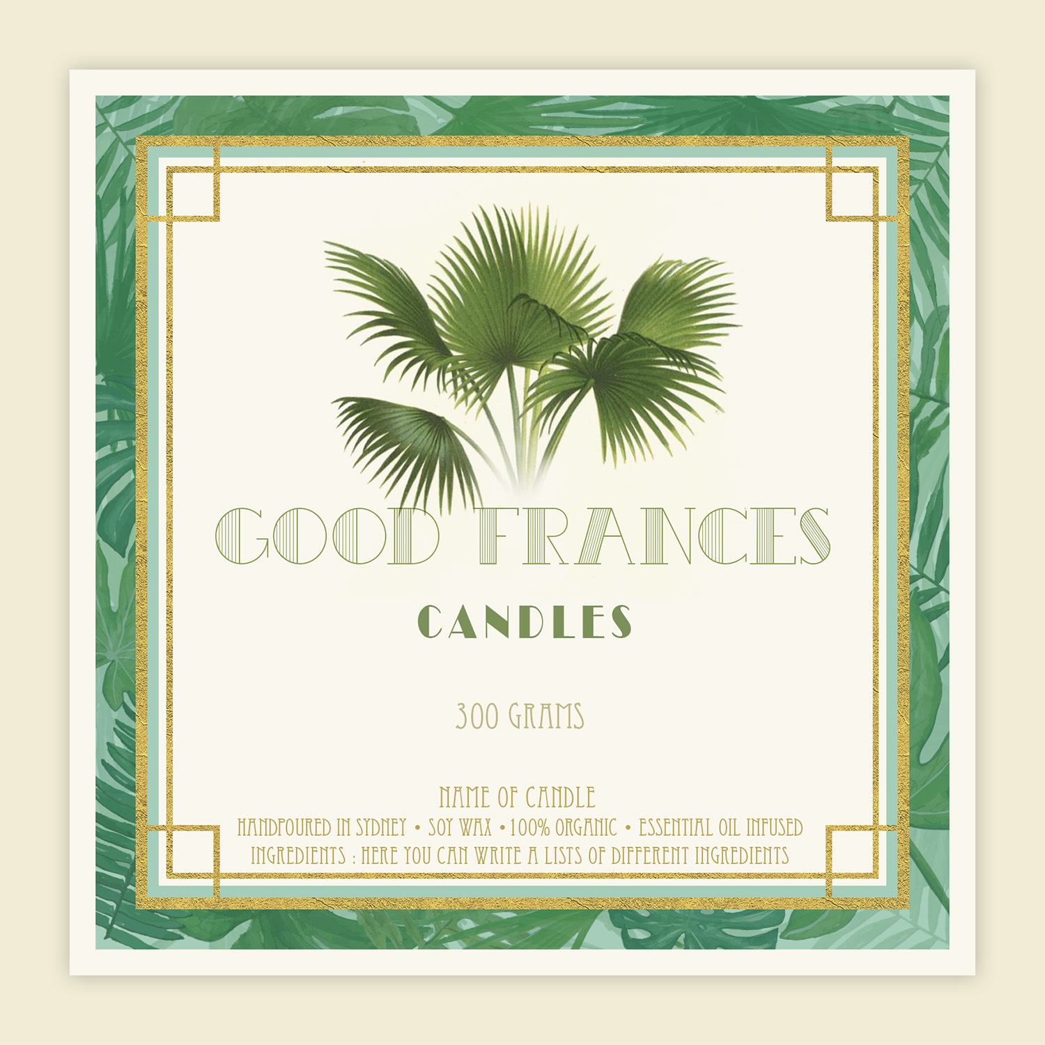
We need a candle label design for a new premium candle company called Good Frances. Good Frances is a premium luxury candle brand with an ethical layer. For every candle sold, a girls school kit will be donated to girls in need in developing countries.
The name Good Frances comes from the founders' grandmother, Frances, who enjoyed elegant classic vintage design and luxury old world travel to colourful tropical places and was a passionate believer in girls education.
We see the look and feel of Good Frances being around warm whites, green palms and light woods, with a touch of vintage art deco font and design and with vintage botanical and tropical print background. The candle itself will be white, with a light wood lid.
LABEL LAYOUT
We see the label as warm white (either a square or a circle), and the content (words/art) as a light shiny gold colour. The square or circle will have a thin to medium borderline of gold, and it might be on its own or overlaid over a vintage tropical or botanical print square (*SEE EXAMPLES MARKED 1 ATTACHED*) for the label.
1. WORDS
Capitals GOOD FRANCES and (same font but smaller) underneath in middle CANDLES.
The font might either be vintage art deco (*SEE EXAMPLES MARKED 2 ATTACHED - note if a Condensed Vintage font -like font used (which might be my current favourite), the letters should be more closely brought together*) or a more elegant simple capitals eg in sans serif or as per the attached example (*SEE EXAMPLE MARKED 3 ATTACHED*.)
2. ART
The picture will be exactly the top half of the attached vintage trithrinax basilicus palm tree from end of the trunk upwards (*SEE EXAMPLE MARKED 4 ATTACHED*) (ie the full length green stems and leaves from the trunk rising out - so its as if the centre of the word lettering of GOOD FRANCES is the trunk and they will rise up out of the middle of the lettering. We could possibly lose that far left leaf dropping down if it looks too busy)
I'm not sure about the proportion of the leaves to the letters - one option could be for the leaves to be small over the middle of the lettering (*SEE EXAMPLE MARKED 6*), or another could be for them to be more proportionate with the lettering. What do you think?
There could be either a plain gold borderline around the white square/circle of the the label content, or it could have touches of art deco patterning around the edges of the words/art or the borderline or otherwise elegantly incorporated into the words/art? (*SEE EXAMPLES MARKED 5 ATTACHED*) - note I've attached some examples but don't feel restricted by these if you have an aligning vision of the pattern/something else that fits the brief! I don't want it to look 100% art deco themed, just elegant touches.
I might possibly want to create one version on white, and one version on black, (both with the colourful vintage tropical backgrounds behind the gold bordered black or white square or circle the words and art content are sitting in.) So the design in shiny light gold should be able to sit on both a black and a warm white background.
The final design should communicate premium 'high end' clean lined elegance, luxury and warmth, with vintage 1920s art deco and botanical/tropical old world luxury travel charm and a feel of palm beach and boho chic.
3. EXTRA NOTES ON CONTENT
Please note I'll need to leave room (about a quarter to a third on the bottom of the label) for word content to describe the candle characteristics and fragrance, for eg:
* Handpoured in Sydney * Soy wax *100% organic
* 300 grams *Essential oil infused
* Name of candle * Ingredients
Aktualisierungen
Hi everyone, if you can please closely exactly follow each component of the brief specifications - all the designs so far have not followed them, and have incorporated too much art deco into the style. It was meant to be a touch around the border only and its meant to be kept simple. There will be two size candles, one medium and one large, the medium will be 6cm x 6cm, and the large 8cm x 8 cm. Thank you.
Added Monday, July 23, 2018
Zielmarkt/( -märkte)
Luxury and ethically oriented consumers
Sehen und fühlen
Jeder Schieber zeichnet eine der Charakteristiken der Marke des Kunden aus sowie den Stil, den euer Logo widerspiegeln sollte.