hoptop
Wollen Sie auch einen Job wie diesen gewinnen?
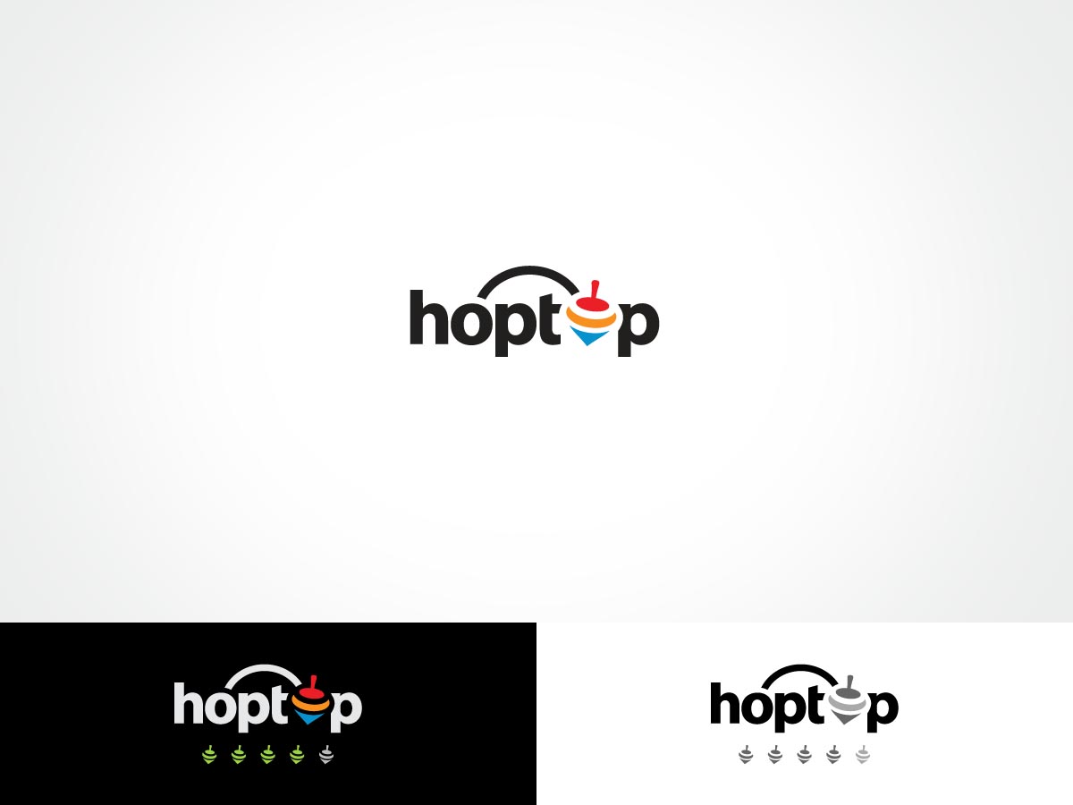
Dieser Kunde bekam 87 Logo-Designs von 28 Designern. Dabei wurde dieses Logo-Design Design von ArtTank als Gewinner ausgewählt.
Kostenlos anmelden Design Jobs finden- Garantiert
-
 US$200
-
 87 Designs
-
 28 Designer
Logo-Design Kurzbeschreibung
We need a logo design for a new company based in Boston called "hoptop". hoptop.co is a new marketing competition website as well as an online marketing community. It helps marketers to get more projects done with less time/budget/resource. It also provide consultants and freelancers new business opportunities. The target audience are mainly from USA, Canada and some European countries.The competition provides ranking and review opportunities to build professional reputation and networks.
Hop means "Jump". Top means "Number 1" as well as "Spinning Top". "hoptop" means "Jump to the top". The website features competition projects, ranking and reviews. We would like to get a spinning top design in the logo. It should be able to separate from the text. (Example: Twitter. The logo can be displayed with the bird or without or just the bird).
The spinning top is a childhood game in China. (Reference: http://kaleidoscope.cultural-china.com/en/144K1186K1618.html) I also attached the history of spinning tops. It will be ideal that the spinning top design is in motion and can be used as review buttons (Examples as attached from tripadvisor, google plus and yelp).
We wanted the logo to be simple but not too simple, modern and fun. It can be easily described and remembered.
Updates
Just updated the brief to include the color scheme options and some logos I like. Thank you!
Added Thursday, January 02, 2014
Hello, just updated the scale of look and feel. I've increased the weighing for Playful, Modern, Professional and Upmarket. Out of all of those, Playful and Modern should get the most weighting. Thank you!
Added Thursday, January 02, 2014
Project Deadline Extended
Added Saturday, January 04, 2014
Industrie/Einheitstyp
Marketing
Logo Text
hoptop
Logo Stile, die Sie interessieren können
Emblem-Logo
Logo eingeschlossen in einer Form
Pictorial / Combination-Logo
Ein reales Objekt (Text optional)
Abstraktes Logo
Begrifflich / symbolisch (Text optional)
Figuren-Logo
Logo mit Abbildung oder Zeichen
Wortmarke-Logo
Word oder namensbasiertes Logo (nur Text)
Lettermark-Logo
Kurzwort oder Buchstaben-Logo (nur Text)
Farben
Vom Kunden ausgewählte Farben für das Logo Design:
Sehen und fühlen
Jeder Schieber zeichnet eine der Charakteristiken der Marke des Kunden aus sowie den Stil, den euer Logo widerspiegeln sollte.
Elegant
Fett
Spielerisch
Ernst
Traditionel
Modern
Sympatisch
Professionell
Feminin
Männlich
Bunt
Konservativ
Wirtschaftlich
Gehobenes
Anforderungen
Schön zu haben
- an illustration of spinning top in motion. The top also can be listed as five tops in a row for review system. (e.g. five stars = five tops. 3.5 stars = 3.5 tops)
color scheme choices: blue, orange, red, or multiple colors.
I like the design of twitter, WWF and dropbox. I've attached the logos as some examples. Please also consider that the logo of spinning top can be used in the review system (i.e. # of stars = # of spinning tops)
It would be nice to see some designs around the Os in hoptop. Some ideas: use some kind of motion (e.g., a wave or a curved line) of the first O jumping/connection to the second O. Or maybe the Os are tilted to the right while everything else is straight so that it projects motion? Or last idea, maybe the Os are slightly elevated above the other letters so that they appear to be jumping? Thank you!