International representatives of Mexico in World Photographic Cup
Wollen Sie auch einen Job wie diesen gewinnen?
Dieser Kunde bekam 122 Logo-Designs von 48 Designern. Dabei wurde dieses Logo-Design Design von MOH Studio als Gewinner ausgewählt.
Kostenlos anmelden Design Jobs finden- Garantiert
-
 US$150
-
 122 Designs
-
 48 Designer
Logo-Design Kurzbeschreibung
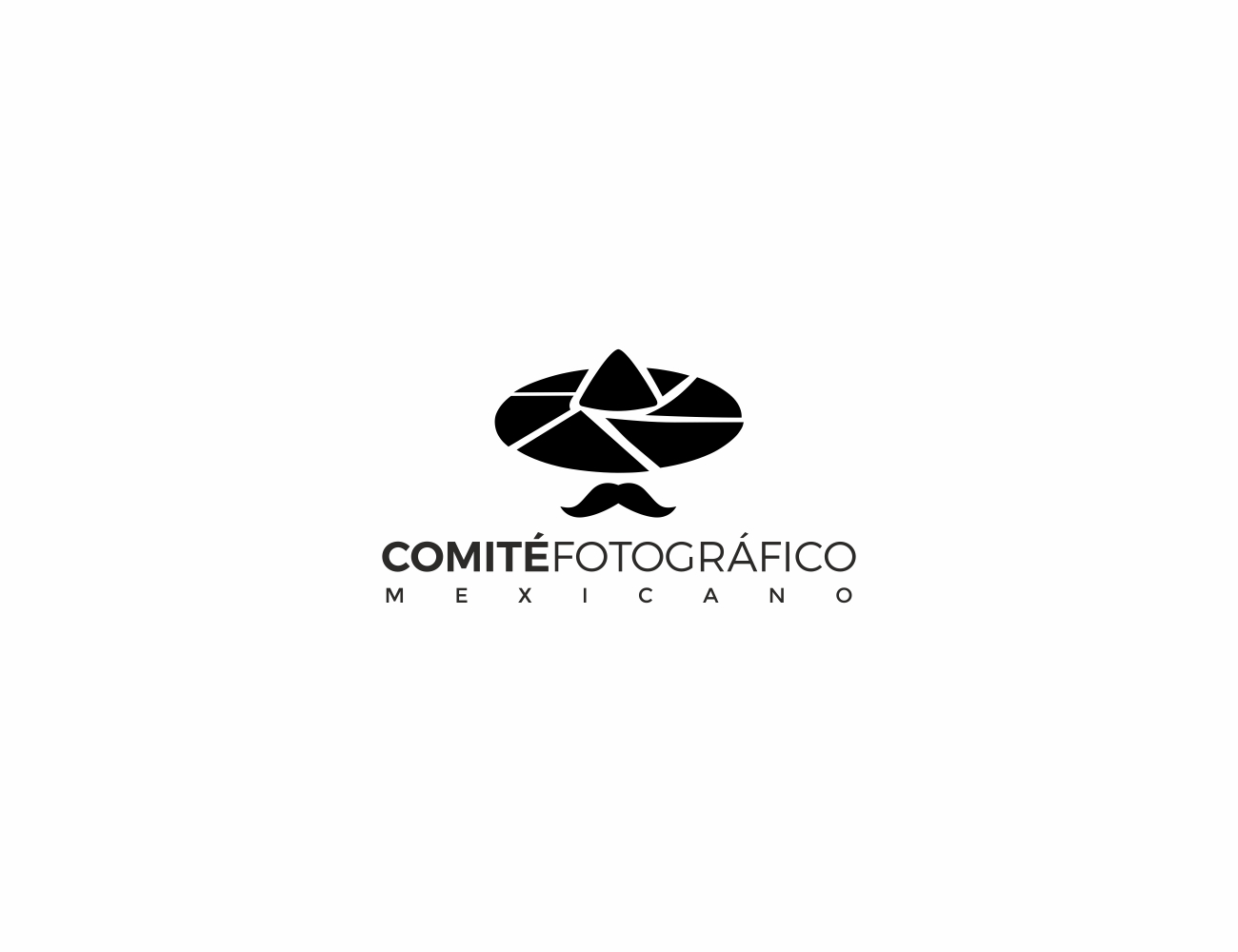
Our organization has just turned 3 years old, we have grown tremendously in importance in our country as we have achieved great results nationally and internationally. Getting top spots at World Photographic Cup, which is like the Olympics of photography. For this reason we feel we have outgrown our logo, as it is very childish and does not look as professional as the photographers/artists we now represent. The text portion of it is ok, what we feel need a desperate upgrade is the image part of the logo. The image was designed with elements that we DO like:1. The hat or "mexican sombrero" which is a stereotypical aspect of our culture but was made to look like the dipham of a camera. However we often get people that don't see the diaphragm and don't understand the why for the hat. 2. The man is a "happy mexican" fact that we do like as we like for our organization to be known as friendly and approachable. We have created a great community that continues to grow and brought the whole mexican industry together. 3. The man is winking as you do when you take a picture. However there are elements that we definitely DON’T care for1. It's too cartoon like and childish2. The "saraper" or wavy part at the bottom3. The fact that the logo resembles that of “mexican taco” restaurant on mex/usa border. What we would like to see portrayed in our evolution of a new logo:1. A graphic or abstract representation of the old logo 2. Something modern- avant garde -innovative, - pioneering, -progressive, unconventional That is what we are. 3. That conveys the serious respected organization we have grown to be, but that also keeps the fresh and approachable look and feel that has helped us be where we are now. 4. Elements that although they might make you think oh this is the Mexican team, does not feel like a stereotypical representation, (we get complaints about portraying bad stereotypical image of méxico)5. Finally that when you see it you do think we are a photographic organization. Making it implicit and not explicit. I am including our current logo and the stationary we are currently using for our communications.
Aktualisierungen
Need extra days to review
Industrie/Einheitstyp
Photographer
Logo Text
Comité Fotográfico Mexicano
Logo Stile, die Sie interessieren können
Abstraktes Logo
Begrifflich / symbolisch (Text optional)
Lettermark-Logo
Kurzwort oder Buchstaben-Logo (nur Text)
Zu verwendende Schriftarten
Sehen und fühlen
Jeder Schieber zeichnet eine der Charakteristiken der Marke des Kunden aus sowie den Stil, den euer Logo widerspiegeln sollte.
Elegant
Fett
Spielerisch
Ernst
Traditionel
Modern
Sympatisch
Professionell
Feminin
Männlich
Bunt
Konservativ
Wirtschaftlich
Gehobenes
Anforderungen
Muss haben
- CFM - Comité Fotográfico Mexicano