Need App for Impact Related Events
Wollen Sie auch einen Job wie diesen gewinnen?
Dieser Kunde bekam 116 App-Designs von 10 Designern. Dabei wurde dieses App-Design Design von DesignCarry als Gewinner ausgewählt.
Kostenlos anmelden Design Jobs finden- Garantiert
-
 US$300
-
 116 Designs
-
 10 Designer
App-Design Kurzbeschreibung
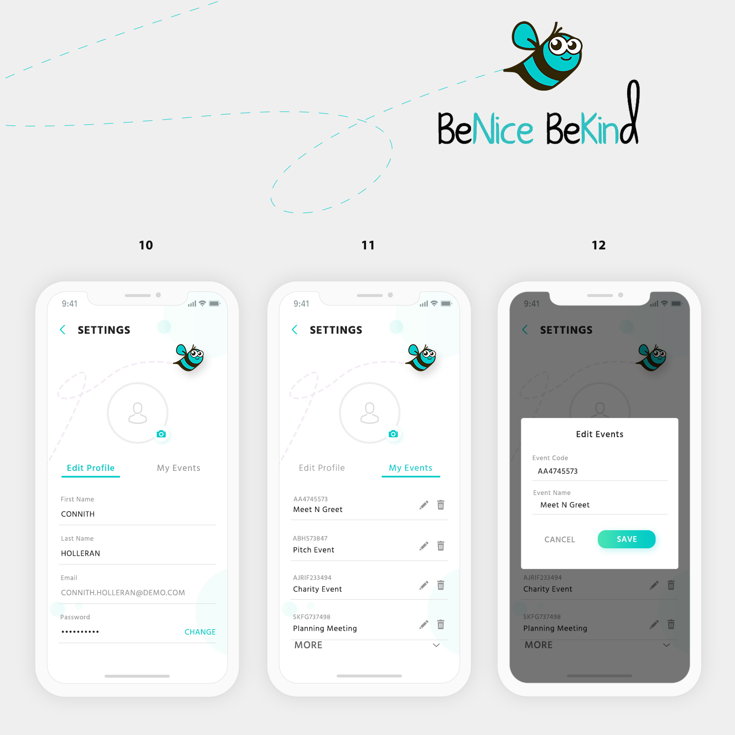
My app is to help with internal events. When you enter the prompted event code the next screen shows you everyone currently at the event. It will give you the ability to Start a conversation with someone you met at that event, or signal it is your turn to send a message. The next screen is a message thread with that person. I am looking for a design that incorporates the colors and ‘feel good’ emotion of our logo. I have pieced together a pretty good interpretation of what I’m looking for in the attached mockup by slicing and dicing designs. I also attached our logo mascot.Screens (see attached mockups)
Note 1: I do not like the picture on the screen used in screen one because it makes it seem like a dating app. I attached an alternative photo that can be used or present different ideas.
Note 2: On the login/signup screen (screen 2) I need an additional first and last name for login, you can try to fit this on one login screen or present a two step signup screen where that is presented in the second screen.
READ MOCKUP GUIDELINES UNDER Must Haves
Zielmarkt/( -märkte)
People attending internal social impact events
Industrie/Einheitstyp
Charity
Zu verwendende Schriftarten
Farben
Vom Kunden ausgewählte Farben für das Logo Design:
Sehen und fühlen
Jeder Schieber zeichnet eine der Charakteristiken der Marke des Kunden aus sowie den Stil, den euer Logo widerspiegeln sollte.
Elegant
Fett
Spielerisch
Ernst
Traditionel
Modern
Sympatisch
Professionell
Feminin
Männlich
Bunt
Konservativ
Wirtschaftlich
Gehobenes
Anforderungen
Muss haben
- Follow the screen mockups attached to project
- PLEASE READ
- I have provided a relatively close design of what I’m looking for in the mockups. Some screens need to be followed more closely to my design mockup than other. I have listed a guide below how how closely you should follow my mockup design exactly. Overall I would like to see some ideas of incorporating a few accent colors so it doesn’t appear SO Blue. I also attached some app inspiration designs I found from around the web
- Screen Mockup Guideline Follow %
- Screen 1: 65% - mostly on target, would like to see ways to make it not SO Blue and possibly creative places to add some explainer text describing the app
- Screen 2: 50% - general design idea is here, but more open
- Screen 3: 35% - a lot more room for design influence
- Screen 4: 70% - mostly on target, a little room for design influence/color scheme ideas
- Screen 5-6: 25% - a lot of room for design change/ideas/influence
- Screen 7-8: 80% - already very close to what I need, maybe open to slight sizing and color scheme ideas
- Screen 9: 15% - the most open for influence, only the general functionality of the screen is communicated here
Schön zu haben
- Follow the screen mockups attached to project
- Please Read Mockup Guideline above. In large part I am looking for something to use some nice accent colors so it is not overwhelmingly blue and bring the whole design into a seamless style.
Sollte nicht haben
- Follow the screen mockups attached to project