Redē 4Christ (WarRede )is the Apparel line. Want to put the logo on social media as well
Wollen Sie auch einen Job wie diesen gewinnen?
Dieser Kunde bekam 111 Logo-Designs von 38 Designern. Dabei wurde dieses Logo-Design Design von FourtuneDesign als Gewinner ausgewählt.
Kostenlos anmelden Design Jobs finden- Garantiert
-
 US$150
-
 111 Designs
-
 38 Designer
Logo-Design Kurzbeschreibung
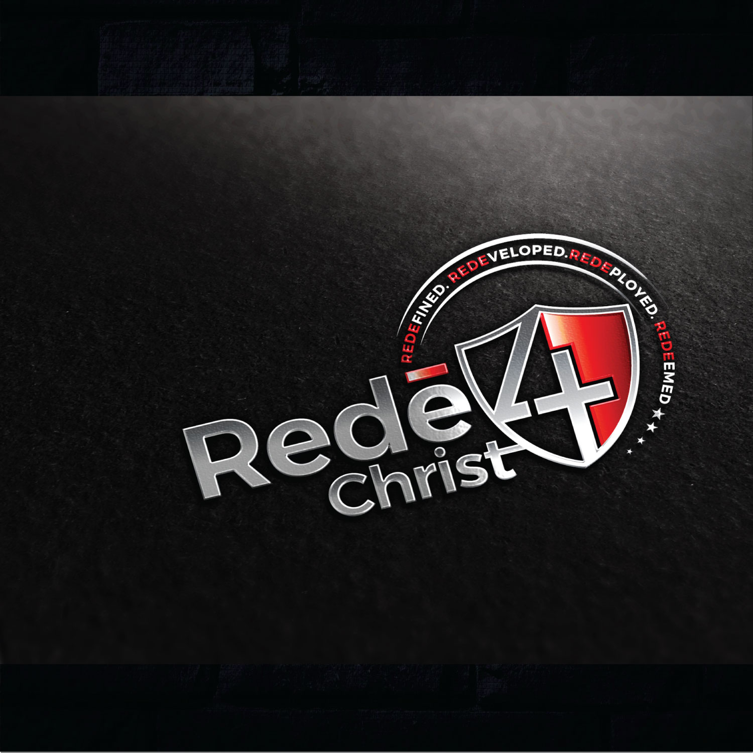
Redē -pronounced (ready) with an (-)accent line over the last (e) is a clothing brand that we've started thats symbolic for a state of readiness and willingness to prepare to serve and lead. It has more of a militant feel like being Rede for battle. We've made it catchy and brought out more ways to emphasize being Rede. For example Rede4Christ means to be Redefined. Redeveloped.Redeployed. Redeemed. These are the 4 pillars of being Rede. We'd like to incorporate a shield in the logo to give it a "WarRede" look. Feel free to use creativity. Remember, the accent is over the last (e) in Rede when its coupled with Rede4Christ or when its solitary. But when its in one of the 4 pillars there is no accent. Just highlight or distinguish the (rede) in Redefined. Redeveloped. Redeployed. Redeemed. No accent in this case. Also, do something cool with the 4 in Rede(4)Christ. If you can somehow make the 4 into a cross but make it still look like a 4 that would be awesome. Just as long as it looks better than what I've attached below. You dont have to do it the same but just to give you some ideas to play off of. I dont want the same as that. Somethimg unique and militant but fashionable. Feel free to change my mind by adding a touch of creativity. My target audience age is from 15-24 and 25-36. Have fun. Cant wait to see the finished product. I like red, black, gray, white and military green.
Zielmarkt/( -märkte)
Ages 15-24 And 25-36
Industrie/Einheitstyp
Ministry
Logo Text
If you stay Redē you don't have to get Redē!
Logo Stile, die Sie interessieren können
Emblem-Logo
Logo eingeschlossen in einer Form
Pictorial / Combination-Logo
Ein reales Objekt (Text optional)
Figuren-Logo
Logo mit Abbildung oder Zeichen
Zu verwendende Schriftarten
Andere Schriftarten erwünscht:
- Be creative
Farben
Vom Kunden ausgewählte Farben für das Logo Design:
Sehen und fühlen
Jeder Schieber zeichnet eine der Charakteristiken der Marke des Kunden aus sowie den Stil, den euer Logo widerspiegeln sollte.
Elegant
Fett
Spielerisch
Ernst
Traditionel
Modern
Sympatisch
Professionell
Feminin
Männlich
Bunt
Konservativ
Wirtschaftlich
Gehobenes
Anforderungen
Muss haben
- Must have shield. Must have cross. Make the 4 look like a cross but still be able to distinguish that it's a 4. Must have accent line above the last (e) in Redē.
Schön zu haben
- Would prefer to have (WarRedē) included in the logo somewhere or in the background.