

 Aktualisieren
Company Logo and Business Card Design - AT Nexus Ltd (READ Project Brief!!!)
Wollen Sie auch einen Job wie diesen gewinnen?
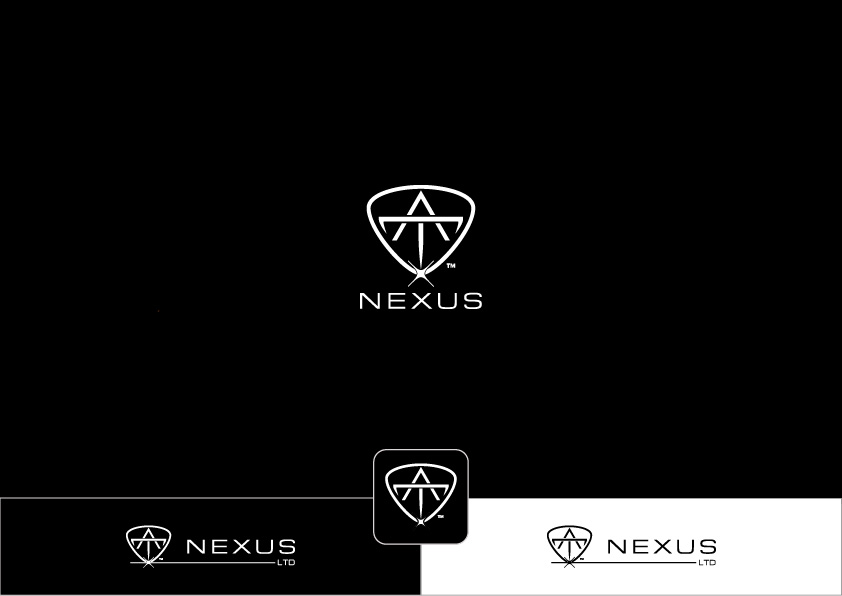
Dieser Kunde bekam 567 Logo-Designs von 165 Designern. Dabei wurde dieses Logo-Design Design von ~idiaz~ als Gewinner ausgewählt.
Kostenlos anmelden Design Jobs finden
- Garantiert
- Gebündeltes Projekt 1
-
 £220
£220
-
 567 Designs
-
 165 Designer
Logo-Design Kurzbeschreibung
A logo for a newly established company based in the UK. Intended to deal with high profile organisations around the globe. The company will be dealing with multi-million dollar companies, corporations and governments in different parts of the world. The types of companies will be; manufacturers, investment, industrial, financial, etc.
The company name is called "AT Nexus Ltd" - AT are initials rather than the word "at" but intended as a play with words. The word nexus means connections and is taken in the social aspect. LTD may or may not be used in the logo design.
The Logo is needed to represent the company and become a brand they can rely and depend on. The company and its brand is about having the right personal and professional connections, being able to achieve objectives that are difficult to achieve without them. Dealing with investment companies, manufacturers, governments, business/financial/ engineering consultants, etc.
The logo will be eventually be registered as a trademark and therefore a unique and creative design must be submitted which does not look like other designs.
The logo must reflect the Initials capital letters ONLY AT (as a monogram) and the notion of Nexus.
We would like the logo to have the following key qualities:
1- Prestigious
2- Simple but Sophisticated
3- Elegant,
4- Powerful,
5- Executive,
6- Modern
7- Reflect confidence.
8- Professional.
9- Upmarket.
I imagine these qualities to be achieved through a CONCISE, SMOOTH and SLEEK design. Think James Bond - a gentleman, calm, confident, overcomes obstacles to get the job done with style.
It is important that colors and design are not greatly affected by black and white print outs. The logo should be recognizable when resizing for different stationary and electronic purposes.
I prefer executive and grayscale colours - however this depends on the designer and what suits their vision.
http://www.executive-impressions.com/blog/simple-guide-to-executive-colours
The design should not be extravagant. Funny characters or too much art and/or too colourful.
SHOULD NOT be a logo based on a template found online or from databases!!!
SHOULD NOT be too simple! I want a design not a just a font!!
Zielmarkt/( -märkte)
Business Consultant, Engineering Consultant, Agent/Distributorship
Kontaktinformationen für Visitenkarte
1 side with company logo and contact details, 2nd side with logo only
Most probably for a 350 grams business card, using lamination and SPOT UV
Logo Text
AT Nexus / AT Nexus Ltd.
Logo Stile, die Sie interessieren können
Emblem-Logo
Logo eingeschlossen in einer Form



Abstraktes Logo
Begrifflich / symbolisch (Text optional)



Wortmarke-Logo
Word oder namensbasiertes Logo (nur Text)


Lettermark-Logo
Kurzwort oder Buchstaben-Logo (nur Text)



Farben
Der Designer kann die Farben des Designs frei wählen
Sehen und fühlen
Jeder Schieber zeichnet eine der Charakteristiken der Marke des Kunden aus sowie den Stil, den euer Logo widerspiegeln sollte.
Elegant
Fett
Spielerisch
Ernst
Traditionel
Modern
Sympatisch
Professionell
Feminin
Männlich
Bunt
Konservativ
Wirtschaftlich
Gehobenes
Anforderungen
Muss haben
- The logo will be eventually be registered as a trademark and therefore a unique and creative design must be submitted which does not look like other designs.
- The logo must reflect the Initials AT and the notion of Nexus.
- We would like the logo to have the following key qualities:
- 1- Prestigious
- 2- Simple but Sophisticated
- 3- Elegant,
- 4- Powerful,
- 5- Executive,
- 6- Modern
- 7- Reflect confidence.
- 8- Professional.
- I imagine these qualities to be achieved through a CONCISE, SMOOTH and SLEEK design. Think James Bond - a gentleman, calm, confident, overcomes obstacles to get the job done with style.
- It is important that colors and design are not greatly affected by black and white print outs. The logo should be recognizable when resizing for different stationary and electronic purposes.
Schön zu haben
- I prefer executive and grayscale colours - however this depends on the designer and what suits their vision.
- http://www.executive-impressions.com/blog/simple-guide-to-executive-colours
Sollte nicht haben
- The design should not be extravagant. Funny characters or too much art and/or too colourful.
- SHOULD NOT be a logo based on a template found online or from databases!!!
- SHOULD NOT be too simple! I want a design not a just a font!!
Dateien

Zahlungen
Gesamt
£220
Projekt-Deadline
11 Okt 2018 22:02:23 UTCProjekt Upgrades
Gebündelte(s) Projekt(e)
- übergebe £29 Visitenkarten-Design an den Sieger
