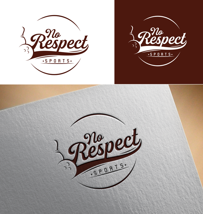
No Respect Sports Productions Logo
Wollen Sie auch einen Job wie diesen gewinnen?
Dieser Kunde bekam 54 Logo-Designs von 19 Designern. Dabei wurde dieses Logo-Design Design von victor2 als Gewinner ausgewählt.
Kostenlos anmelden Design Jobs finden- Garantiert
-
 US$150
-
 54 Designs
-
 19 Designer
Logo-Design Kurzbeschreibung
We are looking to create a logo for a brand new company called No Respect Sports Productions. We are inspired by a comedian from the 1970s and 1980s from our youth named Rodney Dangerfield. Rodney famously used the lines "I get no respect" in a lot of his bits. Here is a commercial from 1982 where he is in a position to win for his team if he only gets one bowling pin and he fails.
https://www.youtube.com/watch?v=J6SBtg9VQ9M
Zielmarkt/( -märkte)
People that play Fantasy Football, which probably biases toward men ages 25-44 in the United States.
Industrie/Einheitstyp
Entertainment
Logo Text
No Respect Sports
Logo Stile, die Sie interessieren können
Pictorial / Combination-Logo
Ein reales Objekt (Text optional)
Figuren-Logo
Logo mit Abbildung oder Zeichen
Zu verwendende Schriftarten
Farben
Der Designer kann die Farben des Designs frei wählen
Sehen und fühlen
Jeder Schieber zeichnet eine der Charakteristiken der Marke des Kunden aus sowie den Stil, den euer Logo widerspiegeln sollte.
Elegant
Fett
Spielerisch
Ernst
Traditionel
Modern
Sympatisch
Professionell
Feminin
Männlich
Bunt
Konservativ
Wirtschaftlich
Gehobenes
Anforderungen
Muss haben
- We are looking for the logo to play off the video above incorporating bowling into the icon of the logo somehow in a stylistic way to symbolize the sports part of the No Respect Sports, but also in homage to the comedian Rodney Dangerfield. We are looking for a logo that incorporates a style from that era i.e. early 1980s in the United States.
- We are very much open to ideas on how bowling imagery is used in the logo. Use of a bowling ball or bowling pin could be abstract. The bowling icon could represent a gutter ball to reference the video and the spirit of No Respect.
- The logo must be able to be produced black and white as well as color.
Schön zu haben
- The winning logo will have a feel that the entire visual language of the company can be built around. Designers should feel free to have fun with the concept leveraging style and color from the early 1980s.
Sollte nicht haben
- I can't think of any should not haves.