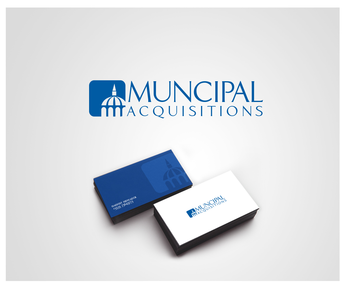
Municipal Acquisitions Logo
Wollen Sie auch einen Job wie diesen gewinnen?
Dieser Kunde bekam 42 Logo-Designs von 24 Designern. Dabei wurde dieses Logo-Design Design von reendesigns als Gewinner ausgewählt.
Kostenlos anmelden Design Jobs finden-
 US$200
-
 42 Designs
-
 24 Designer
Logo-Design Kurzbeschreibung
We want to revamp/modernize our logo a little bit. We really love our logo but here are the problems:
1. This color blue is hard to match. We want it to be a deep, dark and rich blue that will be reliably reproduced in Microsoft Office applications. We also want the inverse of the logo in white so that we can overlay it on top of a blue or other background.
2. The backgrounds need to be transparent. We need to be able to overlay the logo onto various backgrounds.
We really like our existing logo and want to maintain the general design but are certainly open to variations on this theme. Specifically, we like the dome of an institutional building which we think emphasizes our focus on government real estate. Additionally, we like the script of the company name, which we think is reminiscent of a "John Hancock" or "Thomas Jefferson" signature which, again, we feel emphasizes our focus on government real estate.
Logo Text
Municipal Acquisitions