Down In Splendour - logo design for a UK based alt-rock band
Wollen Sie auch einen Job wie diesen gewinnen?
Dieser Kunde bekam 133 Logo-Designs von 41 Designern. Dabei wurde dieses Logo-Design Design von JACQUI als Gewinner ausgewählt.
Kostenlos anmelden Design Jobs finden- Garantiert
-
 NZ$240
-
 133 Designs
-
 41 Designer
Logo-Design Kurzbeschreibung
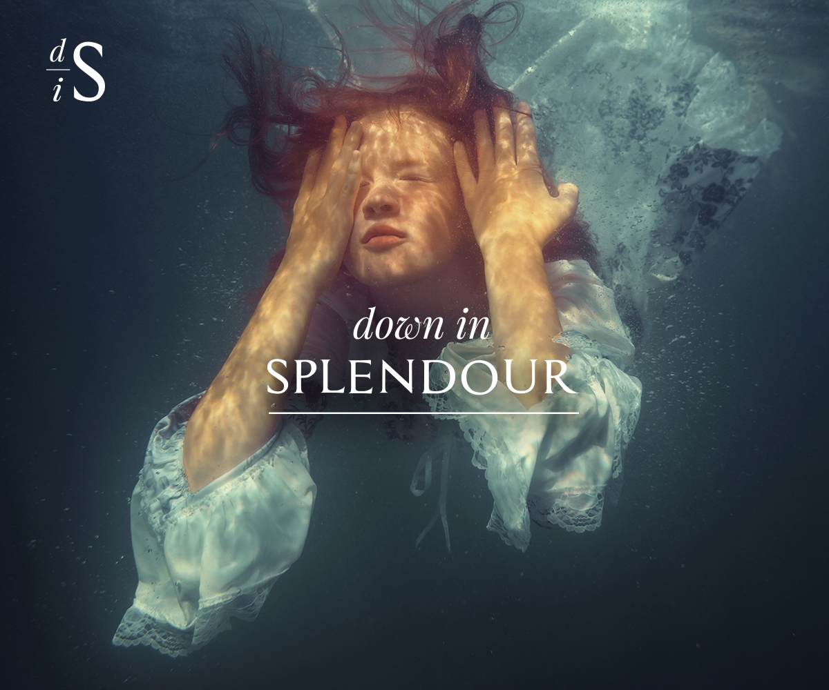
Down In Splendour are a London based alternative rock band. Their music encompasses alt-rock, psychedelic, progressive, world and acoustic.The band are looking for a logo that can be used in a variety of formats and captures the look and feel of their music.The logo will be used in a variety of media and formats. The included image (example: Girl Under Water) has been used as a backdrop at Down In Splendour concerts and provides a sense of the feel of the band and style needed. A striking, organic and flexible logo that lends itself to multiple uses, formats and placement.A screenshot of the Down In Splendour website (under construction has also been attached).Key Inclusions1) White/Black/Reversible. Organic feel. No colour inclusions, but the format should allow for the logo to be potentially rendered in colour if needed in the future. (examples attached - Pink Floyd)2) Simple but striking, and versatile. It will need to work in a variety of settings e.g. web, social media, album covers, posters, T-shirts, vinyl3) Striking font, but bear in mind that the font should be flexible enough to sit in a variety of placements. Ie. Not so extreme that it jars with everything else likely to be around it. Fonts can be adjusted for impact if desired. (examples attached - The Beatles, Abba4) Workable in a portrait and landscape setting5) Two formats:a. Full: Down In Splendour (example: Foo Fighters)b. Abbreviated: using first letters – DiS (avoiding the sense of ‘dissing’ someone though) – suggest the emphasis goes on the ‘D’ and the ‘S’ with the ‘I’ smaller or less emphatic. (example: FF - Foo Fighters)
Zielmarkt/( -märkte)
Contemporary music fans with an interest in alternative rock, progressive, psychedelic, world and folk music. Keen to avoid the usual rock cliches.
Logo Text
Down In Splendour
Logo Stile, die Sie interessieren können
Wortmarke-Logo
Word oder namensbasiertes Logo (nur Text)
Lettermark-Logo
Kurzwort oder Buchstaben-Logo (nur Text)
Zu verwendende Schriftarten
Farben
Vom Kunden ausgewählte Farben für das Logo Design:
Sehen und fühlen
Jeder Schieber zeichnet eine der Charakteristiken der Marke des Kunden aus sowie den Stil, den euer Logo widerspiegeln sollte.
Elegant
Fett
Spielerisch
Ernst
Traditionel
Modern
Sympatisch
Professionell
Feminin
Männlich
Bunt
Konservativ
Wirtschaftlich
Gehobenes
Anforderungen
Muss haben
- Simple, elegant and striking. Down In Splendour is fairly sophisticated alt-rock music, so we are keen to avoid cliched rock imagery.
Schön zu haben
- A reversible format black/white and also an abbreviated/icon logo - as detailed in the project description.
Sollte nicht haben
- Should avoid the standard rock image cliches. Down In Splendour is fairly sophisticated alt-rock music.