

 Aktualisieren
Credit Union Foundation logo refresh.
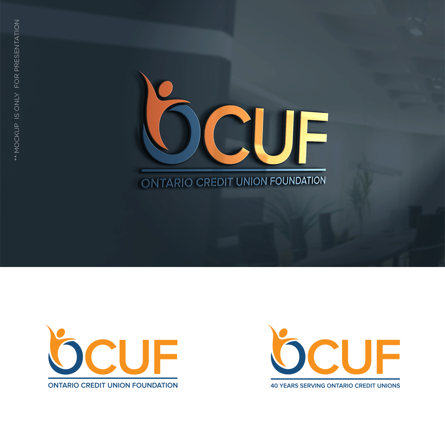
Wollen Sie auch einen Job wie diesen gewinnen?
Dieser Kunde bekam 154 Logo-Designs von 41 Designern. Dabei wurde dieses Logo-Design Design von designbysy als Gewinner ausgewählt.
Kostenlos anmelden Design Jobs finden
- Garantiert
-
 C$150
C$150
-
 154 Designs
-
 41 Designer
Logo-Design Kurzbeschreibung
Looking for an update of our logo. It is a bit conventional and still usable, but because we turn "40" this year (1997 - 2019) we were thinking we might do a logo "refresh". Ideally you could incorporate reference to the "40 years serving Ontario Credit Unions" that would come off in 2020 and revert to a standard (new) logo. Hopefully that makes sense. A new logo with a 40 year application that returns to the new logo (without the 40) in 2020.
Zielmarkt/( -märkte)
Ontario (Canada) Credit Unions are our members.
Industrie/Einheitstyp
Financial Service
Logo Text
Ontario Credit Union Foundation (or if OCUF is in logo) could be "Serving Ontario Credit Unions"
Farben
Vom Kunden ausgewählte Farben für das Logo Design:
Sehen und fühlen
Jeder Schieber zeichnet eine der Charakteristiken der Marke des Kunden aus sowie den Stil, den euer Logo widerspiegeln sollte.
Elegant
Fett
Spielerisch
Ernst
Traditionel
Modern
Sympatisch
Professionell
Feminin
Männlich
Bunt
Konservativ
Wirtschaftlich
Gehobenes
Anforderungen
Muss haben
- Colours we have used are #1f4d7f and #F99106 (not stuck on these but would provide some continuity perhaps, or surprise me!
Schön zu haben
- We have use "peeps" in our current logo, can be viewed at www.ocuf.org. It was a take off of the international credit union symbol of people holding a globe (which we don't want). This worked well as we were able to make icons using them. Again not a must have - wanted to give as much info as possible.
