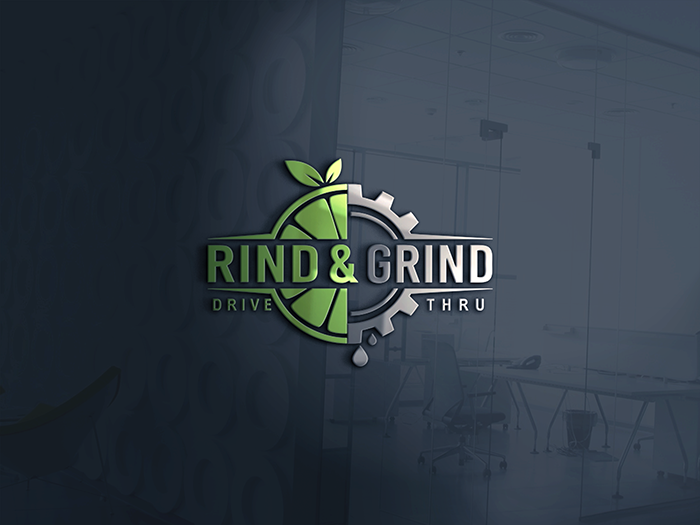
Rind & Grind Drive Thru
Wollen Sie auch einen Job wie diesen gewinnen?
Dieser Kunde bekam 361 Logo-Designs von 151 Designern. Dabei wurde dieses Logo-Design Design von NATURAL SRI als Gewinner ausgewählt.
Kostenlos anmelden Design Jobs finden- Garantiert
-
 US$490
-
 361 Designs
-
 151 Designer
Logo-Design Kurzbeschreibung
Need a logo to represent our juice bar concept. Rind & Grind will feature health based smoothies, fresh squeezed juices, and premium coffee. The business is geared towards creating a fun, social atmosphere for individuals looking for a nutritious option to gather over. The store will be family friendly and logo should be playful with the fruit and show a little masculinity with the grind portion.
Aktualisierungen
Need a couple of days before selecting a winner
Zielmarkt/( -märkte)
Individuals of all ages looking for something nutritious and healthy to drink.
Industrie/Einheitstyp
Juice Bar
Logo Text
Rind & Grind
Logo Stile, die Sie interessieren können
Pictorial / Combination-Logo
Ein reales Objekt (Text optional)
Farben
Der Designer kann die Farben des Designs frei wählen
Sehen und fühlen
Jeder Schieber zeichnet eine der Charakteristiken der Marke des Kunden aus sowie den Stil, den euer Logo widerspiegeln sollte.
Elegant
Fett
Spielerisch
Ernst
Traditionel
Modern
Sympatisch
Professionell
Feminin
Männlich
Bunt
Konservativ
Wirtschaftlich
Gehobenes
Anforderungen
Muss haben
- The rind of a fruit to represent the Rind portion of the name. The Grind portion of the name could be represented with coffee bean or some kind of machinery like the cog. This signifies an active motion and "Grind" to represent the coffee portion of our menu. When using the cog please refer to "Smoothie Factory" logo and make sure we have a different look. Logo must be in one color with no gradients, shadows, or special effects. Solid outlines are fine. Logo must be easy to invert and create outdoor channel letter signage. Font can be in different color.
- The concept will have drive thru so below the Rind & Grind saying there should be an optional Drive Thru tagline. The Drive Thru tagline should be removable for stores that do not have a drive thru.
- The logo should be clear, precise, simple, yet unique it its look. The design we have submitted is a good base but it is complicated and font is hard to read. Logo must be balanced between feminine and masculine. Must be fun and healthy. Also we are not wanting R&G font in the logo as shown. Maybe more fruit, a straw, special design, etc.
Schön zu haben
- Would be nice if logo can represent fruit, and active lifestyle. In the logo we wish for the "Rind" portion to be feminine or family friendly while the "Grind" portion to be masculine. Coffee is secondary to our business and should not dominate the logo.
Sollte nicht haben
- No gradients, shadows, special effects. 2 color max but logo must look good in single color and not dependent on multi color. Coffee is secondary to our business and it should not dominate the logo. We initial felt the cog wheel could represent The Grind and coffee but realized another company Smoothie Factory uses this and we must look significantly different. There should be no fonts in the logo itself. We submitted a sample with R&G in the logo but that needs to be eliminated.