Insurance Broker looking to grow national needs revamp logo design
Wollen Sie auch einen Job wie diesen gewinnen?
Dieser Kunde bekam 116 Logo-Designs von 47 Designern. Dabei wurde dieses Logo-Design Design von LL d.e.s.i.g.n als Gewinner ausgewählt.
Kostenlos anmelden Design Jobs finden- Garantiert
-
 A$150
A$150
-
 116 Designs
-
 47 Designer
Logo-Design Kurzbeschreibung
New logo needed for small insurance broker network of 10 brokers looking grow its presence nationally. Main client base is Small and Medium Enterprises (SME) as well as professionals with personal insurance needs.
We are also looking to promote ourselves to other brokers to join our network throughout Australia.
We believe in customer service and the human element to what we do.
We are in an industry that we want to show a little professionalism yet inject a little personality to it at the same time. It helps makes us personable, connect with our audience on a human level and differentiates us from the bigger boys.
The logo therefore needs to be
- elegant, professional, smart, modern, minimalist, simplistic logo
- font: very clear, thin, elegant, smart)
- I'm opened to incorporating a geometric shape like a square around the icon in current logo.
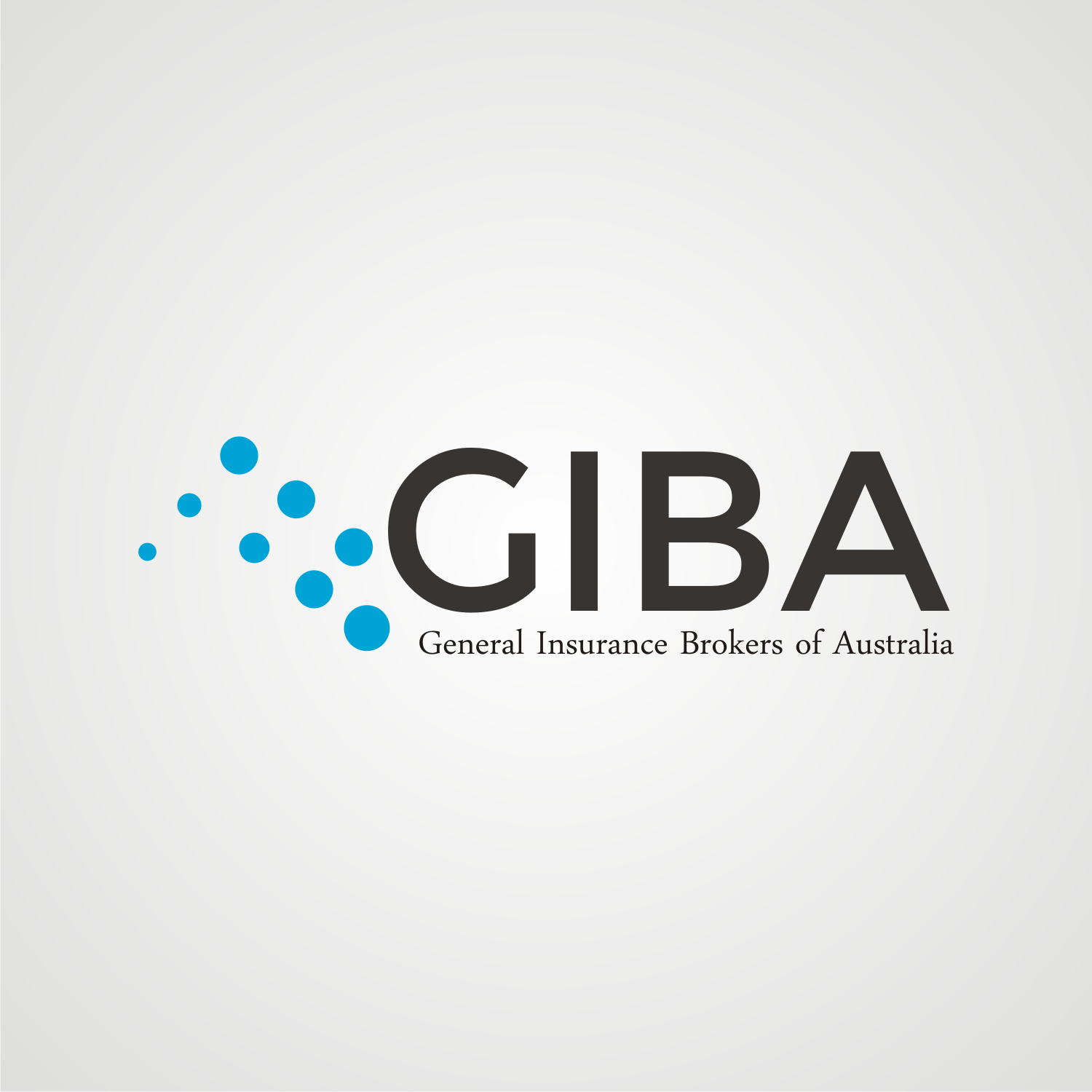
The icon on our current logo is a series of coloured dots. It is meant to symbolise the star constellation known as "The Southern Cross". It's an iconic Australian symbol that is on our national flag. The series of dots however does not marry up with this. We would want to retain the dots to maintain a level of continuity and help people identify the updated logo as being us. If we could somehow either make notable the southern cross in this series of dots (either by different colour or size) or reduce the number of dots to just those in the constellation it would be great.
Our Corporate Colours are to be redefined and I'm open to colour choices. The current colour scheme is lifted from the current logo of dark blue, a creamy grey and black. Visit www.giba.com.au for a better idea. We are looking to move to a modern colour scheme keeping in line with a dark blue, a grey and introducing a brighter punchy blue that lifts the logo and brand. I would like to see somewhere in the logo the bright blue, maybe the icon or the acronym of our company name "GIBA"? I've selected a blue but am happy for designer suggestions
Zielmarkt/( -märkte)
Small Medium Enterprise, Professionals with personal insurance needs and other brokers to join network
Industrie/Einheitstyp
Insurance Broker
Logo Text
The text in the logo shall say: General Insurance Brokers of Australia. The attached logo doesn't have this, but the acronym is GIBA which we use and refer to. Its our domain name as well. If we can incorporate that in as well it would be great. Maybe GIBA large and Genereal Insurance Brokers of Australia in smaller font size
Logo Stile, die Sie interessieren können
Abstraktes Logo
Begrifflich / symbolisch (Text optional)
Zu verwendende Schriftarten
Farben
Vom Kunden ausgewählte Farben für das Logo Design:
Sehen und fühlen
Jeder Schieber zeichnet eine der Charakteristiken der Marke des Kunden aus sowie den Stil, den euer Logo widerspiegeln sollte.
Elegant
Fett
Spielerisch
Ernst
Traditionel
Modern
Sympatisch
Professionell
Feminin
Männlich
Bunt
Konservativ
Wirtschaftlich
Gehobenes
Anforderungen
Muss haben
- Must retain some continuity / reference with existing logo. The dots to be retained in some way. See Project Description for further details on must haves
Schön zu haben
- GIBA included in the logo. I am conscious that it may become to much (icon, GIBA and the the whole name spelt out) but would like to incorporate the acronym GIBA in there somehow)