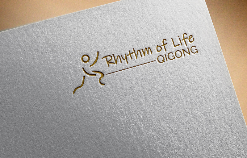
Logo for my Qigong Business Rhythm of Life Qigong. I teach Qigong for mental health and for heal...
Wollen Sie auch einen Job wie diesen gewinnen?
Dieser Kunde bekam 48 Logo-Designs von 18 Designern. Dabei wurde dieses Logo-Design Design von Synthi als Gewinner ausgewählt.
Kostenlos anmelden Design Jobs finden-
 NZ$220
-
 48 Designs
-
 18 Designer
Logo-Design Kurzbeschreibung
I want a logo that has a line drawing that stands out a bit like the one I have uploaded and the name of my business. Qigong is like Tai Chi for those that don't know. Work with your life force energy through mindfulness movement and the breath. Feel free to be creative with the drawing but this depicts a move I like called cloudy hands. I love purple and the colours that relate to the qigong energy centres are purple gold and white. I would quite like to be able to put it on a black t shirt as well as flyers and business cards. I don't like blunt script but prefers the letters to be a bit curvy and flowing but not so much so that it is hard to read. Please no pictures of someone in the lotus position or lotus flower.
Zielmarkt/( -märkte)
Mature people wanting to improve their health and wellbeing, physical, mental, emotional and spiritual
Industrie/Einheitstyp
Health And Wellness
Logo Text
Rhythm of Life Qigong
Logo Stile, die Sie interessieren können
Pictorial / Combination-Logo
Ein reales Objekt (Text optional)
Zu verwendende Schriftarten
Andere Schriftarten erwünscht:
- Ink Free
Farben
Vom Kunden ausgewählte Farben für das Logo Design:
Sehen und fühlen
Jeder Schieber zeichnet eine der Charakteristiken der Marke des Kunden aus sowie den Stil, den euer Logo widerspiegeln sollte.
Elegant
Fett
Spielerisch
Ernst
Traditionel
Modern
Sympatisch
Professionell
Feminin
Männlich
Bunt
Konservativ
Wirtschaftlich
Gehobenes
Anforderungen
Muss haben
- I like purple as a primary colour but don't mind if it has gold or white in it but not sure how the white would stand out on a white business card or paper
Schön zu haben
- I like the second picture I uploaded with the top arm a bit lower but it is copied off the net and someone else is using it so not sure if it could be subtly changed for my logo
Sollte nicht haben
- Do not want blunt font or too curvy so you cant read it