Logo design for a Residential Luxury Real Estate Brokerage
Wollen Sie auch einen Job wie diesen gewinnen?
Dieser Kunde bekam 244 Logo-Designs von 109 Designern. Dabei wurde dieses Logo-Design Design von GVisions als Gewinner ausgewählt.
Kostenlos anmelden Design Jobs finden-
 US$150
-
 244 Designs
-
 109 Designer
Logo-Design Kurzbeschreibung
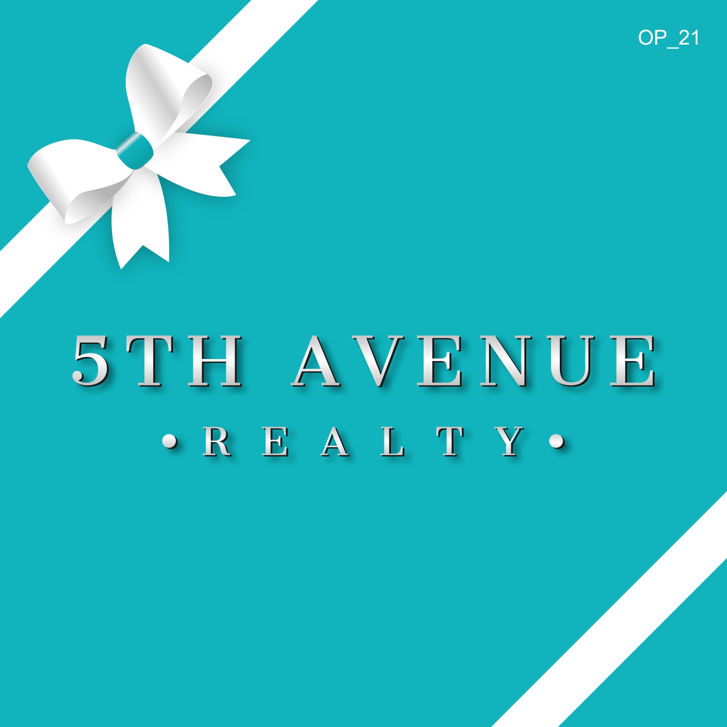
Logo design for a Residential Luxury Real Estate Brokerage in Michigan. The logo should look elegant but clearly legible when driving by a for sale sign on a home. We prefer the logo to be the actual name of the company instead of a symbol of something... We like silver shiny, luminous font and maybe for the for sale signs a color close to "tiffany blue" for background color but lighter and with a less green tint. It may be nice to see a small bow like the ones attached in either that pearl color and Rose Gold Font or a white bow with the blue background.
Zielmarkt/( -märkte)
Luxury Residential Buyers and Sellers
Industrie/Einheitstyp
Real Estate Agent
Logo Text
5th Avenue Realty
Logo Stile, die Sie interessieren können
Wortmarke-Logo
Word oder namensbasiertes Logo (nur Text)
Farben
Vom Kunden ausgewählte Farben für das Logo Design:
Sehen und fühlen
Jeder Schieber zeichnet eine der Charakteristiken der Marke des Kunden aus sowie den Stil, den euer Logo widerspiegeln sollte.
Elegant
Fett
Spielerisch
Ernst
Traditionel
Modern
Sympatisch
Professionell
Feminin
Männlich
Bunt
Konservativ
Wirtschaftlich
Gehobenes
Anforderungen
Muss haben
- Must look very elegant but legible. Do not like the "5" to be too large. Prefer not to have the "5" on top of the rest of the company name.
- Must look like a very professional and luxurious company.
Schön zu haben
- Either Light blue tiffany blue-like color (nothing green) or a shimmering Pearl background with Rose Gold or Black font.
- I like the black on black bow but that should be the only time there is a black background since I don't really like a black background. Bu tit might look elegant to pair that black bow with a black background and rose gold or bright glimmering silver font and a splash of light blue.
- The A in Avenue and/or R in Realty might look nice if it was a fancier style then the rest of the font.
Sollte nicht haben
- Too much Script int he font. The first letter is fine but not the entire logo in script.