Personal tax, financial planning and investment management firm requires modernized & redesig...
Wollen Sie auch einen Job wie diesen gewinnen?
Dieser Kunde bekam 412 Logo-Designs von 128 Designern. Dabei wurde dieses Logo-Design Design von NilavroShuvro als Gewinner ausgewählt.
Kostenlos anmelden Design Jobs finden- Garantiert
- Gebündeltes Projekt 2
-
 US$400
-
 412 Designs
-
 128 Designer
Logo-Design Kurzbeschreibung
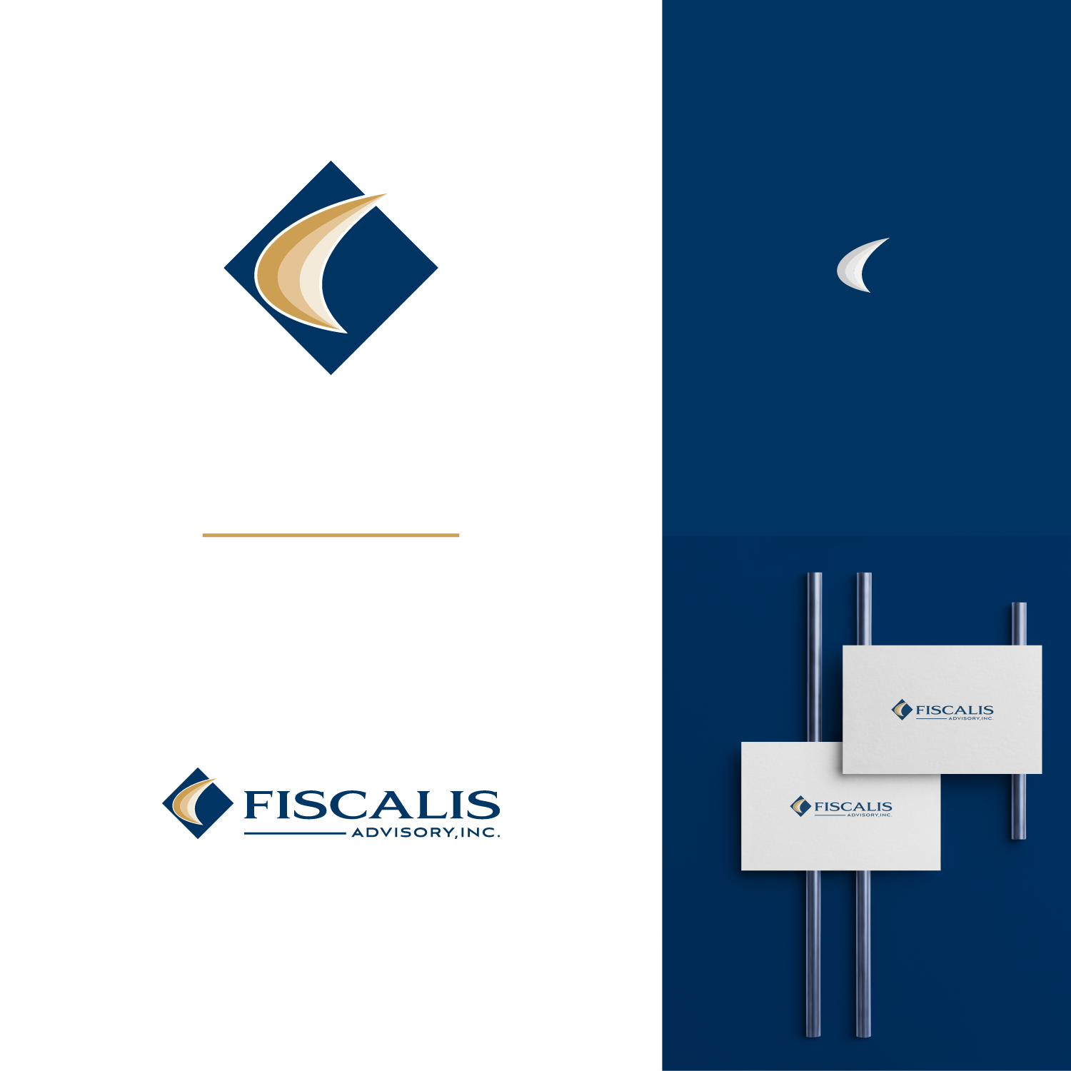
We are a professional tax, financial planning and investment management firm providing fiduciary level services to clients. We are NOT a SALES company. We are professional advisors, working in our client's best interests. To eliminate conflicts of interest, we do not participate in any product sales. Its unfortunate we have to make this distinction, but we do. Our final design needs to project stability, and trustworthiness. At this point,I'd like to keep using our current colors and am not wedded to anything else about the current logo and font. You can view the current logo and firm colors at www.fiscalisadvisory.com
Updates
Gathering more feedback
Zielmarkt/( -märkte)
Successful individuals and families
Industrie/Einheitstyp
Financial Planning
Kontaktinformationen für Visitenkarte
Text on single side with complementing color on the reverse.
Logo Text
Fiscalis Advisory, Inc.
Logo Stile, die Sie interessieren können
Pictorial / Combination-Logo
Ein reales Objekt (Text optional)
Abstraktes Logo
Begrifflich / symbolisch (Text optional)
Lettermark-Logo
Kurzwort oder Buchstaben-Logo (nur Text)
Zu verwendende Schriftarten
Sehen und fühlen
Jeder Schieber zeichnet eine der Charakteristiken der Marke des Kunden aus sowie den Stil, den euer Logo widerspiegeln sollte.
Elegant
Fett
Spielerisch
Ernst
Traditionel
Modern
Sympatisch
Professionell
Feminin
Männlich
Bunt
Konservativ
Wirtschaftlich
Gehobenes
Anforderungen
Muss haben
- See the colors in use at www.fiscalisadvisory.com - primarily the blue and gold in the logo itself. I can provide CMYK codes if necessary. Any logo graphic must work the rest of the layout and not over power the FISCALIS name.
Schön zu haben
- Check file named EFrontier. Would like to see and icon built on a series of these shapes perhaps in an overlapping fan format where each one pivots off the base and gets a bit steeper along the left edge. If we call this shape a "swoosh" perhaps gold swooshes against a blue background. I think a translucent effect where the left edge of the swoosh is the darkest might be interesting, however, abstraction and artistic design interpretation is appreciated! This figure represents a fundamental concept in my profession where the steeper the upward slope on the left hand side represents a better result. Therefore this is something we aim to provide for our clients. A series of these in a set of three swooshes where each one moves up and to the left is a better result. The idea is to start lower and move higher showing improved results.
Sollte nicht haben
- It seems I'm less inclined to like a graphic icon created from the use of letters taken from the firm name (F, A, etc). So far, I prefer symbols that evoke ideas of movement, improvement, progress, growth, balance and symmetry.
Dateien
Alle Dateien herunterladen - 0,3 MBZahlungen
Gesamt
US$400
Projekt-Deadline
27 Apr 2019 18:09:28 UTCProjekt Upgrades
Gebündelte(s) Projekt(e)
- übergebe US$39 Visitenkarten-Design an den Sieger
- übergebe US$49 Briefpapier-Design an den Sieger