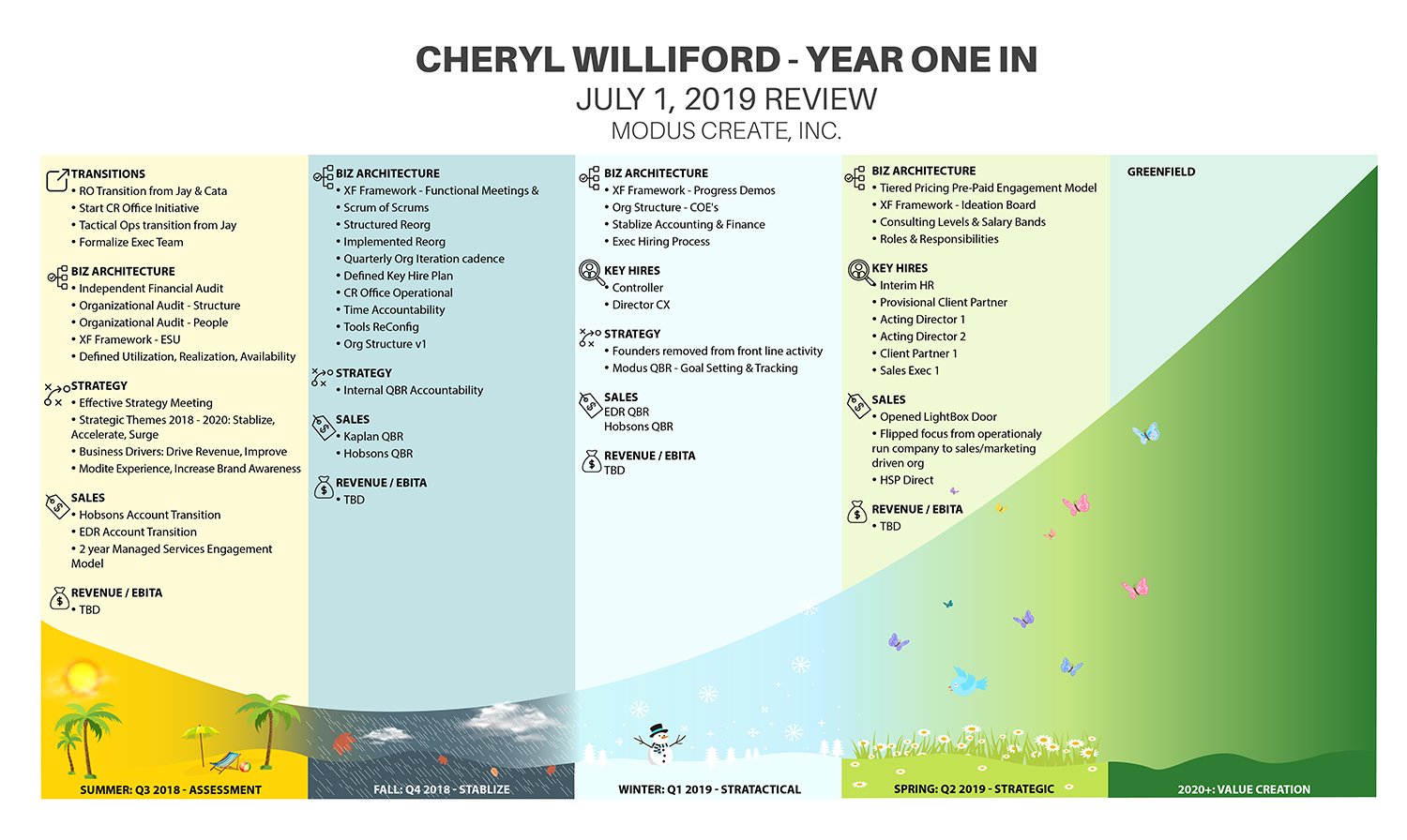
Executive Performance Review mapped on J-curve
Gewinner
Wollen Sie auch einen Job wie diesen gewinnen?
Dieser Kunde bekam 33 Infografik-Designs von 12 Designern. Dabei wurde dieses Infografik-Design Design von IndreDesign als Gewinner ausgewählt.
Kostenlos anmelden Design Jobs finden- Garantiert
-
 US$190
-
 33 Designs
-
 12 Designer
Infografik-Design Kurzbeschreibung
I need to turn an executive company performance review into a visual infographic. The list of accomplishments is grouped into four calendar quarters. Each quarter needs a subtle representation of the season. The four quarters and associated list of accomplishments need to be mapped to a J-curve. - Spreadsheet with accomplishments attached (Throughput)- Sample image of a J-curve. You can google J-curve to see more images.- The title should be "Cheryl Williford Year in Review"
Zielmarkt/( -märkte)
Board of Directors
Sehen und fühlen
Jeder Schieber zeichnet eine der Charakteristiken der Marke des Kunden aus sowie den Stil, den euer Logo widerspiegeln sollte.
Elegant
Fett
Spielerisch
Ernst
Traditionel
Modern
Sympatisch
Professionell
Feminin
Männlich
Bunt
Konservativ
Wirtschaftlich
Gehobenes
Anforderungen
Schön zu haben
- This will be presented to a company founder that is an artist and customer experience expert. He is very visual so a nice visual representation of the data will be impactful. He also uses the phrase that you have to live with or work with someone for four seasons before you really know them. This is why I have the seasons mapped to the quarters. The Fall season motif should be gloomy and stormy.
Dateien
Alle Dateien herunterladen - 0,0 MBPNG
j_curve.png
Donnerstag, 23. Mai 2019
XLSX
Cheryl Year in Review v2 Saturday, 25 May 2019 15:26:49
Samstag, 25. Mai 2019
Zahlungen
1. Platz
US$150
Zahlung fürs mitmachen x 4
US$10