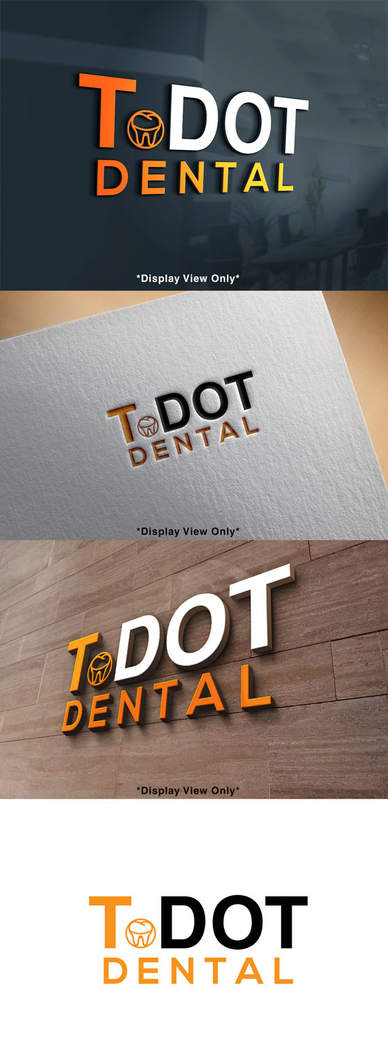
Dental office in Toronto Named T-Dot Dental
Wollen Sie auch einen Job wie diesen gewinnen?
Dieser Kunde bekam 128 Logo-Designs von 61 Designern. Dabei wurde dieses Logo-Design Design von Mylogo 3 als Gewinner ausgewählt.
Kostenlos anmelden Design Jobs finden- Garantiert
-
 C$250
C$250
-
 128 Designs
-
 61 Designer
Logo-Design Kurzbeschreibung
Logo for a dental office that is in downtown Toronto , the demographic are mostly millennials, the office is modern simple. And the colour theme is mainly “orange , white and Grey” The name of the office is T-DOT Dental , the name is like a “kool” abbreviation for Toronto. My thoughts is to have "T" in Orange or White and "Dot" in the other colour ( vice -versa) , if the T in orange then dot in white.
want to make sure it is copy righted and not being used somewhere else. If we can add a 🦷 tooth or small smile line
Zielmarkt/( -märkte)
young Millennials.
Industrie/Einheitstyp
Dental Clinic
Logo Text
T.DOT Dental
Logo Stile, die Sie interessieren können
Emblem-Logo
Logo eingeschlossen in einer Form
Pictorial / Combination-Logo
Ein reales Objekt (Text optional)
Lettermark-Logo
Kurzwort oder Buchstaben-Logo (nur Text)
Sehen und fühlen
Jeder Schieber zeichnet eine der Charakteristiken der Marke des Kunden aus sowie den Stil, den euer Logo widerspiegeln sollte.
Elegant
Fett
Spielerisch
Ernst
Traditionel
Modern
Sympatisch
Professionell
Feminin
Männlich
Bunt
Konservativ
Wirtschaftlich
Gehobenes
Anforderungen
Muss haben
- Either a small tooth or teeth smile line.
Schön zu haben
- something representing Toronto ( like CN tower)
Sollte nicht haben
- no tooth brushes or smiling tooth ( nothing cheesy)