Bear Essential Oils - Body Oils
Wollen Sie auch einen Job wie diesen gewinnen?
Dieser Kunde bekam 84 Verpackungs-Designs von 23 Designern. Dabei wurde dieses Verpackungs-Design Design von Pinky als Gewinner ausgewählt.
Kostenlos anmelden Design Jobs finden- Garantiert
-
 C$350
C$350
-
 84 Designs
-
 23 Designer
Verpackungs-Design Kurzbeschreibung
I am in need of 4 different label and package designs for a new line of body oils that I am launching. I already have the logo and names, it is now a matter of positioning the content. The names are as follows;
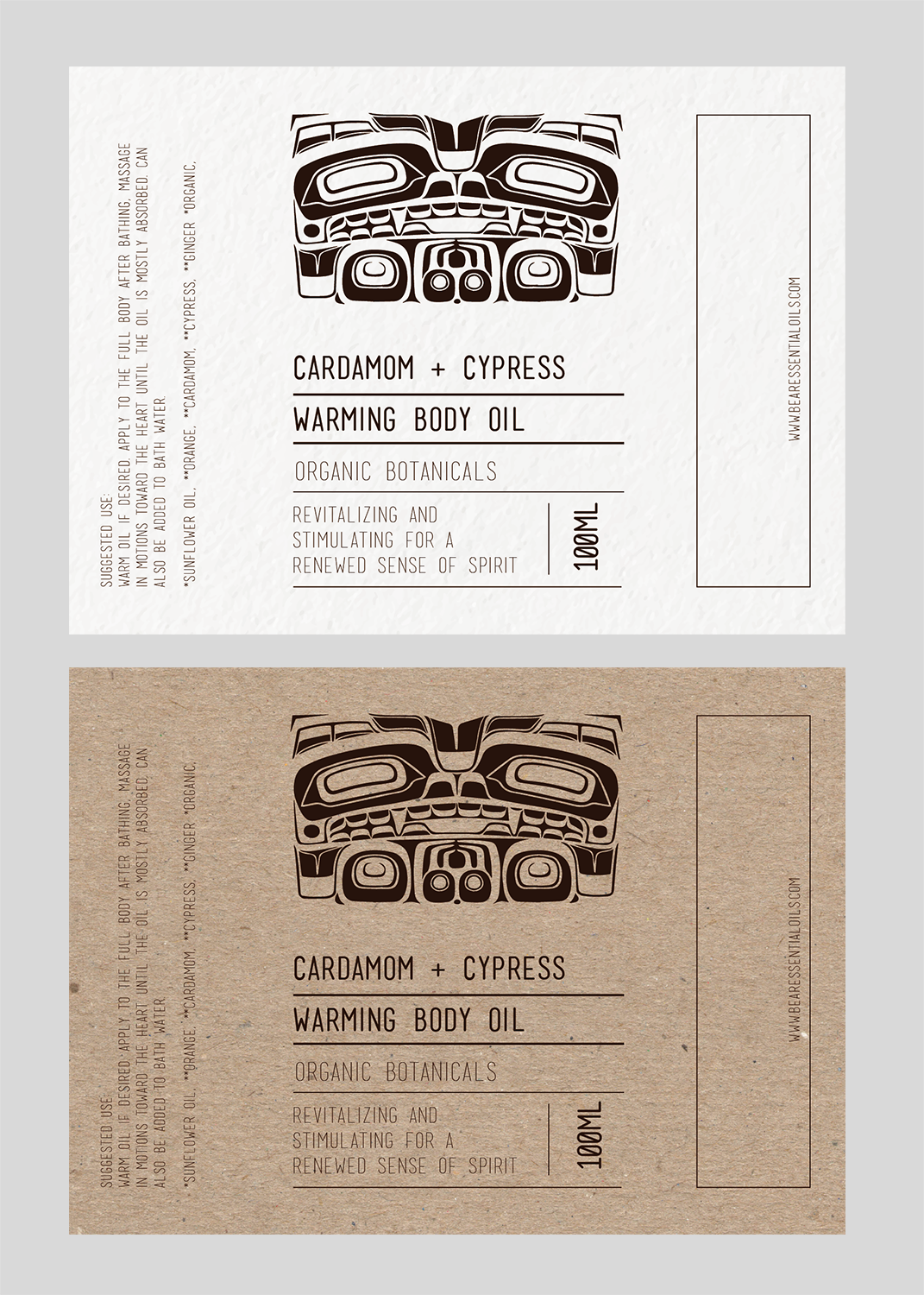
1) CARDAMOM + CYPRESS
WARMING BODY OIL
2) NEROLI + LEMON
UPLIFTING BODY OIL
3) CEDAR + BIRCH
GROUNDING BODY OIL
4) SAGE + MINT
COOLING BODY OIL.
The size of each label is 13cm wide x 9.5cm high. The size of the box is 4.5cm x 4.5cm x 15.5cm high.
The size of the bottle is 4cm across the base and 10.5cm in glass height.
I have included an image from a line that I started to work on but it didn't go anywhere. I thought the borders looked good to frame it in however, I am not attached to anything at this point. I am also including a picture of a product line that has used different colors on the packaging. I am not certain that this is the direction I'd like to take however I like how it looks with them. If we were to add the color I think it should be JUST the boxes and NOT the labels and they would be as follows; WARMING OIL - warm burgundy, earth tones UPLIFTING OIL - warm light, lightish blues GROUNDING OIL - warm soft, brownish creams COOLING OIL - refreshing light, pale green possibly blue. I would be interested to see what adding a sprig of a plant would look like on the boxes however with the already busy logo it might look like too much is going on. As you will see in our instagram and website we currently have the bear logo in a foil. I am not sure that I want to proceed with this foil as it is difficult to photograph. I would like to look at colors that compliment the existing line of essential oils as well as the dark brown wood on the cap.
I have added a design that looks a bit industrial that I like, it reads black ops.
Zielmarkt/( -märkte)
My market is mainly females who are interested in natural health age 17 - 70. There is a large movement for organic + green beauty. I would like the label to look and feel clean and natural. Something that has been wildcrafted, raw and completely from nature.
Industrie/Einheitstyp
Health And Wellness
Farben
Der Designer kann die Farben des Designs frei wählen
Sehen und fühlen
Jeder Schieber zeichnet eine der Charakteristiken der Marke des Kunden aus sowie den Stil, den euer Logo widerspiegeln sollte.
Elegant
Fett
Spielerisch
Ernst
Traditionel
Modern
Sympatisch
Professionell
Feminin
Männlich
Bunt
Konservativ
Wirtschaftlich
Gehobenes
Anforderungen
Muss haben
- Appeal to very progressive organic consumers. Please see the pictures marked SAMPLES 1, 2, 3 + 4 for design ideas.
- Easy to read. Clean design.
- The following information should be on the label as well as the packaging box.
- Size - 100 ML
- Barcodes - still to come
- Ingredients:
- 1) CARDAMOM + CYPRESS WARMING BODY OIL - *Sunflower Oil, **Orange, **Cardamom, **Cypress, **Ginger *Organic, **Organic essential oil
- 2) NEROLI + LEMON UPLIFTING BODY OIL - *Sunflower oil, **Orange, **Neroli, **Grapefruit, **Lemon, **Bergamot, **Benzoin, *Organic, **Organic essential oil
- 3) CEDAR + BIRCH GROUNDING BODY OIL - *Sunflower Oil, **Cedarwood, **Birch, **Benzoin, **Patchouli,*Organic, **Organic essential oil
- 4) SAGE + MINT COOLING BODY OIL - *Sunflower oil, **Spearmint, **Clary Sage, **Geranium, **Ylang Ylang, *Organic, **Organic essential oil
- Suggested Use:
- Warm oil if desired. Apply to the full body after bathing, massage in motions toward the heart until the oil is mostly absorbed. Can also be added to bath water.
Schön zu haben
- I would like to see the designs on the actual bottle (pic included) to see how it looks.
Sollte nicht haben
- Bright colors.