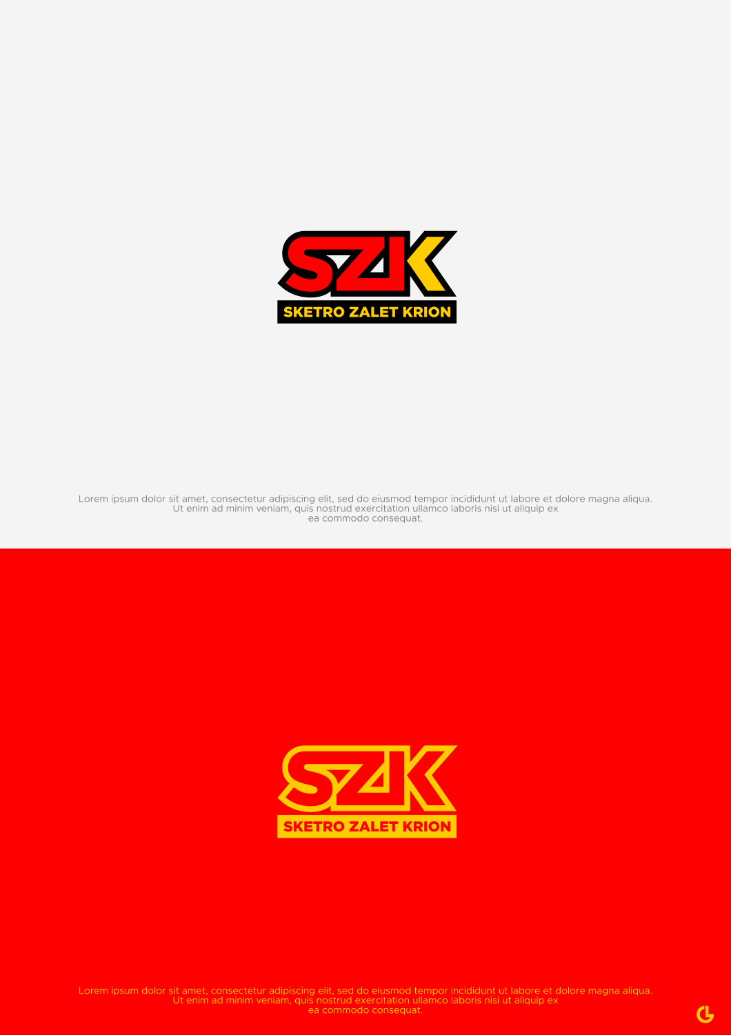
SZK Logo ( A redisgn of a old family supermarket logo)
Wollen Sie auch einen Job wie diesen gewinnen?
Dieser Kunde bekam 205 Logo-Designs von 112 Designern. Dabei wurde dieses Logo-Design Design von R!CKY als Gewinner ausgewählt.
Kostenlos anmelden Design Jobs finden- Garantiert
-
 A$150
A$150
-
 205 Designs
-
 112 Designer
Logo-Design Kurzbeschreibung
I neeed you to bring and old family supermarket logo into the now.
Ideally having some refence to the old but with a fresh new take.
Ideally the traits of the old logo to shine within the new.
Main colours and shape to resemble the old with a new look font.
The key elements of the yellow background, red retangular shapes arond the letters and overall main shape of the logo to be similar.
Zielmarkt/( -märkte)
Business is a private finance and real estate company.
Logo Text
SZK (Letters) Sketro Zalet Krion (Replace Supermarket)
Logo Stile, die Sie interessieren können
Wortmarke-Logo
Word oder namensbasiertes Logo (nur Text)
Lettermark-Logo
Kurzwort oder Buchstaben-Logo (nur Text)
Sehen und fühlen
Jeder Schieber zeichnet eine der Charakteristiken der Marke des Kunden aus sowie den Stil, den euer Logo widerspiegeln sollte.
Elegant
Fett
Spielerisch
Ernst
Traditionel
Modern
Sympatisch
Professionell
Feminin
Männlich
Bunt
Konservativ
Wirtschaftlich
Gehobenes
Anforderungen
Schön zu haben
- SImalar fetaures to the old