35th Anniversary Logo needed for a family owned business who caters to small communities.
Wollen Sie auch einen Job wie diesen gewinnen?
Dieser Kunde bekam 134 Logo-Designs von 50 Designern. Dabei wurde dieses Logo-Design Design von Aimar ALV als Gewinner ausgewählt.
Kostenlos anmelden Design Jobs finden- Gebündeltes Projekt 1
-
 C$500
C$500
-
 134 Designs
-
 50 Designer
Logo-Design Kurzbeschreibung
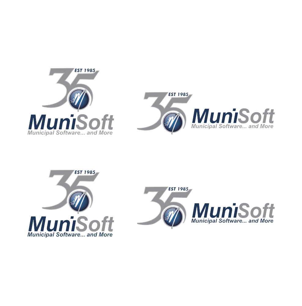
We need modifications to our existing logo to reflect our upcoming 35th Anniversary. We would need one design with three slight modifications: one vertical, one horizontal and one with graphic only (I have attached the three we currently use as a reference). We would like to stick with our current colour theme (blue and grey) but are open to using various shades of grey, white and black in addition to the blue. Our tagline "Municipal Software... and more" is not necessary to include in the anniversary logo (but the Circle with the 'M' in it is important to include). We are a small, Canadian company with over 700 clients across Canada. Our target market is small municipalities. We focus on functional products and never sacrifice the functionality for trends or bells/whistles that would not be beneficial to the majority of our clients. Though we create software, we are not strictly speaking a tech company. We meet in the middle between IT and Accounting. The final logo should communicate that we have served our clients for 35 years by providing excellence in software and service through integrity, partnership and community. Please note: the "S" in "MuniSoft" is capitalized.
Aktualisierungen
Need extra days to review
Zielmarkt/( -märkte)
Small municipalities
Logo Text
MuniSoft / 35th Anniversary
Logo Stile, die Sie interessieren können
Pictorial / Combination-Logo
Ein reales Objekt (Text optional)
Zu verwendende Schriftarten
Farben
Vom Kunden ausgewählte Farben für das Logo Design:
Sehen und fühlen
Jeder Schieber zeichnet eine der Charakteristiken der Marke des Kunden aus sowie den Stil, den euer Logo widerspiegeln sollte.
Elegant
Fett
Spielerisch
Ernst
Traditionel
Modern
Sympatisch
Professionell
Feminin
Männlich
Bunt
Konservativ
Wirtschaftlich
Gehobenes
Anforderungen
Muss haben
- The circle in the attached logo with the "M" in it.
- Wording of some sort that depicts our 35th Anniversary (i.e. 35th Anniversary, EST 1985, etc.)
- Blue/Grey colour scheme (but open to incorporating white, black, various shades of grey)
Dateien
Alle Dateien herunterladen - 0,4 MB
Zahlungen
Gesamt
C$500
Projekt-Deadline
07 Okt 2019 15:20:15 UTCProjekt Upgrades
Gebündelte(s) Projekt(e)
- übergebe C$49 Briefpapier-Design an den Sieger