Dynamic banner stand for Canadian music education charity
Wollen Sie auch einen Job wie diesen gewinnen?
Dieser Kunde bekam 25 Banner-Designs von 11 Designern. Dabei wurde dieses Banner-Design Design von Lauren als Gewinner ausgewählt.
Kostenlos anmelden Design Jobs finden-
 C$90
C$90
-
 25 Designs
-
 11 Designer
Banner-Design Kurzbeschreibung
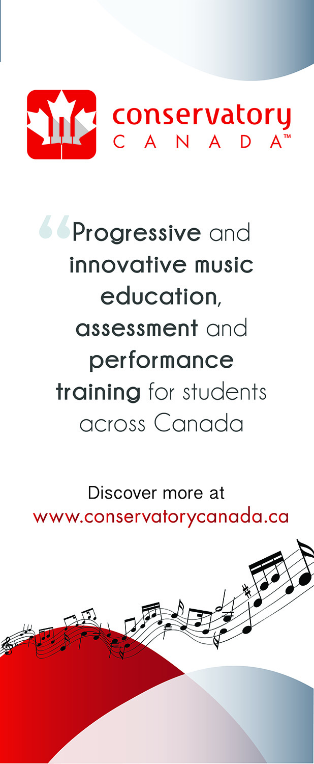
Conservatory Canada offers music exams and other programs to instrumental and vocal students across Canada. We are looking to offer flexible, progressive, and more modern programs than our more traditional competitors. We need a new banner stand for our office that concisely demonstrated and illustrates our current identity materials while messaging what we do, directing interested people to our website. We have a previous banner stand that was designed for a separate purpose that is uploaded for reference, as well as our logo. We are hoping to match the look and feel of the previous banner stand as closely as possible, with the same or similar fonts, some similar layout, with similar shapes, graphics and colours. The new banner stand does not copy information from the old banner (uploaded for reference) but instead includes the following detail: Logo (uploaded), the following descriptor: "Progressive and innovative music education, assessment and performance training for students across Canada". This should be in a font that is modern, engaging, similar to the old banner stand (uploaded), yet conveys some element of tradition and authority. The banner also includes "Discover more at www.conservatorycanada.ca" The banner should also include the same red/white/grey colour scheme as the old one, with similar background graphics that evoke fun and creativity in a modern way. Again, this design has new content as described here, and does not copy the content from the uploaded banner - it is only included for reference as to look and feel. The new banner should copy the original schemes to provide us with continuity in our marketing materials.
Zielmarkt/( -märkte)
General public that is passing by our office
Zu verwendende Schriftarten
Andere Schriftarten erwünscht:
- See uploaded banner for reference
Farben
Vom Kunden ausgewählte Farben für das Logo Design:
Sehen und fühlen
Jeder Schieber zeichnet eine der Charakteristiken der Marke des Kunden aus sowie den Stil, den euer Logo widerspiegeln sollte.
Elegant
Fett
Spielerisch
Ernst
Traditionel
Modern
Sympatisch
Professionell
Feminin
Männlich
Bunt
Konservativ
Wirtschaftlich
Gehobenes
Anforderungen
Muss haben
- Similar look and feel to previous banner (uploaded)
Schön zu haben
- Please see project description for more detail
Sollte nicht haben
- Radical departure from current look and feel.