Poster and band logo Now & Then band logo
Wollen Sie auch einen Job wie diesen gewinnen?
Dieser Kunde bekam 46 Logo-Designs von 23 Designern. Dabei wurde dieses Logo-Design Design von hargai als Gewinner ausgewählt.
Kostenlos anmelden Design Jobs finden- Garantiert
-
 A$120
A$120
-
 46 Designs
-
 23 Designer
Logo-Design Kurzbeschreibung
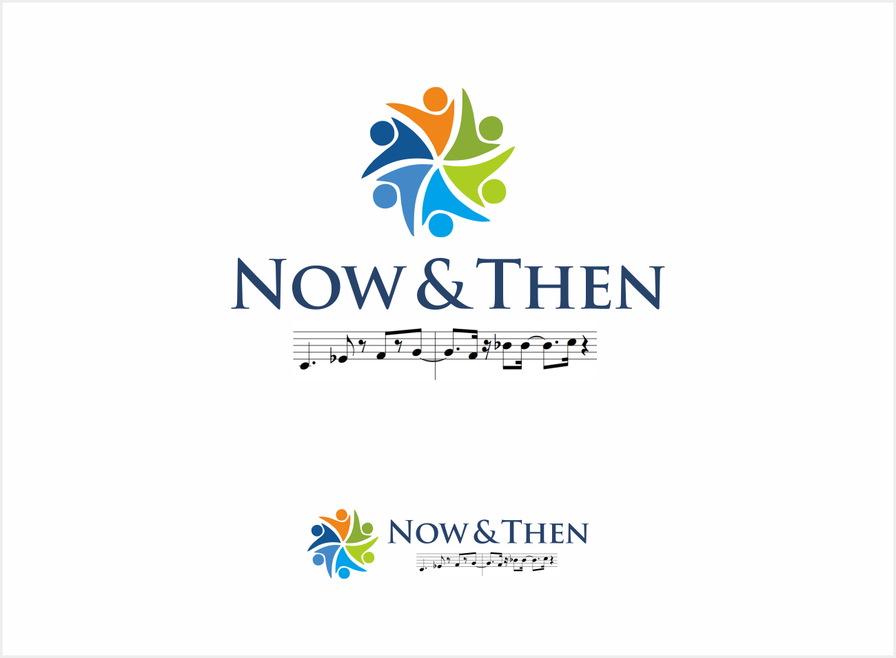
I am after a logo for our band. The band is called Now & Then. I would like the logo to have Now in the top left hand corner in modern font, the & in the middle of the page, and Then written in a older font ( like Times New Roman or similar) in the bottom right hand corner.
I would also like numbers for each decade, from 50s to now, scattered over the page but less pronounced. 50s in a 50 style font, 60s in a hippie 60s style font, 70 in disco, 80s in a cool 80s font, 90s in something suitable and then naughties (or 00s).
If possible can we also get a juke box in the bottom left hand corner and some sort of transition from the juke box in bottom left hand corner across the bottom of the page to a streaming type idea with music notes coming from something that denotes modern music streaming (internet / wifi / smart phone) something like that. Perhaps across the bottom, something like music notation in a ribbon that goes from the jukebox across the bottom of the page to the modern streaming...
Zielmarkt/( -märkte)
Music venues and people wanting to book a band for an event such as a wedding, corporate event etc...
Logo Text
Now & Then
Logo Stile, die Sie interessieren können
Pictorial / Combination-Logo
Ein reales Objekt (Text optional)
Farben
Der Designer kann die Farben des Designs frei wählen
Sehen und fühlen
Jeder Schieber zeichnet eine der Charakteristiken der Marke des Kunden aus sowie den Stil, den euer Logo widerspiegeln sollte.
Elegant
Fett
Spielerisch
Ernst
Traditionel
Modern
Sympatisch
Professionell
Feminin
Männlich
Bunt
Konservativ
Wirtschaftlich
Gehobenes
Anforderungen
Muss haben
- Logo should be easy to read from a distance. It should reflect the band name and what we do. We play big hits from the 50s right through to today.
- I selected pictorial/combination in the logo style section, but i really want words to be more prominent and the decade numbers less so.
Schön zu haben
- The focus should be on the name. Also, we would like numbers depicting each decade (50s 60s 70s 80s 90s 00s..) scattered around randomly in the background.
- Mayeb a mirror ball type effect of light coming ou from the centre behind the &
- If possible, and if it does not make the logo too busy and reduce too much space, we would like a jukebox on left side at bottom, and then going across the bottom of the page some way of morphing that into a modern music device on the right hand side... from a jukebox to a streaming device or simply something depicting music flying through the air to a phone... even across music notation.
Sollte nicht haben
- Not too busy, or with fonts that are difficult to read.