

 Aktualisieren
Climate Change Podcast Needs a Logo to Launch a Movement.
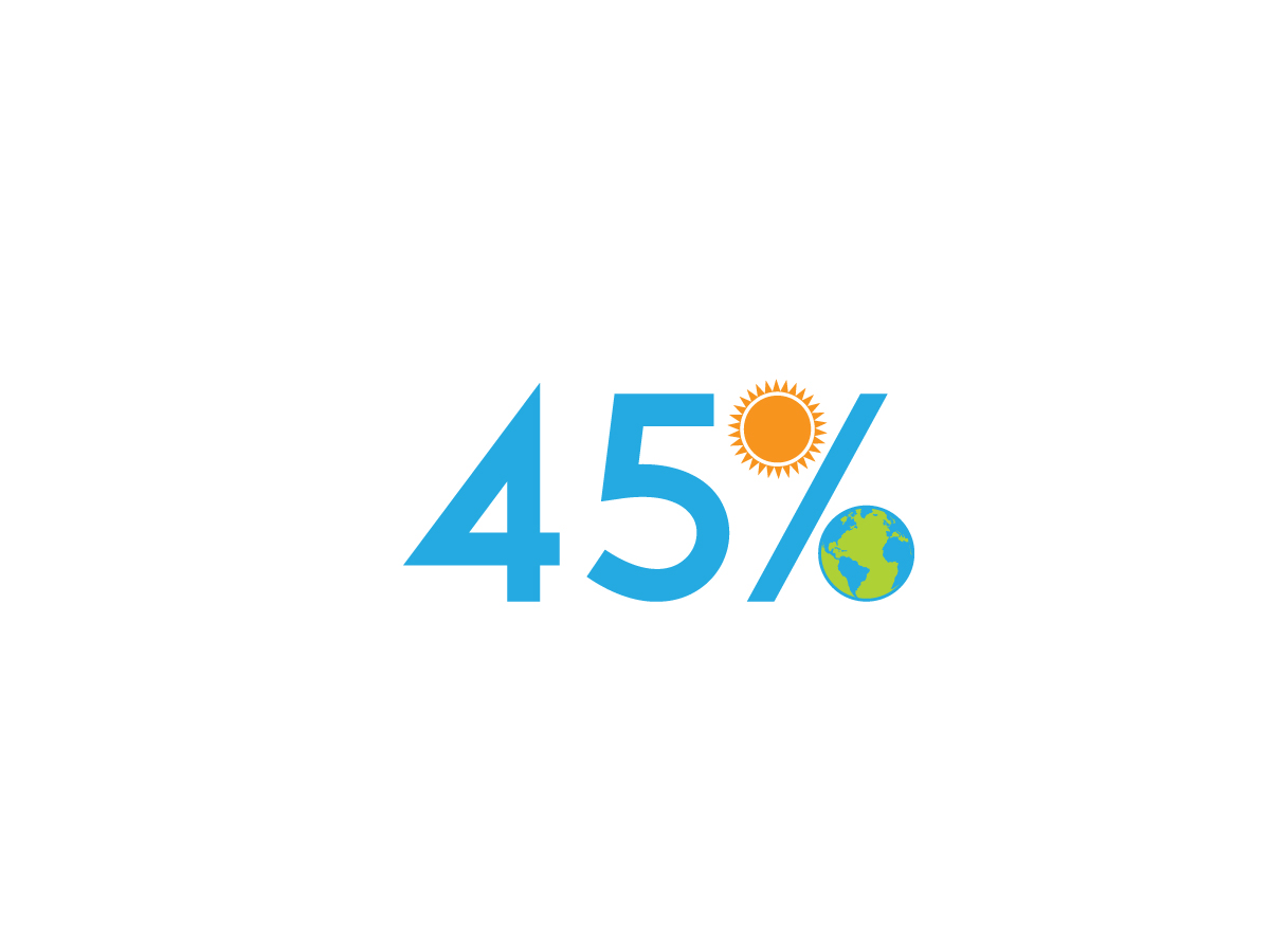
Wollen Sie auch einen Job wie diesen gewinnen?
Dieser Kunde bekam 90 Logo-Designs von 46 Designern. Dabei wurde dieses Logo-Design Design von alex hop als Gewinner ausgewählt.
Kostenlos anmelden Design Jobs finden
-
 US$150
-
 90 Designs
-
 46 Designer
Logo-Design Kurzbeschreibung
45 % is a media campaign that challenges every household in America to reduce their carbon footprint by 45%. The challenge comes from the world’s top climate scientists, who issued a special report in 2019 that warned of a climate catastrophe if our global carbon footprint is not reduced by 40-50% before 2030. The campaign will include a website, social media accounts, a blog, and, as the centerpiece, a podcast that follows one family through the 45% challenge. The family's struggles with reducing CO2 emissions related to home energy consumption, driving, air travel, diet, and shopping habits will be followed and linked with interviews with the world experts and leaders on environmental issues.
The podcast cover art dimensions are 3000 x 3000 pixels, which is an 1:1 aspect ratio. In general, you should be using JPG or PNG files and if you're creating podcast cover art, it should have a minimum of 1400 x 1400 pixels
Zielmarkt/( -märkte)
Young adults, 20-35
Logo Text
45%
Logo Stile, die Sie interessieren können
Abstraktes Logo
Begrifflich / symbolisch (Text optional)



Zu verwendende Schriftarten

Farben
Der Designer kann die Farben des Designs frei wählen
Sehen und fühlen
Jeder Schieber zeichnet eine der Charakteristiken der Marke des Kunden aus sowie den Stil, den euer Logo widerspiegeln sollte.
Elegant
Fett
Spielerisch
Ernst
Traditionel
Modern
Sympatisch
Professionell
Feminin
Männlich
Bunt
Konservativ
Wirtschaftlich
Gehobenes
Anforderungen
Schön zu haben
- You need to communicate that this is about the earth/climate/environment. The logo should be warm and eye catching. The themes to consider are the earth, households, children, family, food, transportation, carbon (or CO2), and sun. (You do not need to include all of these concepts.) You could also make use of the footprint in the design. Should work in black and white as well as color.
Sollte nicht haben
- Would prefer three colors or fewer. If you use more, it would be good to have a three color alternative version. Avoid gradients or provide an non-gradient alternative.


