America's Best Sandwiches
Wollen Sie auch einen Job wie diesen gewinnen?
Dieser Kunde bekam 159 Logo-Designs von 47 Designern. Dabei wurde dieses Logo-Design Design von Dennis Jackson Design als Gewinner ausgewählt.
Kostenlos anmelden Design Jobs finden- Garantiert
-
 US$150
-
 159 Designs
-
 47 Designer
Logo-Design Kurzbeschreibung
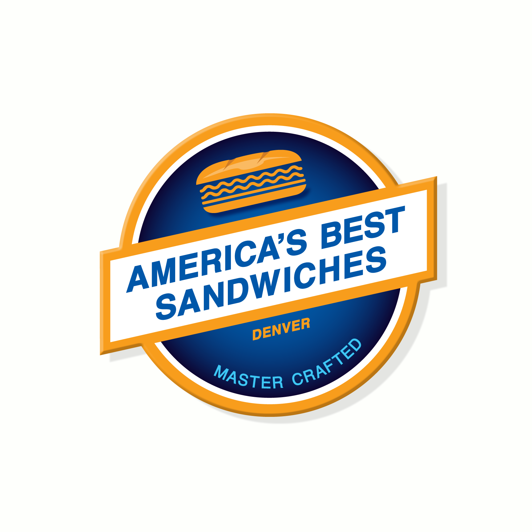
Thank you for your interest in helping design my logo.<br/><br/>The company name is America’s Best Sandwiches, and I’m looking for a really cool logo design. This is a local Denver start-up and the two colors I like are blue and orange.<br/><br/>I like blue in cobalt, royal, dark-ish, etc. The orange I like in straight up orange to tangerine, and I’m also open to golds – like the Warner Bros. logo.<br/><br/>I’m not a graphic artist, but I would like a visual element like a banner over a circle, or a shield, or something to that effect. I realize America’s Best Sandwiches is a lot of words/letters, but it describes what I sell, and the sandwiches will be amazing.<br/><br/>I’m open to any cool ideas.<br/><br/>One graphic image I like is a chef’s knife, such as sticking up from a cutting board, or just by itself.<br/><br/>The effect I want is for the viewer to see the sign, and think “Hey, this looks like a cool place to go and have a great sandwich for lunch.” I’ll also be open for breakfast and brunch on the weekends. My target audience will be mainly men in the 25 to 55 age range, and women too. My store is a place for busy/working people to get high-quality food quickly (fast casual). Think: Restaurant quality without the wait – in a fun atmosphere.<br/><br/>I will not be competing against national chains like Subway, Jimmy Johns, Firehouse Subs, etc. in terms of going for big sandwiches (foot longs) and cheap prices (4.99). It’s like high-end gourmet burgers versus Burger King. I want the logo to be cool, easy to read, and say “upscale”. I’d also like it to be timeless/elegant. Bold, but in an understated way (if that makes sense). When I say bold, I mean that it pops off the page and begs to be looked at (good contrast).<br/><br/>In addition to great sandwiches and quick service, we’ll be priding ourselves on quality of service, friendly, professional, warm. The kind of place where the owner is always around, and people remember your name.<br/><br/>It’s called America’s Best Sandwiches because the sandwiches are that good, and they come from all different parts of America, like East coast, West coast, the South, Texas, and so on. I’ve been to all 50 states and reviewed hundreds of restaurants all over the country. I’m bringing the best to Denver, and plan to be the best sandwich shop in town.
Zielmarkt/( -märkte)
People, mostly men, 25 - 55 who like to go out for crazy good sandwiches and beer taprooms
Logo Text
America's Best Sandwiches
Logo Stile, die Sie interessieren können
Emblem-Logo
Logo eingeschlossen in einer Form
Farben
Vom Kunden ausgewählte Farben für das Logo Design:
Sehen und fühlen
Jeder Schieber zeichnet eine der Charakteristiken der Marke des Kunden aus sowie den Stil, den euer Logo widerspiegeln sollte.
Elegant
Fett
Spielerisch
Ernst
Traditionel
Modern
Sympatisch
Professionell
Feminin
Männlich
Bunt
Konservativ
Wirtschaftlich
Gehobenes
Anforderungen
Muss haben
- see link
Schön zu haben
- see link
Sollte nicht haben
- see link