haydentechnology.com Logo, Providing innovative and strategic consulting to banks and credit unions
Wollen Sie auch einen Job wie diesen gewinnen?
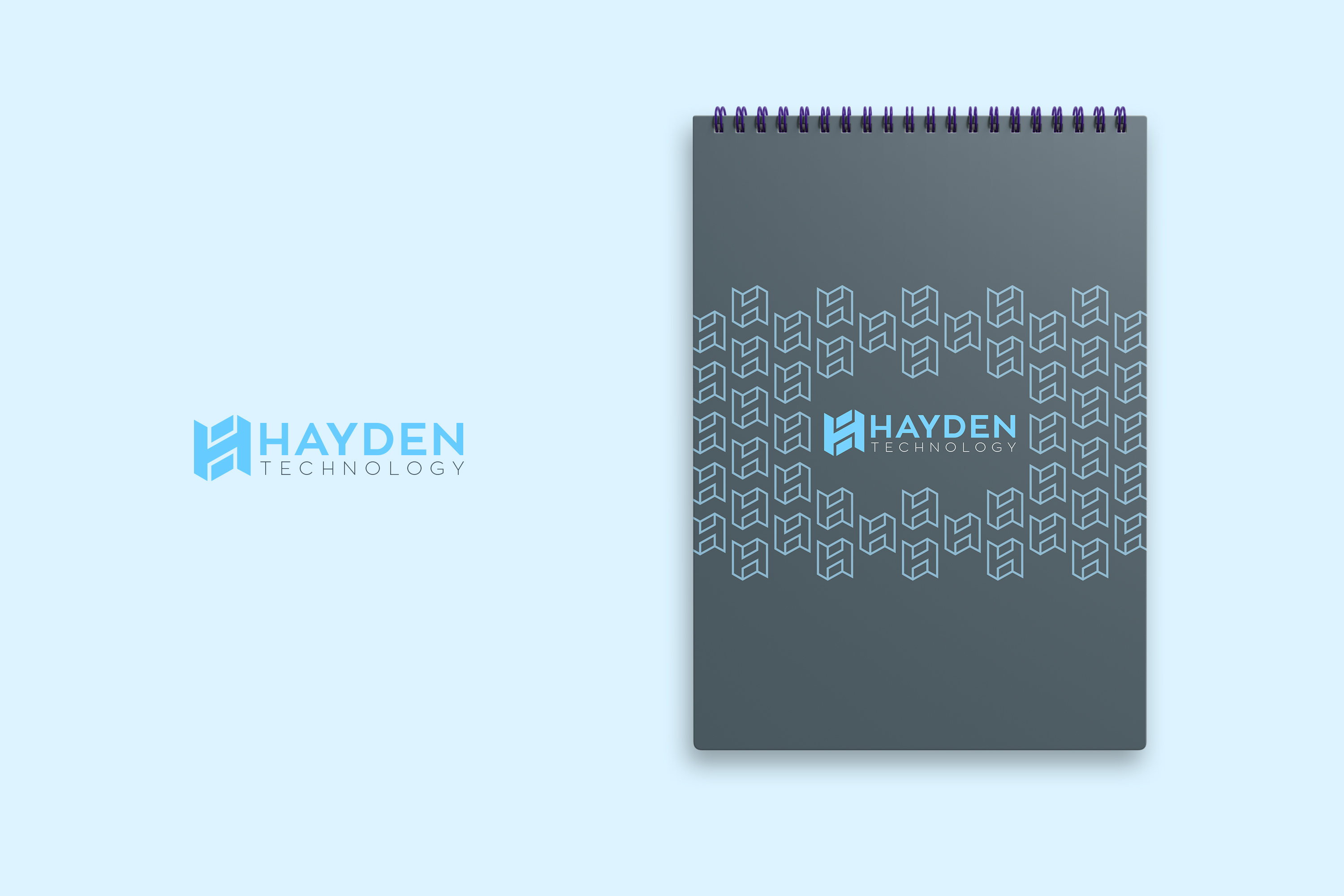
Dieser Kunde bekam 262 Logo-Designs von 112 Designern. Dabei wurde dieses Logo-Design Design von JohnM. als Gewinner ausgewählt.
Kostenlos anmelden Design Jobs finden-
 US$160
-
 262 Designs
-
 112 Designer
Logo-Design Kurzbeschreibung
Looking for a new logo... see website haydentechnology.com. We like simple. We like HT. We are interested in NEW logo + new font for "Hayden Technology" ... We like Hayden stacked on top of Technology.
Update:
1. I don't think I like Orange color... now that I see it... I would like to stick with my website's version of blue / gray / white / black combinations. Perhaps a very small accent of orange... but generally 2-color combinations... blue / dark-gray on white, blue / light-gray on black. white / dark gray on blue.
2. need to have square logo and full logo versions. I like the idea of HT in form that is easy to recognize on linked-in, twitter, instagram... but then matches well with the full Hayden Technology version.
3. I want an "evolution" of my current logo... not a grand change... and the evolution is FORWARD progress... clean. classy. recognizable.
Zielmarkt/( -märkte)
Banking, Credit Unions, Consulting
Logo Text
Hayden Technology
Zu verwendende Schriftarten
Farben
Vom Kunden ausgewählte Farben für das Logo Design:
Sehen und fühlen
Jeder Schieber zeichnet eine der Charakteristiken der Marke des Kunden aus sowie den Stil, den euer Logo widerspiegeln sollte.
Elegant
Fett
Spielerisch
Ernst
Traditionel
Modern
Sympatisch
Professionell
Feminin
Männlich
Bunt
Konservativ
Wirtschaftlich
Gehobenes
Anforderungen
Muss haben
- cool, simple, interesting, classy. Use my current color pallette on haydentechnology.com website (banner: blue, gray, black, white)
need to have square logo and full logo versions. I like the idea of HT in form that is easy to recognize on linked-in, twitter, instagram... but then matches well with the full Hayden Technology version.
Schön zu haben
- an "evolution" of my current logo... not a grand change... and the evolution is FORWARD progress... clean. classy. recognizable.