SWITCH ENERGY FITNESS EXPERIENCE
Wollen Sie auch einen Job wie diesen gewinnen?
Dieser Kunde bekam 229 Logo-Designs von 80 Designern. Dabei wurde dieses Logo-Design Design von MT als Gewinner ausgewählt.
Kostenlos anmelden Design Jobs finden- Garantiert
-
 US$110
-
 229 Designs
-
 80 Designer
Logo-Design Kurzbeschreibung
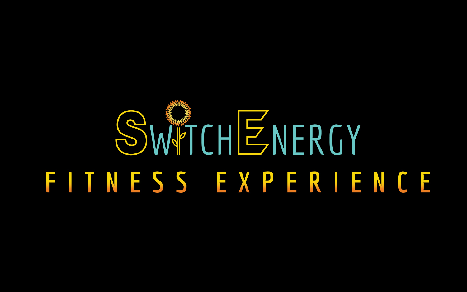
I am fitness service providing online and in person fitness training and events. I am based in Atlanta, GA. The service is called SWITCH ENERGY FITNESS EXPERIENCE. My fitness experiences are fun, high energy and and innovative. I would like the design to communicate energy, life, fun, style. The targeted demographic will be women age 25-45. I am looking for a design that is bold and simple enough to stand alone and would look good, in black and white, on shirts and fitness equipment. I have attached a mock up below that I created in Canva. I really like how the mock up looks however I wanted a unique design I will be able to trademark. With that said, I would like to keep a lot of the same elements in the mock up. I would like to use the same brand colors I used in the mock ups. You will see in the mock up that I included a sunflower graphic as the "I" In SWITCH. I really like this idea and would like to see what you could do with it. I also like the "hollow" font used with the "S" and the "E" as I feel it give an illusion of illumination and movement and would like to see a variation of that as well.
Zielmarkt/( -märkte)
women age 25-45, African american
Industrie/Einheitstyp
Fitness
Logo Text
SWITCH ENERGY FITNESS EXPERIENCE
Logo Stile, die Sie interessieren können
Pictorial / Combination-Logo
Ein reales Objekt (Text optional)
Abstraktes Logo
Begrifflich / symbolisch (Text optional)
Zu verwendende Schriftarten
Sehen und fühlen
Jeder Schieber zeichnet eine der Charakteristiken der Marke des Kunden aus sowie den Stil, den euer Logo widerspiegeln sollte.
Elegant
Fett
Spielerisch
Ernst
Traditionel
Modern
Sympatisch
Professionell
Feminin
Männlich
Bunt
Konservativ
Wirtschaftlich
Gehobenes
Anforderungen
Muss haben
- The same brand colors listed in the mock up I uploaded. A clean, look.
Schön zu haben
- I would like to see a stylized sunflower graphic used as the I in "SWITCH"