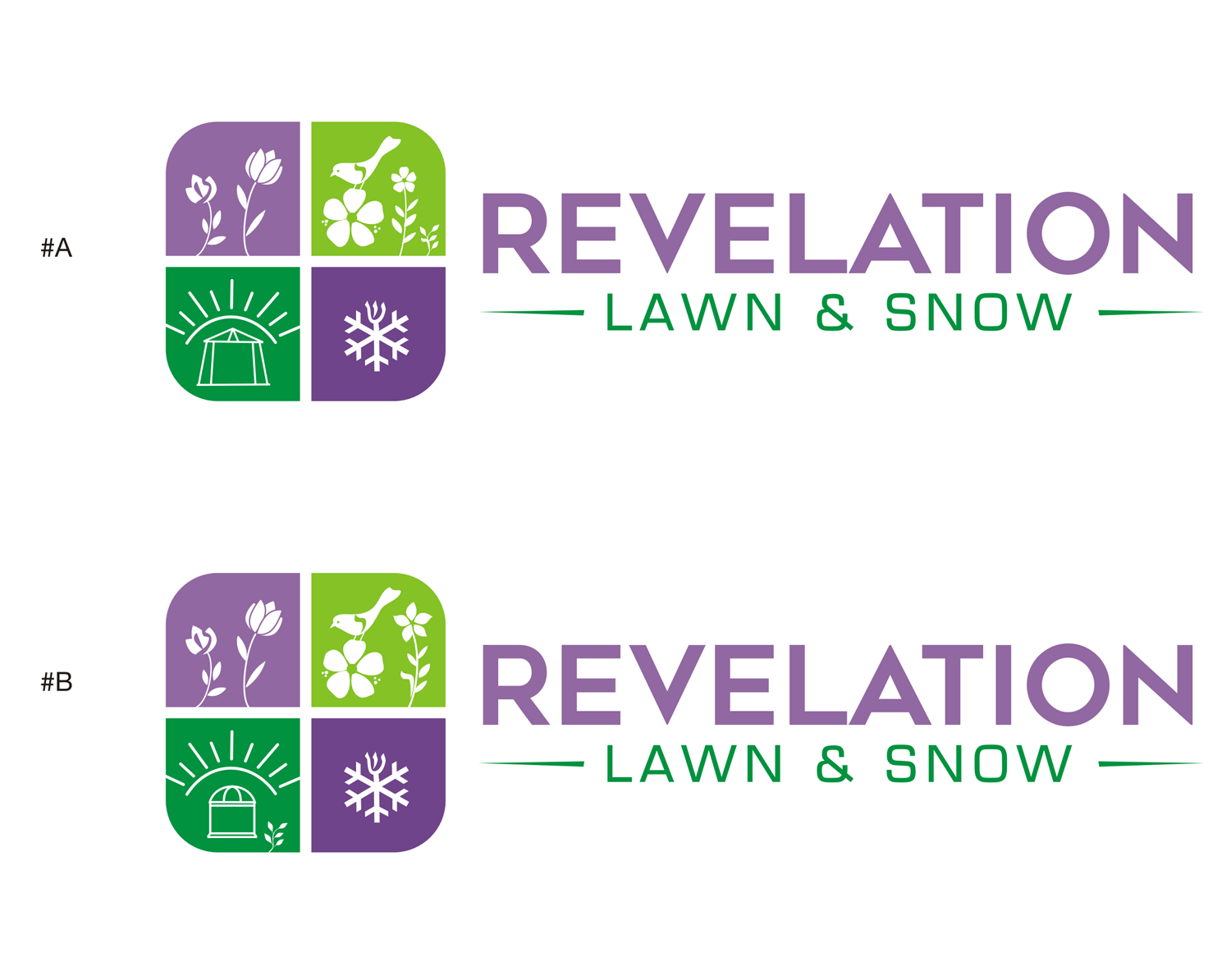
Revelation Gardens Logo (complicated logo)
Wollen Sie auch einen Job wie diesen gewinnen?
Dieser Kunde bekam 316 Logo-Designs von 87 Designern. Dabei wurde dieses Logo-Design Design von lovely angel als Gewinner ausgewählt.
Kostenlos anmelden Design Jobs finden- Garantiert
-
 US$300
-
 316 Designs
-
 87 Designer
Logo-Design Kurzbeschreibung
NOTE: Any submissions that do not follow this brief will be eliminated, unfortunately. Any logos not eliminated currently that do not embody the instructions are simply there because the logo follows one or more of the instructions in a creative way, but those submissions will be eliminated when the vote time occurs.
-The colors for revelation should be purple as the main color and green as the secondary color.
-The new logo needs to have a light source: A sun seems to make the most sense but flames, lamps, torches are all light sources too.
-The new logo also should be incorporating a gazebo with flowers and growing things. The light source of a sun incorporated in it somewhere smartly is a must. Possibly the silhouette of a family enjoying the space? That is not a must have but just an idea that is there..
NOTE: PLEASE NO "TUFTS OF GRASS", instead think flowers and growing spring time type things in a flower garden with birds and butterflies and such.
Aktualisierungen
Some of the designers are posting the exact same design twice. Secondly, this is the first time I am using this platform and I am trying to learn how to make the most of your service, while keeping a solid budget for my logo.
Low design quality
Not good for it to end on a Saturday
Zielmarkt/( -märkte)
Upper middle class to upper class
We are a garden care company and snow removal service that focuses on high quality garden care for upper end lawns and higher class properties.
Industrie/Einheitstyp
Landscape Gardening
Logo Text
Revelation Lawn & Snow
Logo Stile, die Sie interessieren können
Emblem-Logo
Logo eingeschlossen in einer Form
Pictorial / Combination-Logo
Ein reales Objekt (Text optional)
Abstraktes Logo
Begrifflich / symbolisch (Text optional)
Zu verwendende Schriftarten
Sehen und fühlen
Jeder Schieber zeichnet eine der Charakteristiken der Marke des Kunden aus sowie den Stil, den euer Logo widerspiegeln sollte.
Elegant
Fett
Spielerisch
Ernst
Traditionel
Modern
Sympatisch
Professionell
Feminin
Männlich
Bunt
Konservativ
Wirtschaftlich
Gehobenes
Anforderungen
Muss haben
- -Colors Main: Purple, Secondary: Green
-Something that provides light must be incorporated
-Garden themed with growing things and spring time stuff incorporated (birds, flowers, butterflies, rainbows, vines, etc)
-Embody the company's services
-A gazebo with growing things ought to be incorporated.
Schön zu haben
- A logo that both can sit smartly before the name (Not above it) and stand alone, without the company name attached to it.
Somebody turned in an awesome logo design that blocked an "R" into 4 blocks and put an aspect of each of the requirements into the different blocks, and even added some creativity of his own. That submission was by far the best, however I had to delete that submission and block him due to other reasons. A Gazebo in one block, flowers and birds in another, a snow flake in another, and the curve of another block was the sun with other things in it too. I really liked that design.
Sollte nicht haben
- -Symbols or designs for false gods or godesses.
-Designs not following the brief
-Finally, if I like a design, but want that design to have alterations and slight changes to it I will guide that. Instead of turning in a bunch of different of the same design in, start from scratch (as painful as that might be, I know). Once you finish one design and turn in another design that is completely different than the others you will have a higher liklihood of one of the designs being something we can work with from there.