

 Aktualisieren
Improving and modifying an existing logo
Wollen Sie auch einen Job wie diesen gewinnen?
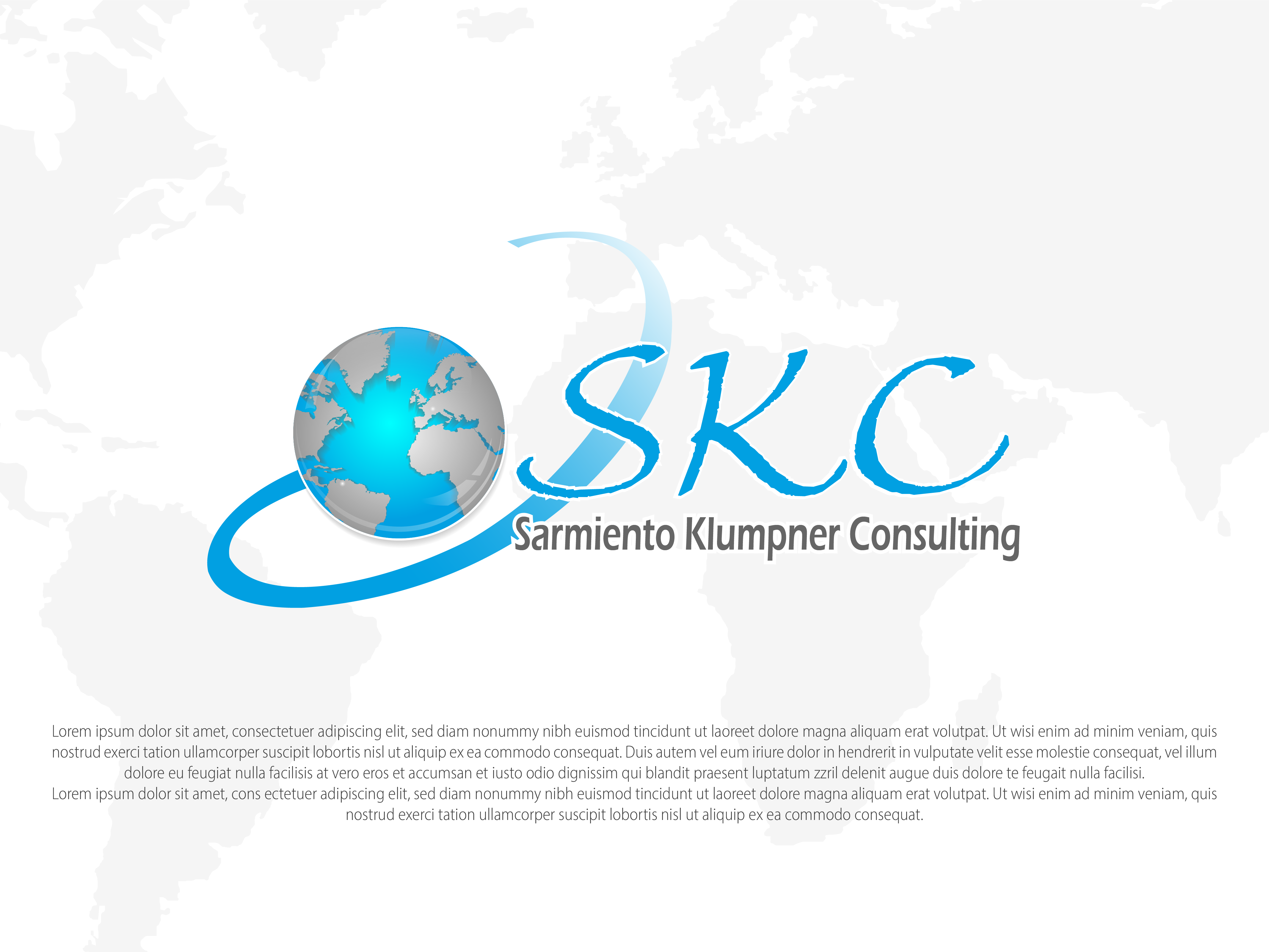
Dieser Kunde bekam 30 Grafik-Designs von 9 Designern. Dabei wurde dieses Grafik-Design Design von YERR® als Gewinner ausgewählt.
Kostenlos anmelden Design Jobs finden
-
 US$110
-
 30 Designs
-
 9 Designer
Grafik-Design Kurzbeschreibung
I need to improve a logo that I already have.
The following are Required modifications:
1. the letters "SNC" should become "SKC".
2. SKC should have the same size. These letters could be a bit smaller than the world.
3. the name Sarmiento Núñez Consulting should become Sarmiento Klumpner Consulting, and could be written less bold, thick, and maybe in a gray tone or less dark/black.
4. the world should show South-America and Western-Europe at the same time. The colours of the world should be inverted. Blue for the sea, metallic gray for the continents.
5.The spiral surrounding the world could become degrading blue.
6. the same white dot that appears in Venezuela, should appear in Switzerland
7. The colors to use are white, black, gray and blue (Ocean blue, Azure, or so). The red becomes blue.
8. the look and feel should be more or less the same as it is right now.
Zielmarkt/( -märkte)
people seeking for legal counseil
Industrie/Einheitstyp
Legal
Zu verwendende Schriftarten

Andere Schriftarten erwünscht:
- calibri, calibri light, big caslon, TNR
Farben
Vom Kunden ausgewählte Farben für das Logo Design:
Sehen und fühlen
Jeder Schieber zeichnet eine der Charakteristiken der Marke des Kunden aus sowie den Stil, den euer Logo widerspiegeln sollte.
Elegant
Fett
Spielerisch
Ernst
Traditionel
Modern
Sympatisch
Professionell
Feminin
Männlich
Bunt
Konservativ
Wirtschaftlich
Gehobenes
Anforderungen
Schön zu haben
- Required modifications:
1. Letters "SNC" should become "SKC".
2. SKC should be of same size, and could be a bit smaller than the world.
3. The name Sarmiento Núñez Consulting should become Sarmiento Klumpner Consulting, and could be written less bold, thick, and maybe in a gray tone or less dark/black.
4. The world shows South-America and Western-Europe. The colours of the world should be inverted. Blue for the sea, metallic gray for the continents.
5.The spiral surrounding the world could become degrading blue or stay gray.
6. The same white dot that appears in Venezuela, should appear in Switzerland
7. Colors to be used: white, black, gray and blue (Ocean blue, Azure, or so). The red becomes blue.
8. The look and feel should be more or less the same as it is right now.