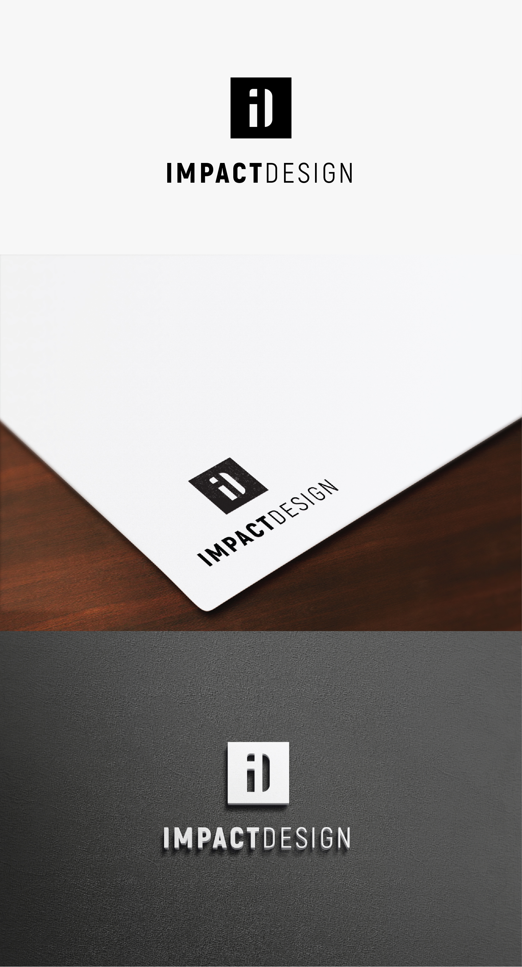
ARCHITECT / BUILDING DESIGN FIRM LOGO

Wollen Sie auch einen Job wie diesen gewinnen?
Dieser Kunde bekam 90 Logo-Designs von 41 Designern. Dabei wurde dieses Logo-Design Design von IMilenovic als Gewinner ausgewählt.
Kostenlos anmelden Design Jobs findenLogo-Design Kurzbeschreibung
I am a building designer and soon to be Architect once registered, I have always wanted to go out on my own and create my own firm and have had the opportunity to do that now. I focus on residential homes on the Gold Coast Australia.
The purpose of Impact Design is the intention to do everything possible within design to create a positive impact on the experience throughout the journey and process of creating built form. The key purpose is to provide a service and do everything within the business objectives to achieve a positive experience and output . At the end of a project the intention is to tick another block of land, helping another happy family in the quest to continually having a great impact on their lives long after the design process and build has taken place.
The visual concept is an aerial view as if you were looking on google earth down on all the blocks of land on the Gold Coast, and highlighting the ones that I have affected by following the process through and getting their renovation, new home or duplex built.
I don't mind the logo that i have attached, however I think the font style is pretty standard, and i am not a fan of how the text does not form a simple shape in the logo. It feels like the text has been forgotten and just added on underneath. I would prefer if my logo had a minimalist appearance as minimalism is an architectural style that I prefer.
For context of the design and company I have started putting together the website / facebook / instagram and I really do prefer the monochromatic scheme black / greys / whites.
I feel as if the word IMPACT needs to have some weight over design, to be a little bit more eye catching, however I do think the shape of the blocks of land are more important than the word impact. The hierarchy would be the following:
1) Logo Shape / Blocks of Land
2) Text - IMPACT
3) Design
Again if we can create an overall minimal shape that would be ideal. Can't wait to see the outcome.
www.impactdesign.net.au
Zielmarkt/( -märkte)
Residential Home Owners
Industrie/Einheitstyp
Architecture
Logo Text
IMPACT DESIGN
Logo Stile, die Sie interessieren können
Pictorial / Combination-Logo
Ein reales Objekt (Text optional)
Abstraktes Logo
Begrifflich / symbolisch (Text optional)
Zu verwendende Schriftarten
Farben
Der Designer darf an diesem Design nur in Graustufen arbeiten
Sehen und fühlen
Jeder Schieber zeichnet eine der Charakteristiken der Marke des Kunden aus sowie den Stil, den euer Logo widerspiegeln sollte.
Elegant
Fett
Spielerisch
Ernst
Traditionel
Modern
Sympatisch
Professionell
Feminin
Männlich
Bunt
Konservativ
Wirtschaftlich
Gehobenes
Anforderungen
Muss haben
- Black White and Grey Colours preferably same as logo attached
Schön zu haben
- One simple shape, rectangular would be ideal for use on construction drawings