Delivery App that needs a One of a Kind Logo
Wollen Sie auch einen Job wie diesen gewinnen?
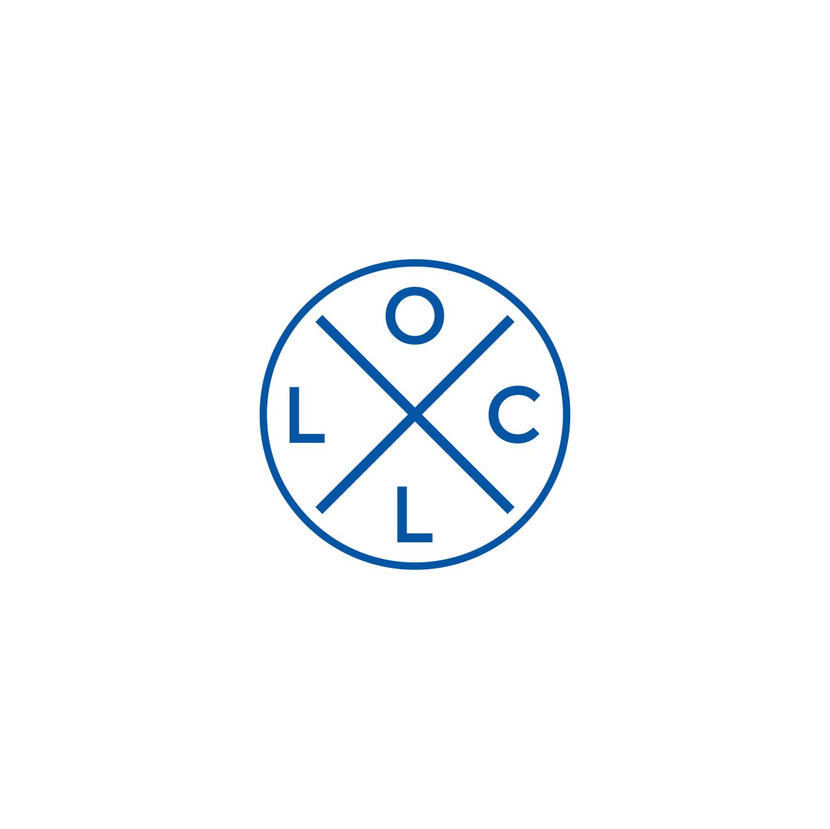
Dieser Kunde bekam 113 Logo-Designs von 51 Designern. Dabei wurde dieses Logo-Design Design von ekalogo27 als Gewinner ausgewählt.
Kostenlos anmelden Design Jobs finden- Garantiert
-
 US$110
-
 113 Designs
-
 51 Designer
Logo-Design Kurzbeschreibung
One thing we're looking for is the simplicity with this logo almost like Apple, but we want it to stand out. To give you more insight into delivery our app it's around our business model. Our delivery app is more than just about delivering food, we are trying to tie into creating experiences of how services are delivered to people. Whether it's for music events that are outdoors and sponsored by a certain restaurant who making the food.
Online TV events that would normally be live and people want to have food, alcohol, or other items packaged in the delivery that helps create that experience at home. It's to provide the business owners using a bigger picture of what you can offer from a delivery app then just food and open them up to a new network of opportunities in this COVID-19 world.
With so many businesses focusing on just delivery, we want to also make people feel like it's as if they were at the location and our app is trying to tie that experience in with what is offered with their delivery services along with any special options. The logo should portray excitement or something that connects with a memorable experience, but also be something unique, different, and yet simple.
The name of the application is X-LOCL which stands for Experience Local. We think the X should be the focal part of the logo and stand out. We'd like it to be a circular type shape, one that looks good in an app icon on a phone or could stand alone just with the X and without the LOCL part in it and be recognizable.
Hopefully, this helps a little more with our thoughts on what we're trying to get with this logo design.
Aktualisierungen
I wanted to point out that we want the logo to be a circle type Logo and the X is the key factor that should stand out the most. The dashed line in XLOCL does not need to be
in the design. The X can be stacked on top of LOCL. Here are some HEX Colors we like:
HEX Color# 32FFF6
HEX Color# 0BFF2A
HEX Color# 0432FF
HEX Color# 32FFF6
HEX Color# 000000
HEX Color# FFFFFF
If possible logo would be kept to only two or 3 color schemes.
Hopefully, this info is helpful for what we're looking for.
Added Thursday, June 11, 2020
Zielmarkt/( -märkte)
Restaurants, Liquor Stores, Convenience Stores, Bars, Music Industry Concerts, Cannabis Industry
Logo Text
X- LOCL
Logo Stile, die Sie interessieren können
Emblem-Logo
Logo eingeschlossen in einer Form
Abstraktes Logo
Begrifflich / symbolisch (Text optional)
Zu verwendende Schriftarten
Andere Schriftarten erwünscht:
- Big Caslon or Book Antiqua or Kefa
Farben
Vom Kunden ausgewählte Farben für das Logo Design:
Sehen und fühlen
Jeder Schieber zeichnet eine der Charakteristiken der Marke des Kunden aus sowie den Stil, den euer Logo widerspiegeln sollte.
Elegant
Fett
Spielerisch
Ernst
Traditionel
Modern
Sympatisch
Professionell
Feminin
Männlich
Bunt
Konservativ
Wirtschaftlich
Gehobenes
Anforderungen
Muss haben
- Must be simple, Unique, compact or circular, X must be the focal point of the design.
Must have a "holy shit that's cool" look when you see it.