Property maintenance company is rebranding and needs a sexy new logo!
Wollen Sie auch einen Job wie diesen gewinnen?
Dieser Kunde bekam 163 Logo-Designs von 77 Designern. Dabei wurde dieses Logo-Design Design von ClearDesign als Gewinner ausgewählt.
Kostenlos anmelden Design Jobs finden- Garantiert
-
 C$150
C$150
-
 163 Designs
-
 77 Designer
Logo-Design Kurzbeschreibung
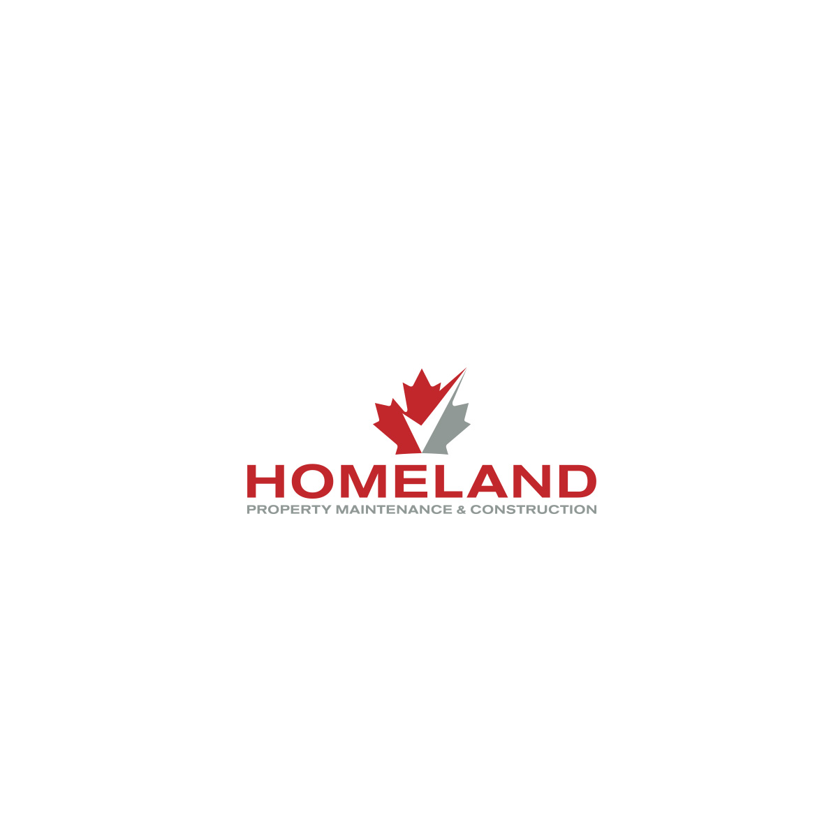
A Toronto base construction and property maintenance company is revamping their logo. The current logo looks and feels more like an anti-virus software or home security company rather than a construction and property maintenance firm. They are looking for something that is more refined, elegant, visually stimulating and memorable to their primary target market.
Their services include line painting, facility and property maintenance, landscaping, snow removal and construction for Walmart, Costco, Home Depot and other big box stores, supermarkets and buildings that require ongoing facilitation and maintenance.
Zielmarkt/( -märkte)
The primary target market is operation and big box store managers and owners of companies such as Walmart, Costco, Home Depot, major supermarkets and other buildings that require ongoing facilitation and maintenance.
Industrie/Einheitstyp
Property Maintenance
Logo Text
Homeland - Property Maintenance & Construction
Logo Stile, die Sie interessieren können
Emblem-Logo
Logo eingeschlossen in einer Form
Wortmarke-Logo
Word oder namensbasiertes Logo (nur Text)
Lettermark-Logo
Kurzwort oder Buchstaben-Logo (nur Text)
Zu verwendende Schriftarten
Sehen und fühlen
Jeder Schieber zeichnet eine der Charakteristiken der Marke des Kunden aus sowie den Stil, den euer Logo widerspiegeln sollte.
Elegant
Fett
Spielerisch
Ernst
Traditionel
Modern
Sympatisch
Professionell
Feminin
Männlich
Bunt
Konservativ
Wirtschaftlich
Gehobenes
Anforderungen
Muss haben
- Logo should be clean and memorable with a legible sub-header that is visible for ALL marketing applications.
The logo will need to include 4 variations once approved:
1) Horizontal version
2) Vertical version
3) Version with sub heading (Property Maintenance & Construction)
4) Version without sub heading
HOMELAND (Main Header) should stand out with sub header below or adjacent
Property Management & Construction (sub heading in small below)
Schön zu haben
- The use of red would be nice to have to tie in with the colour of Canada representing a Canadian brand but client is open to designers recommendations.
Sollte nicht haben
- 1) No use of a House, home or roof of home in the logo.
2) No weird or funky colours
3) Do not reuse the shield that is from the old logo
Submission of concepts that have any of the following, will not be considered!