Add a suitable font for my Lettermark Logo
Wollen Sie auch einen Job wie diesen gewinnen?
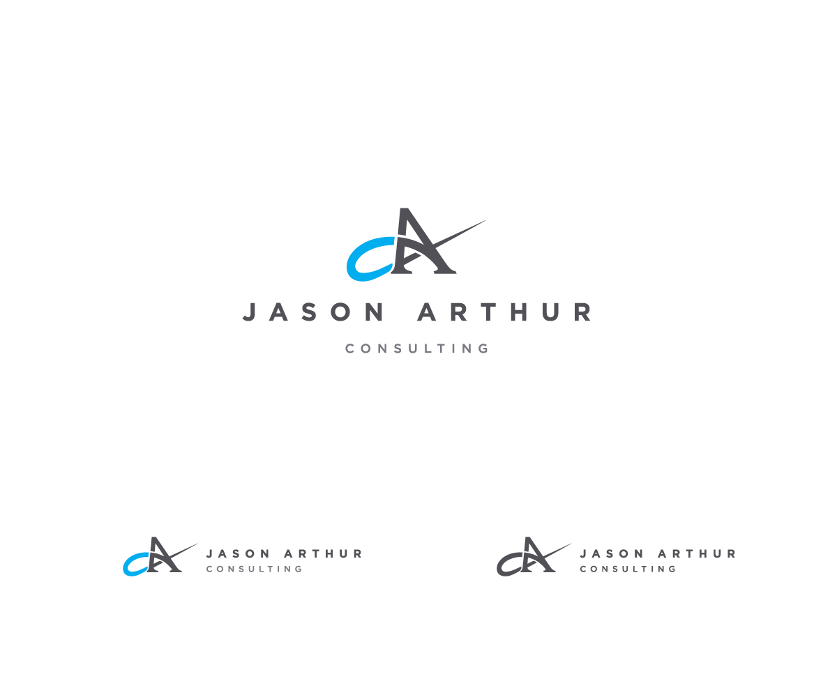
Dieser Kunde bekam 68 Grafik-Designs von 26 Designern. Dabei wurde dieses Grafik-Design Design von Nikolay Vanchev als Gewinner ausgewählt.
Kostenlos anmelden Design Jobs finden- Garantiert
-
 US$140
-
 68 Designs
-
 26 Designer
Grafik-Design Kurzbeschreibung
I have a logo already done, but I want to add a suitable font for the name of the business.
The part of the logo that says, Jason Arthur Consulting needs to look a little more suitable to the lettermark.
You can change colors as well if you wish, if you think it will make a difference. As well, you can change the sizing.
I have two requests:
1. Could the designers please submit something they consider to be the best idea they have. If I like, then we can make changes and variations. Sending a whole bunch of submissions at once is confusing and just results in a lot of eliminated designs.
2. I would like to see, in the remainder of the submissions, the symbol in the logo, placed to the left of the "Jason Arthur Consulting" where Jason Arthur is at the top and Consulting in just below.
Thank you very much.
Aktualisierungen
I have two requests:
1. Could the designers please submit
something they consider to be the best idea they have. If I like, then
we can make changes and variations. Sending a whole bunch of submissions
at once is confusing and just results in a lot of eliminated designs.
2.
I would like to see, in the remainder of the submissions, the symbol in
the logo, placed to the left of the "Jason Arthur Consulting" where
Jason Arthur is at the top and Consulting in just below.
Thank you very much.
Added Monday, January 27, 2014
Could the designers please submit ONLY one design at a time.
As well, most people are not managing the proportions of the symbol and the Jason Arthur Consulting. Many seem to simply be placing the symbol to the left and are done with it.
Added Thursday, January 30, 2014
Project Deadline Extended
Reason: Still not satisfied with submissions.
Added Thursday, January 30, 2014
Project Deadline Extended
Reason: I do not know that many of the designers are reading the brief or the additions made to the brief. I have asked that the symbol be placed to the left of the words, Jason Arthur Consulting, but I still keep getting images to the top. As well, I'm not getting anyone who is trying to ensure that they do something with the proportions of the symbol and the words, to make them look like they belong together.
Added Thursday, February 06, 2014
Zielmarkt/( -märkte)
My audience is small to medium sized businesses needing marketing services.
Industrie/Einheitstyp
Business
Sehen und fühlen
Jeder Schieber zeichnet eine der Charakteristiken der Marke des Kunden aus sowie den Stil, den euer Logo widerspiegeln sollte.