LOVY
Wollen Sie auch einen Job wie diesen gewinnen?
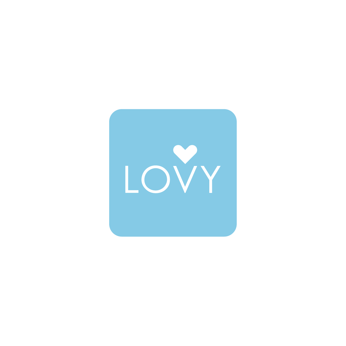
Dieser Kunde bekam 149 Logo-Designs von 74 Designern. Dabei wurde dieses Logo-Design Design von Chau Lun So als Gewinner ausgewählt.
Kostenlos anmelden Design Jobs finden- Garantiert
-
 €110
€110
-
 149 Designs
-
 74 Designer
Logo-Design Kurzbeschreibung
We need a logo for an app called LOVY. It's a dating app. The whole thing should be kept minimalistic.
The logo itself should be adapted to an app button (the size for an iphone app or android device), so it should be compact. We imagine the O in the shape of a heart (minimalistic, icon typical), but it's not a must. A heart icon (icon is important) or something similar can also be built in differently.
We are looking forward to your ideas! Many thanks in advance.
Zielmarkt/( -märkte)
Apps, dating apps
Logo Text
LOVY
Logo Stile, die Sie interessieren können
Lettermark-Logo
Kurzwort oder Buchstaben-Logo (nur Text)
Zu verwendende Schriftarten
Andere Schriftarten erwünscht:
- see Description
Farben
Vom Kunden ausgewählte Farben für das Logo Design:
Sehen und fühlen
Jeder Schieber zeichnet eine der Charakteristiken der Marke des Kunden aus sowie den Stil, den euer Logo widerspiegeln sollte.
Elegant
Fett
Spielerisch
Ernst
Traditionel
Modern
Sympatisch
Professionell
Feminin
Männlich
Bunt
Konservativ
Wirtschaftlich
Gehobenes
Anforderungen
Muss haben
- Perfect fit in to an app icon
Minimalistic
Colors:
fade / progression of soft coral red / soft orange / soft yellow and white
or
fade / progression of baby blue / soft yellow and white
or
fade / progression of baby blue and a soft coral red and white
Schön zu haben
- We imagine a white background with colored font or even colored background and white font.
The font can be similar to the ones you see below (source Dafont.com), but you are welcome to try it out. The font should not be too thin (but also not too thick), rounded and minimalistic.
We would see the colors in two variations:
A variation between soft coral red, soft orange and a soft yellow, a harmonic progression between all is also possible. If you take only one color, then soft coral red, please.
and the second variation would be between baby blue and a soft yellow tone. If you use only one color, then please baby blue. a harmonic progression between both is also possible.
As an alternative you could also think of baby blue and baby pink / coral red, but we don't think of anything suitable at the moment. But we like to be surprised.
We imagine the O in the shape of a heart (minimalistic, icon typical), but it's not a must. A heart icon (icon is important) or something similar can also be built in differently.
Or maybe a small "speech bubble" like the likebubble from Instagram and inside the logo / name.
Sollte nicht haben
- Not to big, or to small.