Stationery for London Estate Agents (Real Estate)
Wollen Sie auch einen Job wie diesen gewinnen?
Dieser Kunde bekam 48 Briefpapier-Designs von 9 Designern. Dabei wurde dieses Briefpapier-Design Design von Two heads als Gewinner ausgewählt.
Kostenlos anmelden Design Jobs finden- Garantiert
-
 £130
£130
-
 48 Designs
-
 9 Designer
Schreibwaren-Design Kurzbeschreibung
We are a modern and professional Estate Agency (Realtors) working with high quality properties in London.
We wish to redesign our stationary using our branding displayed on the front of our offices and require a digital version of this logo to be produced (photograph attached). Slight 'tweaking' of this branding is acceptable.
Aktualisierungen
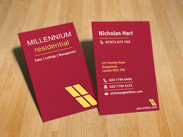
1st July 2010 Thank you all those designers who have uploaded submissions. Business Card - Details Side: Business Card - Logo Side: Outline of London Skyline Examples of the london skyline are available at http://www.dreamstime.com/searchkwy_london-skyline-silhouette Please be advised that we are looking for an outline, not a 'filled in' silhouette. Letterhead Please feel free to ask us any questions. Nicholas
I have been able to further refine our design requirements based on your submissions.
We like Two Heads' business card submission that has not been eliminated and have the following design clarifications;
a) Please use an email icon (e.g an envelope).
b) Please make the email as equally prominent as the telephone and fax
c) We very much like MagnaCrest's 'mini window icon' - please display the website URL under such a mini window icon at the bottom right of the card.
We are very happy with the colouring, fonts and proportions used by Two Heads.
We invite designers to try adding an outline of the London Skyline to the left of the large window icon on the business card and in a suitablie position on the Letterhead (e.g at the top left of the letterhead).
We have the following design clarifiications to our Letterhead requirements;
A) We would like the main logo to be on the top right side of the letterhead.
B) We do NOT want the large window icon to be on the left of the logo or the bottom of the letterhead. We are happy having the large window icon to the right or underneath the MR brand.
C) Please use icons for tel, fax and email (e.g. envelope icon for e-mail address)
D) We like two coloured red borders, one at the top and bottom of the letterhead but are happy for variations in shape and size.
E) We currently prefer our address and contact details at the bottom of the letterhead.
F) We like MagnaCrest's 'mini window icon' and would prefer this to be used to display the website URL at the bottom right of the letterhead.
G) Please be advised that the letterhead does NOT need additional space for the Company Name as per Two Heads' submission - the MR brand is sufficient.
Zielmarkt/( -märkte)
Owners of high quality property in London.
Industrie/Einheitstyp
Real Estate
Sehen und fühlen
Jeder Schieber zeichnet eine der Charakteristiken der Marke des Kunden aus sowie den Stil, den euer Logo widerspiegeln sollte.
Elegant
Fett
Spielerisch
Ernst
Traditionel
Modern
Sympatisch
Professionell
Feminin
Männlich
Bunt
Konservativ
Wirtschaftlich
Gehobenes
Anforderungen
Muss haben
- Business Cards: We would like a 'vertical' style business card with our branding on one side and our staff's details on the other;
- Our website is www.millres.com and we are flexible where that should be on the card and letterhead.
- Stationery details are available in a file attached to this project.
Schön zu haben
- It would be great to have a horizontal version of the digital logo for placement on property portals (150x60)
Sollte nicht haben
- Logo should not deviate significantly from the branding on our offices (shop front) - photograph attached.